1

I am a software developer for a plugin for Blender. I am new to UX, but have created UIs and GUIs for some time.

My plugin has three buttons - two with filter options grouped visually with them. Above these buttons is an animation panel that, when checked, extends the existing functionality of all three buttons (ie selecting objects over multiple frames instead of just one).

I am adding an option, "auto keyframe". However, due to Blender's limitations, only one of the buttons ("Set Objects nView") and two of its filters is compatible with this new option. Its two other two filters, as well as the other two buttons, don't support it.

With all of this, the question is: how should I show that the option only works for one button? Is it better to make a separate button or an option that disables some buttons?

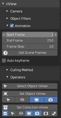
Option 1: have an auto-keyframe checkbox in the animation subpanel, leave buttons alone. However, since the other two buttons ("Select Object nView" and "Set Collection nView") do not support the keyframing, they will need a warning or be disabled.

Auto keyframe checkbox, buttons remain the same

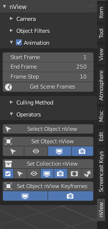
Option 2: no "auto keyframe" checkbox. Instead, have another button of "Set Object nView with keyframes". This button will require the animation option to be checked, otherwise be disabled with a reason.

nView panel with animation panel, and a button at the bottom for "Set Object nView Keyframes"

Either one honestly feels somewhat viable, but also seem to be visually inconsistent in their own way. Is there one that is significantly more viable than the other? Or is there something I'm missing?

1
  • I am curious to know which option you went with, and whether the limitations imposed by Blender is likely to change in the near future since that might require you to redesign the plugin regardless of which option you went with.
    – Michael Lai
    Commented Mar 14, 2022 at 2:40

2 Answers 2

0

I haven't used Blender extensively but I suggest the first starting point is to look at similar filtering options that behave in a similar way and copy it.

In general, desktop applications appear to follow the convention of showing all the options that are possible and disable those that aren't, although this trend might be changing since many desktop applications are starting to adopt web design patterns due to cloud-based versions also being available.

Also, in complex software that has many options and configurations, it is a good idea to create an immediate feedback to the user when they make certain selections so that they don't end up lost from doing a number of menu and button clicks.

So I would suggest simply keeping the Autoframe checkbox as it is and disabling the buttons (perhaps provide a tooltip to help the user enable the option). As long as you have covered all the variations in a clear and consistent way you should avoid most usability issues that might come up.

0

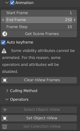
I did resolve this myself, so I'll at least share what I did (if you strongly disagree, feel free to make your argument). In short, I stuck with the first option, added a warning that when keyframing is on, some buttons will be disabled. And of course, the related buttons and options are disabled.

Auto keyframe has warning: "Some visibility attributes cannot be animated. For this reason, some operators and attributes will be disabled."

By the way, I also realized that the row of options underneath each button can only be disabled as an entire row, not as individual options (as per Blender API's constraints - I could add subcolumns for each option and disable those, but that may mess with alignment). So I made each button's options as a popup when clicking the buttons before running.

Your Answer

By clicking “Post Your Answer”, you agree to our terms of service and acknowledge you have read our privacy policy.

Not the answer you're looking for? Browse other questions tagged or ask your own question.