3

I've seen a few questions regarding deep hierarchy and miller columns, but haven't seen an example of it with smaller screens (tablets, would be the limit. this is not for phones). I'm not really a UI designer, more of a web developer, just read through a bunch of google material design stuff and like it. I have a project that has a deeply nested structure where jumping back and forth at various levels quickly is needed. I just wanted to get some feedback on this idea. Trying to avoid visual clutter, show breadcrumbs, while maintaining as much space as possible for the "details" of the content.

Questions: Is having this many columns too cluttered? Is collapsing them an an acceptable solution?

Users would need to create/update/delete items at the various levels. At the 3rd level, they would need to perform the same set of actions on a 4th level of items in addition to viewing report type information. Each level has its own set of details. Sorry, i'm trying to be vague but not too vague and i can't think of a good analogy for this scenario.

With 3 columns on a smaller screen it would result in something like this: miller columns running out of space
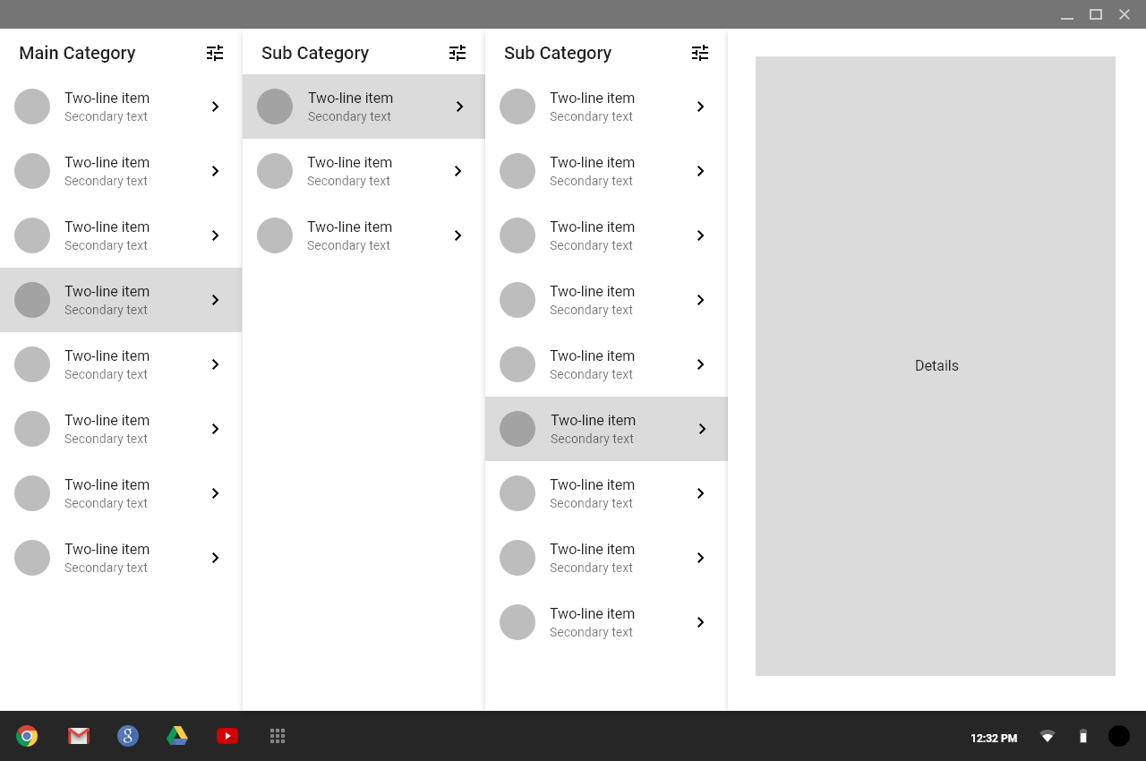
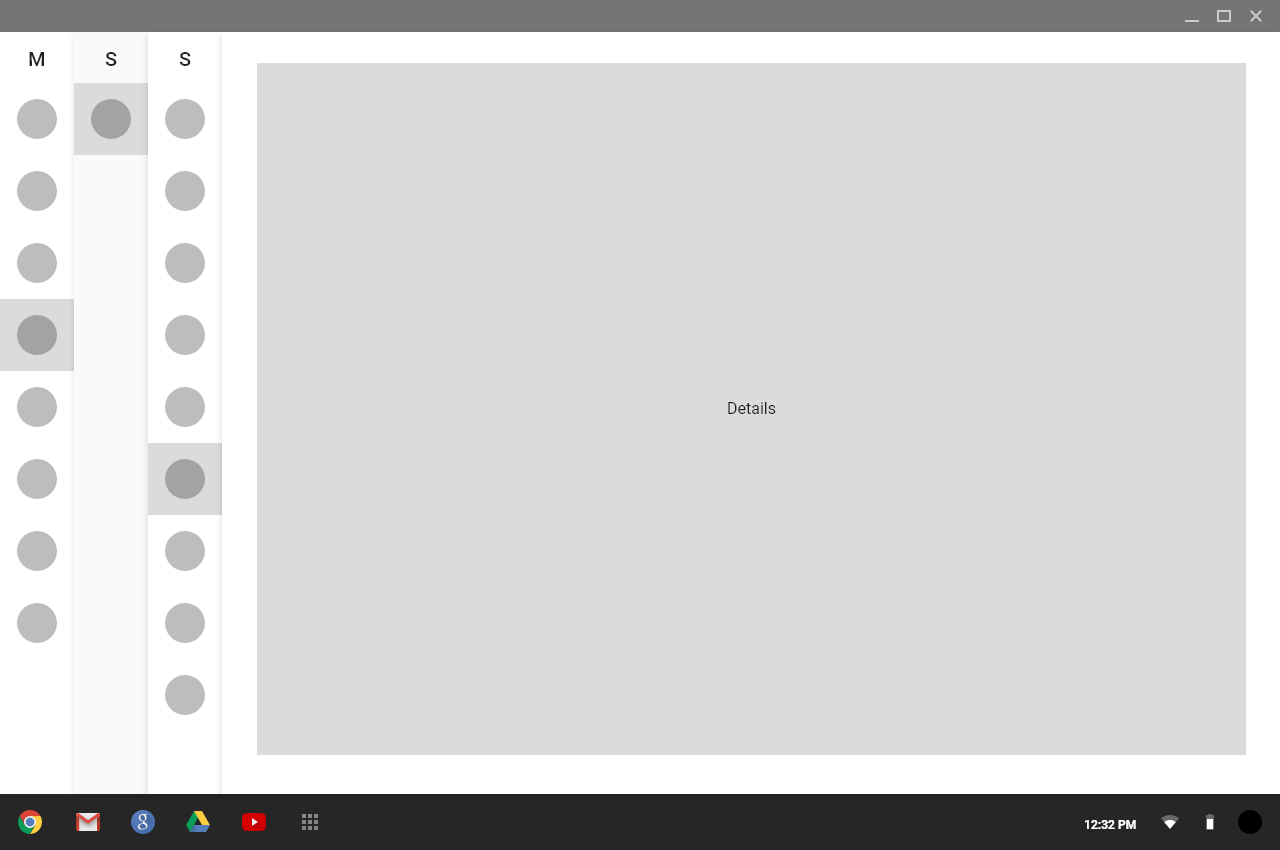
One idea is to completely collapse all columns enter image description here

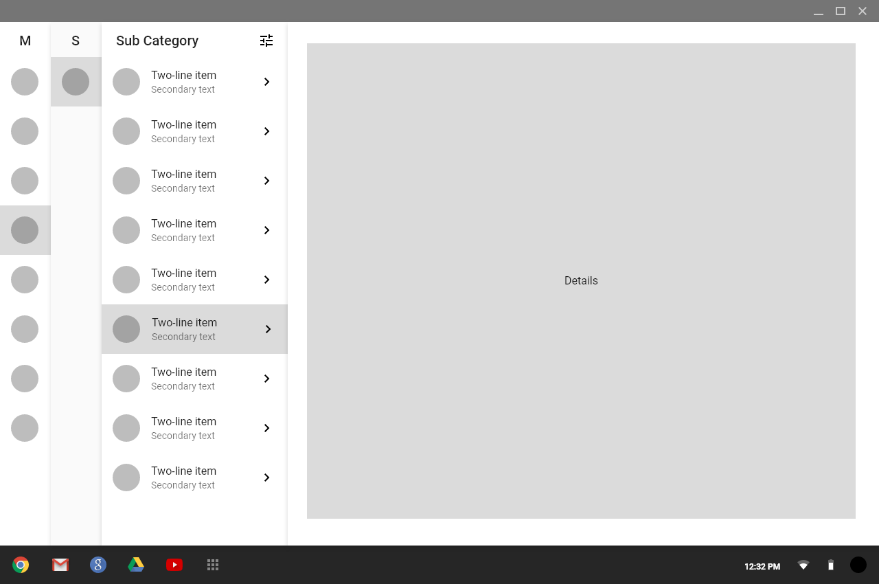
Another is to have it the last column always visible enter image description here

5
  • Is your 3rd column have element e.g filter? Or is it a page related to navigation ?
    – Swapna
    Commented Apr 17, 2020 at 2:43
  • Also out of 3 variations, 03 is much better. This is valid if the 03rd column is something related to navigation. If not, you can think of merging the 3rd column along with the details page.
    – Swapna
    Commented Apr 17, 2020 at 2:47
  • the idea is that each column has a filter toggle, the last picture shows it slide out for the selected column. other idea is to have a pop-up. this does look a little confusing in retrospect
    – aibarra
    Commented Apr 17, 2020 at 2:55
  • Hi, and welcome to the site! Can you nail your post to a single question? I can see at least two (1st image vs. 3rd image; i.e., should left columns be collapsed? -- where to place a filter?) in here. Also, more context about the users and their tasks will help us give more appropriate recommendations. Commented Apr 18, 2020 at 10:21
  • thanks! sorry, my thoughts are all over the place. i updated the post. nailed it to 2 questions.
    – aibarra
    Commented Apr 18, 2020 at 16:13

1 Answer 1

2

Let's try to analyze each separate concern:

Is having this many columns too cluttered?

Instead of starting with that question, I'd start by asking if users will have enough space to do theirs task comfortably in the "details" space. While you can always assure them that, the clutter is less of an issue.

But I see that you'd need to place 4 columns, besides the details one, so you'll most likely need to "show less" of the columns. Options vary.

Is collapsing them an an acceptable solution?

Start by discarding the one collapsed with only circles. There the context is totally lost, which will for sure "make the users think", something you always like to avoid.

Then I'd ask, is that circle containing any kind of information that is really necessary for the user? Because, cutting it out, will significantly reduce the amount of space needed for each column, maybe enabling to fit them all.

If that's not an option, you'll definitely will have to reduce the amount of items that are shown at once.

If you go the collapsible route, some recommendations:

  • Always show the last column (as in your last image) to have some context
  • Give users the options to manually collapse/uncollapse any column at will.
  • Reduce the size of the columns, while you progressively add more of them. But always get sure that the last one on the right, is perfectly visible.

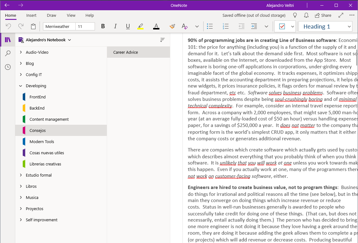
Other viable alternative could be using at least some components of a tree structure. Here an example of Microsoft OneNote, which you can use as a base and adapt to your use case.

enter image description here

Also another example from windows explorer. You can help yourself with some visual design to improve the visualization of each hierarchy.

enter image description here

As rule of thumb for all cases, I'd try not to occupy more than half the horizontal available space with columns, so users have at least half screen to visualize and interact with the details.

1
  • 1
    Thanks! this is really good information and guidance. The circles will contain abbreviations of titles or dates. Will definitely give the user the ability to collapse/expand parent columns, while keep last/current column expanded. Need to get onenote, didn't know they have that kind of interface. i'm only use to it on Mac OS finder views. thanks again!
    – aibarra
    Commented Apr 19, 2020 at 3:01

Your Answer

By clicking “Post Your Answer”, you agree to our terms of service and acknowledge you have read our privacy policy.

Not the answer you're looking for? Browse other questions tagged or ask your own question.