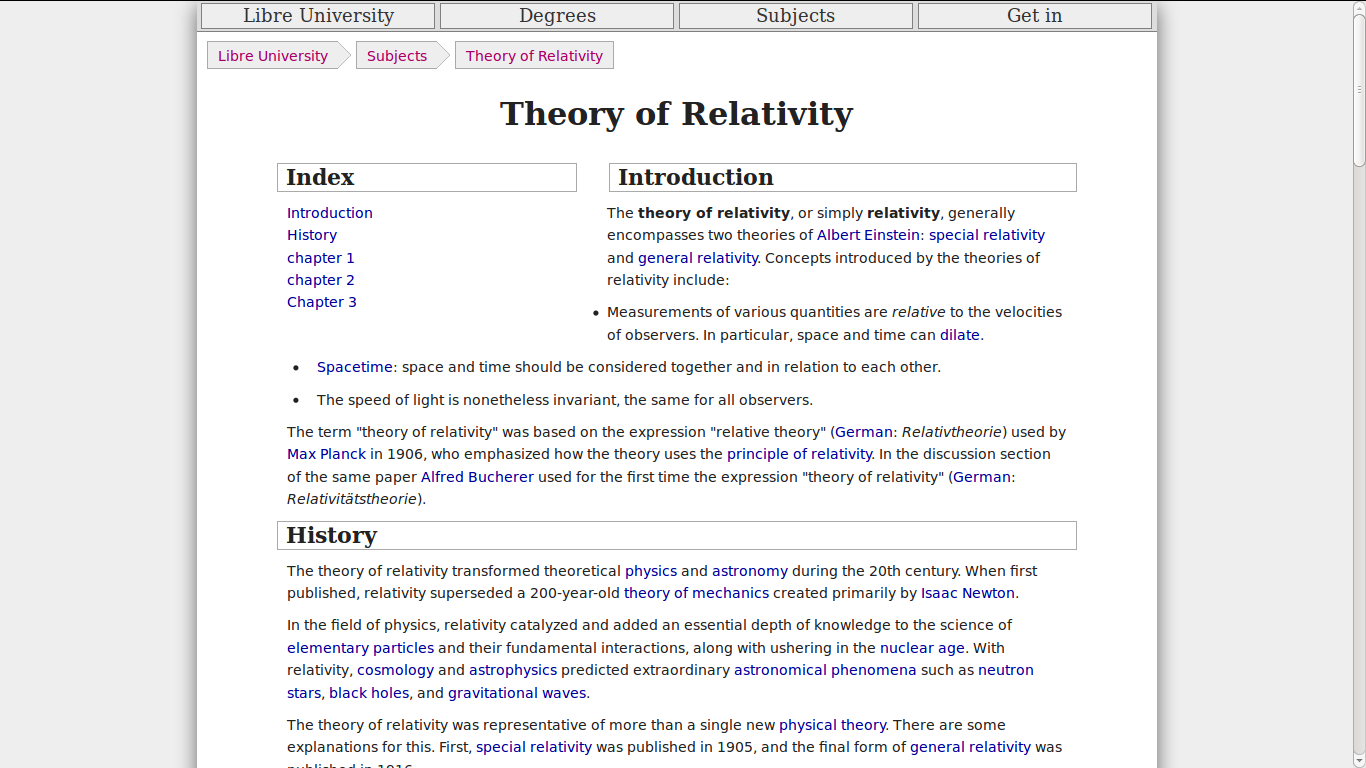
Preview I got so far of both Navigation Bars
First I'll show the preview of what I got so far. I'm trying to find an equilibrium in the page I'm slowly developing (an online university). I'm showing here both of them. As you can see, it doesn't look really good:

Note: the page is in the middle of a redesign, being the second navigation bar the only thing implemented so far. Many things are broken now, but feel free of giving me any extra tip if you want (:
Navigation menu
IMHO, it has these advantages:
- Jumping from one section to another fast without previous knowledge of the site's structure.
- See enough of the site's tree to know if you are interested in it just by hovering over the menu.
- You can put generic elements there, providing there's no other place, as the search bar and login/profile link in my case.
- Users see this in every web.
Breadcrumbs
This navigation bar is also very useful. The main advantage it has is that it allows to jump up a level. Say the user wants to go up one level to see other kind of resources (Theory of Relativity has: "Text", "Videos", "Equations", "Exams", etc), or two levels to see related subjects, then he can just do that with a click. Also, users are used to this schema from the file explorer in the computers. More information.
Question
Do you have any recommendations on how to integrate both bars? They can be merged however you want, but both should still be on the top, no side menus are allowed.
Possible solutions
These are the 2 ideas I have:
Delete the breadcrumbs menu and only put a button on the left saying "Go back to the Subject" (in this case).
A preview of my second idea. This is: deleting the navigation menu and, when hovering over the breadcrumbs, making a dropdown sub-menu with siblings for each one show up. So, if you hover the "Subjects" in the bar, then "Degrees" and "News" are shown. Search and user are always shown on the right. Please, check the preview as it's difficult to explain but IMO it looks really slick. Could it be counter-intuitive in the way it is now for uninformed users? How could I make it more intuitive? Edit: this second option is heavily discussed here: Better approach to blue/underlined for link?;
Edit: The question doesn't show any research efforts, but I've been a LOT of tutorials/tips on how to make a proper navigation bar. Although I haven't learned how to combine it for this case.
