17

I'm having trouble designing a search box with two mandatory filters/categories before the user hit the "go" button.

So far, the best solution I could come up with was this one:

enter image description here

I've presented the following solution to my client, but they insist it's not ideal once the user would have to open up the split button and change the axis of their cursor and all of that, but I don't really see how this can be a heavy impact on the navigation. If it was all up to me, I would go along with this one, but they insist it's not the format they want, so forget about it.

enter image description here

Well... any ideas?

3
  • Are these the only two categories users would search? Commented Oct 19, 2018 at 14:38
  • yes, there are only these two filters available
    – feelerino
    Commented Oct 19, 2018 at 15:09
  • 1
    Using the same search term, how will the results differ with each of these options? I cannot quite figure out if users are searching for documents or within documents
    – Michael J.
    Commented Oct 19, 2018 at 20:03

8 Answers 8

11

I remember GitHub had something like what Mike M suggested for their search. I just noticed that it's changed, and what they do now is make the selection a part of their autocomplete-like menu: enter image description here

I imagine the default selection at the top is what they believe to be the most common, which makes sense to search in the current repo by default. An advantage I note in this is that it let's you switch without hassle. If I wanted to search "rails" in "All GitHub" (which makes more sense), all I need to do is press before hitting Enter. This means that switching the filter is just a single additional keypress.

Comparing this with other solutions:

  • dropdown input at the left means I have to Shift+Tab and hit either once or twice (I get the feeling that some dropdowns don't change the selection on the first hit and only open the menu with the selection unchanged, which gives me uncertainty about dropdowns in general).
  • 2 buttons at the right with the default on the left means I have to hit Tab twice.
  • 2 buttons at the right with the default on the right means I only have to hit Tab once to switch, but it might not be intuitive that the default is not what's closest to the input.
  • radio input is like dropdown but at least I can be sure that hitting the arrow key will cause a change in selection.

All these other solutions also suffer in that they have more visual noise, when the input is not in use. An advantage they do all have, however, is that they don't require javascript (if we're talking websites here), which is nice both for the developer and users.

2
  • hey JoL, unfortunatelly only now I saw your reply :( this is a very convenient solution. Thank you anyway, that was a great insight.
    – feelerino
    Commented Nov 28, 2018 at 13:26
  • @feelerino I see you haven't accepted any answer, yet. You probably should, even if it's not mine. You accept an answer by clicking on the checkmark below the voting buttons.
    – JoL
    Commented Nov 28, 2018 at 16:28
13

If the filter is mandatory, choose the most frequent search as the default.

You can try a scoped search dropdown before the search input field. This way the search button is Active from the beginning.

Lead with what your metrics show that the majority of users will want to search by, and don't make them pause to choose a filter.

enter image description here

The tradeoff

If you have some metrics that make the case for the most likely search, users who don't see the filter, and just search will be rewarded.

Those who would search 'Fragments' (let's say it's the lesser of the searches), might not see the dropdown, and search immediately.

2
  • 1
    this is a very good solution, even Amazon use this logic and I don't see a good reason for not using it. I may suggest the client that they leave the user search for whatever they want, and then when the results come in, they can filter it by tabs just above the results list. That could be more effective. I don't know.
    – feelerino
    Commented Oct 19, 2018 at 15:17
  • @feelerino I could see the argument that that leads to a significantly increased search time, both in terms of processing and in terms of user decision. It's worth bringing up, just figure out what the average time increase is if the person gets irrelevant results and has to filter them out after the search so you know what you're dealing with. Commented Oct 20, 2018 at 15:30
7

Since this is a mandatory tasks before interacting with search, consider search like the Call to action like save or submit. Before you can accomplish these actions you must fill out a form.

In this case your form is a radial group and a text input field.

enter image description here

2
  • I've offered this option too, but client argued the filters "are too important" to go out of the reading flux. I mean, the thing is right by the search field, right?
    – feelerino
    Commented Oct 19, 2018 at 15:21
  • Perhaps since you have disabled interaction with the call to action this will be better received and you also provided inline instruction. I do like DarrylGoddan option where you just use two call to actions. This is not scalable solution but you can iterate later.
    – Bromox
    Commented Oct 19, 2018 at 16:25
5

If these are the only two options and are likely to remain so, I would go with something like this:

mockup

download bmml source – Wireframes created with Balsamiq Mockups

3
  • this is actually a good option, but the problem is that apparently the user would search for very long terms, like this is a page that's gonna be used by engineers and people looking for some very particular content about energy, power plants and the likes. The client himself commented about this solution, even saying they used it in a previous project, but that it wouldn't really work for this current one.
    – feelerino
    Commented Oct 19, 2018 at 15:14
  • I would very interested in a usability test to see what criteria your users will search. The norm for search is to be vague and use keywords. I find it curious that you would have users search for long phrases. In the event that users do search with key words and or questions this would circumvent your clients concern, making this a viable solution.
    – Bromox
    Commented Oct 19, 2018 at 16:27
  • This is a valid option only if the 2 options are equal in terms of importance and expected usage frequency. Otherwise - you force the user to make unnecessary choices every single time he uses the search..
    – Yoav Barak
    Commented Oct 22, 2018 at 7:27
5

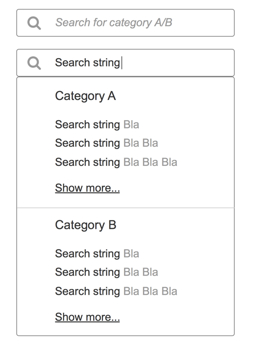
Did you consider an auto-suggest search for both categories?

That way you provide the user with immediate value before forcing him to make a further choice..

enter image description here

3

Probably not an ideal design decision — I mean I certainly wouldn’t do this, but since the client seems to be a bit of a stickler, I’m just throwing it out there as an idea.

Two search bars, one for each category, when the user focuses on one, disable the other.

Like I said, not a good idea, but I don’t see anything wrong with the other solutions you’ve already presented to the client, so it seems to me like the client doesn’t really want some that makes sense. Instead, they just want what they want, and they want you to just figure out what that is.

Maybe they want something stupid like this...?!

2

One good alternative: Search for both every time (if performance considerations allow), and present the results in two tabs "documentos" and "fragmentos". Foreground the tab that is known to be about the more frequent search (can be globally set, or a per-user setting). If performance is a problem here, execute the search filling the background tab only if it is actually clicked.

1

You could ask yourself how mandatory choosing really is and just search in both categories by default. You can then offer filters on the result page to refine the search.

If, as you say, the search terms are long anyway, the results might already be unique enough to yield what the users are searching for.

If you still want to give all options from the beginning, hide the filters under an advanced search drawer or something similar.

Your Answer

By clicking “Post Your Answer”, you agree to our terms of service and acknowledge you have read our privacy policy.

Not the answer you're looking for? Browse other questions tagged or ask your own question.