The Challenge
Including long text (up to 30 characters) topics in filter UI of search results to allow easy filtering.
Existing Considerations
Having filters and even faceted searches is nothing new however I am working on a project with a particular challenge. I need to find an optimal way to include sub filters on search results page which can have long text. Additionally, faceted categories won't work perfectly as 1 sub category can fall across 1 or more core categories.
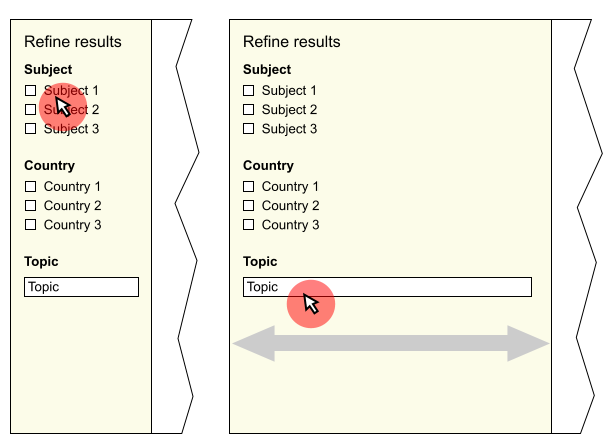
Traditionally a search page will have filters down the left and show the search results to the right. Having faceted search categories (like amazon) is great but in this case the text would appear too long on the left (such as topics).
Elipsing the sub categories would only be half useful as in order to understand the entire topic one has to see most if not all of it.
Editing the topics to be smaller is also not an option as these are fixed in their wordings and is data that we are pulling in from another source.
The proposal
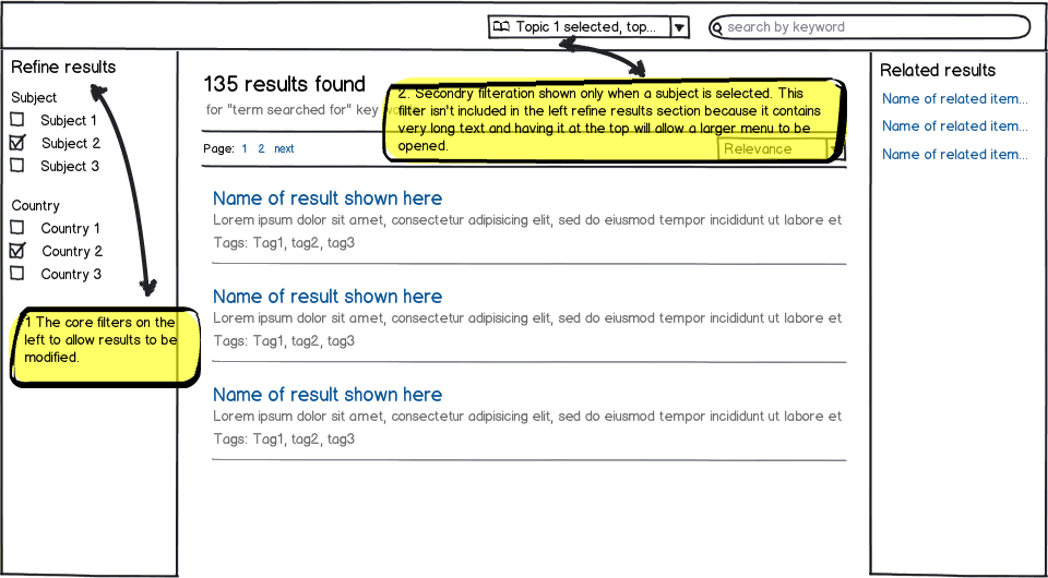
Below you can see a (very) rough sketch of what I was initially thinking. The core filters would be down the left as expected but then should any core categories be selected that allow for further filteration then a menu would appear to provide those options at the top of the results. This would then open up into a larger selection menu to allow selection and deselections.
What I don't like about this is that it provides two different experiences in filtering and also dealing with the user changing one of the core categories again may mean the sub filters are automatically made void, perhaps un-intentially causing the sub filters to be lost. Finally, the filters are not all in one place.
I'd love your thoughts on this and for any suggestions you might think are helpful.

download bmml source – Wireframes created with Balsamiq Mockups

