0

I am creating an administration panel for an application and one of the needs is to manage quizzes in one page without any pop-ups.

The application should be usable both on mobile and desktop.

I had come up with a solution to show buttons next to each possible answer of a question and the green checkmark indicates the correct answer. When a user would hover one of the red crosses - they would turn into green checkmarks, which would indicate that the user has to click to make this answer the right one.

However hover doesn't work on mobile. What could be an alternative solution good for user experience that would also be usable on a phone?

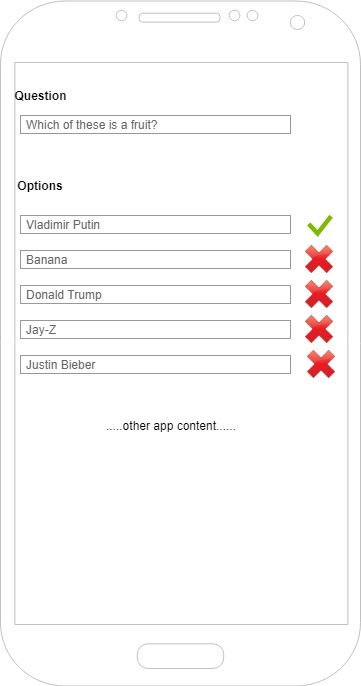
enter image description here

1 Answer 1

1

Avoid using several buttons and components, it makes the UI too busy and less friendly.

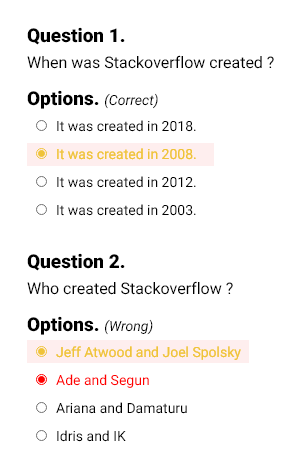
Make a good use of Radio Button or Checkbox to signify choice and use styles to indicate correct or wrong choices, a typical user sees red and knows that's a wrong choice.

Here's a design to help you out.

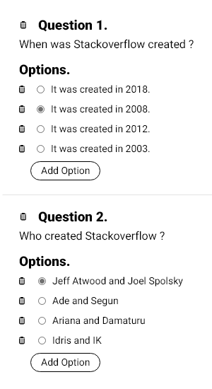
For Quiz Creator


enter image description here

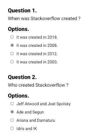
For Person Attempting the Quiz(Quizee)


Before submission of Quiz.

enter image description here


After submission of Quiz.

enter image description here

2
  • Sorry if it wasn't clear enough in the question, but I am trying to implement a UI for CREATING quizzes, not filling them. Commented Aug 15, 2018 at 15:50
  • Oh really, well, it still works, all the user(quiz creator) has to do is add options, that automatically appear with a radio button, then the selected option is the correct answer. However for delete purposes, a delete icon at the back of the radio button should be used, I'll edit my answer now. Commented Aug 15, 2018 at 16:02

Your Answer

By clicking “Post Your Answer”, you agree to our terms of service and acknowledge you have read our privacy policy.

Not the answer you're looking for? Browse other questions tagged or ask your own question.