1

I have a complex settings structure to manage machinery, where parts(functions) of the machine can have a combination of one or two settings. So basically the settings are set individually, but some other settings, when activated require functions of the machine to be grouped together.

Is scrollable menu structure a no-no in mobile settings UI?

A design option is to first suggest the user to group/ungroup functionality and based on that some settings become redundant, so hide/unhide or toggle the availability of settings.

Thus the result would be a scrollable list for mobile, within that list some items toggle between shown/hidden.

The scrollable settings list would not be very long, maybe 3 screens long. The alternative is some sort of pagination, but the thing is that the user should see all machine functions at a glance while they adjust settings for another function.

We have resisted the scrolling and felt pagination simplifies the UI, but I am at a loss how to split the settings so it makes sense

7
  • 2
    Can you give us a little mroe info? It's hard to make suggestions for the groupings without a detailed example. Perhaps put in a rough wireframe of what you have so far?
    – Franchesca
    Commented May 13, 2014 at 8:45
  • I don't have wireframes. I am starting to think I should use radio buttons for the options, and depending on the selection the settings that remain available just get unhidden/hidden
    – Heidi
    Commented May 13, 2014 at 15:48
  • 1
    This site actually has the balsamiq wireframe tool available to use. If you go into edit mode on your answer and look at the toolbar above the text box you will see an icon with a pencil on it. From there you can use the interface to build whatever you want. Have fun! :D
    – Franchesca
    Commented May 13, 2014 at 20:58
  • @Franchesca, I had no idea and Ive been on Stack for a few years haha. Thanks! Commented May 14, 2014 at 14:12
  • 1
    @Franchesca, maybe bring it up in the meta.stackexchange.com Commented May 19, 2014 at 21:35

1 Answer 1

1

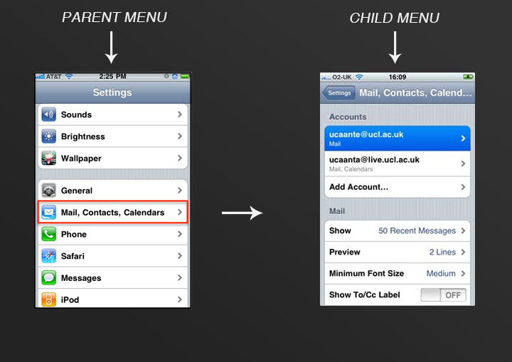
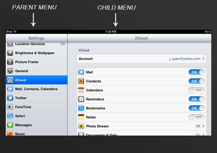
Users are accustomed to swiping through settings and when weighed against pagination, I think you're better off keeping with the standards. If you are concerned with the page length, consider breaking up your settings into somewhat generic and hierarchical groups and create additional menus to break it up - parent menus with children menus.

mobile app parent child settings

mobile app parent child settings

Your Answer

By clicking “Post Your Answer”, you agree to our terms of service and acknowledge you have read our privacy policy.

Not the answer you're looking for? Browse other questions tagged or ask your own question.