2

I am designing a complex software application used by enterprise clients, which has a large amount of data entry forms (as is the nature of the work being done on there).

The application is available in a browser, and as a phone app and there is a large established user base and in the next couple of years there will be an influx of new users.

In the design, we have used a yellow background and a red asterisk to denote a mandatory field within a form, like so:

app field

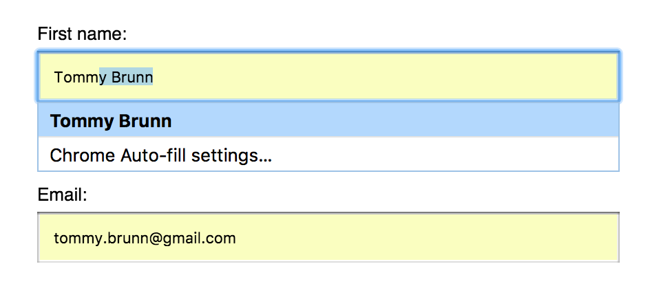
This is obviously incredibly similar to the browser auto complete styling from various browsers:

browser field

We have had user feedback, from a usability test with 10 users (as part of a procurement process, and as such, not ran by our selves - so unfortunately, we couldn't ask targeted questions). But from that, a few users did state that they liked the yellow on mandatory fields, as it made it easier to locate them in the form. But, I'm not sure this is a large enough sample to base a decision on or come to a conclusion around this particular issue.

My questions is:

Is it an issue to use the same styling to indicate our mandatory field? even if we turn autocomplete off or if autocomplete wont ever feature in fields within our form? e.g. is the yellow background pattern to signify autocomplete well established enough to confuse users if it doesn't mean autocomplete?

2 Answers 2

1

Is it an issue to use the same styling to indicate our mandatory field?

Yes it is, you should never use the same styling because users might expect something to happen while something completely different happens or nothing happens at all.

There is no reason to use the same color as auto complete. Your users did not like the color they liked that the mandatory fields were styled different to the non mandatory fields which makes it easier to locate them at first glance.

You could use a different color that does not interfere with the auto-complete function and still provide your users a visual clue for mandatory fields.

1

It will become a problem when a user clicks on autofill and all of a sudden a lot of the fields will appear mandatory, which may causes confusion. Also, if I see this yellow in form fields, I automatically review all the content in the fields, because autofill often fails to fill in the correct value. This could mean, that users may read over the form twice just to be sure, that everything is correct, even if the autofill action never happened.

So basically the problem is: You have two different behaviors which are represented in a very similar way, and this is always a point where users can get confused. I think the fact, that mandatory fields need some extra attention from the user, is a good thing, because this quickly allows me to spot, which fields are necessary and which are optional (I am not a fan of the red asterisk btw, but it's ok, since it is widely used and the user will know the meaning), but I would pick a different color. There are a lot of colors, that draw the attention of the user, just check if you find one, that matches the whole style of your page / app.

Your Answer

By clicking “Post Your Answer”, you agree to our terms of service and acknowledge you have read our privacy policy.

Not the answer you're looking for? Browse other questions tagged or ask your own question.