I'm currently stuck in a bit of a UX conundrum. I need to be a bit vague about the specifics, but I hope it is clear enough.
Background info:
In our system we have certain items that need to be saved. Each item consists of multiple properties, that are grouped.
In order for our system to be able to process the item in the further stages of the system, each group has a set of fields that are required, whilst some might have fields that are optional.
Our user base consists of users that have a quite bit of computer experience but also quite a few users that almost never use a computer.
Our user base wants a draft system so they can fill in each group whenever they want; and on top of that they want to save each individual group with the info they have at that time, regardless of the fact that each field is filled in. This is because gathering said information takes time.
On top of that, we have a fine-grained permission system that allows us to prevent users from filling in group A or group B, because they are not allowed to know anything about that part of the item.
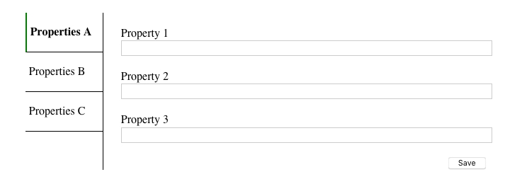
This is a extremely simplified view of what we have today
The Case:
At a certain point in time, a user wants to finalize the item so it moves from a draft status to an item we can actually use in our system. This user has the right the finalize it, but might not have the rights to fill in each group. The user will get an indication one of the groups is missing required values, but if they don't have the rights to edit that group, they'll have to contact one of their fellow users to fill in the missing info.
The question is, how do we indicate the fields are required for finalization, but not needed to simply "save" the form?
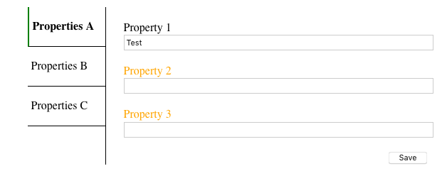
I'm currently tasked to mark the "required for finalization" fields in an orange color once at least one field is filled in and the form has been saved at least once, like this :
I'm afraid this won't be clear enough to our users and this will throw them off. Except for adding a kind of legend at the top of the form telling the users what the color means, which most likely will be something they won't read, I cannot think of a way to make this more clear.
I'm a bit tied to the solution of marking things in orange, as this has been decided by the majority of the developers in our team and there's no option to deviate from that decision.
What would be the best way to indicate the context in which these fields are required? What should I add to the label? Is there a better way to handle this kind of situation?


