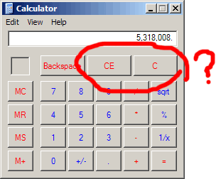
The behavior you're observing, where users hit the "Clear" button multiple times on a calculator, is indeed an interesting phenomenon from a UX perspective. If we break down the potential reasons behind this action and observe how it relates to user behavior and interface design.
Lack of Immediate Feedback
Users might press the "Clear" button multiple times because of the lack of immediate, noticeable feedback. In many interfaces, especially with physical calculators, the "Clear" button might not provide a distinct enough response (audible click, screen flash, etc.) to assure users that the action has been successfully registered. Without this feedback, users might instinctively press the button again to ensure the screen is cleared.
Trust in the Action
Another factor could be a trust issue. When users interact with calculators—whether physical or virtual—they rely on the accuracy of their input and the response of the device. If a user has experienced a situation where a single press didn’t clear the screen as expected (perhaps due to a lag or a mechanical issue in a physical button), they might develop a habit of pressing the button multiple times as a precaution.
Habitual Behavior
Habits form over time, often as a response to uncertainty or lack of feedback. If users have encountered situations where the screen didn’t clear after a single press, they may have adopted the behavior of double or triple pressing as a routine. This can quickly become an automatic action, performed without conscious thought, especially in a context where precision is critical—like calculations.
Psychological Assurance
From a psychological standpoint, pressing the "Clear" button multiple times might provide users with a sense of control or assurance. It's a way to double-check that they won’t accidentally start a new calculation with remnants of the previous one still on the screen. In scenarios where users are quickly inputting data or moving between tasks, this repeated action might serve as a mental reset, ensuring they are starting fresh.
Addressing the Design
If this behavior is widespread, it may suggest that the design could benefit from enhancement. Some potential solutions could include:
Enhanced Feedback:
Implementing more noticeable feedback when the "Clear" button is pressed, such as a brief screen flash, a sound, or a more prominent visual change.
Clearer States:
Differentiating between the "Clear" and "All Clear" functions more clearly, if both exist, to ensure users understand the scope of each action.
User Education:
In cases where it’s feasible, brief onboarding or tooltips in digital calculators could help inform users about the effectiveness of the "Clear" button.


 .
.