1

I'm developing an application where users can add charts and graphs to a workspace. Every time they add a chart to their workspace, I want to provide them with a banner notification that says something along the lines of this:
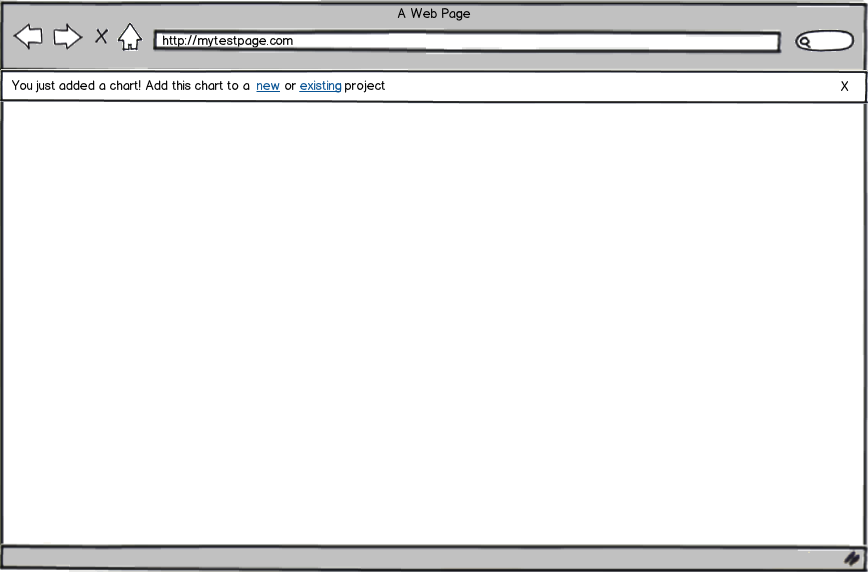
mockup

download bmml source – Wireframes created with Balsamiq Mockups

My problem lies in the wording of the notification. In the example above, new and existing would be links to the same area of the application, but different experiences. (Creating a new project and adding to an existing project).

I want the users to know they can add it to a new OR existing project, but I don't want to give them multiple links in one notification. What's the best way to word the notification so the user knows they can do both? Is it acceptable to have multiple links in a notification?

3
  • If both links take the user to the same location, why not highlight them together? "Add this chart to a new or existing project" isn't confusing to me.
    – Alan
    Commented Aug 17, 2017 at 14:04
  • @AlanGeorge It takes them to the same location, but it would be different experiences. So adding to an existing project has different steps than adding to a new project.
    – BDD
    Commented Aug 17, 2017 at 14:17
  • Unless you are using anchor tags to jump them to a specific part of the page, or different calls to a controller, I would argue the links should not be separate.
    – Alan
    Commented Aug 17, 2017 at 14:21

2 Answers 2

1

Success! You have added a chart. Add it to your project.

4
  • Why are you linking to Google? Commented Aug 17, 2017 at 19:36
  • 1
    Although this answer needs a bit more explanation to meet UX.SE standards, I think the message itself might work well here. "Your project" could apply to a new or existing one.
    – Alan
    Commented Aug 17, 2017 at 19:42
  • @DavidPostill I think it was attempting to emulate a link for the answer (or maybe Google needs a chart).
    – Alan
    Commented Aug 17, 2017 at 19:44
  • yes, my answers was too ambiguous. The link was indeed to emulate that the whole message after confirmation verbiage was to be a link thus increasing awareness and hitzone. It also makes the assumption that the front ends has the logic to take the user to the correct experience
    – Bromox
    Commented Aug 17, 2017 at 20:02
-1

Just show it that item is added to the cart. You don't have to mention in which section of cart it's been added in notification area. Keep it as minimal as possible. Because notification are supposed to inform not to explain action in detail.

1
  • Could you edit this post. Your point isn't clearly understood.
    – Mayo
    Commented Aug 9, 2019 at 13:03

Your Answer

By clicking “Post Your Answer”, you agree to our terms of service and acknowledge you have read our privacy policy.

Not the answer you're looking for? Browse other questions tagged or ask your own question.