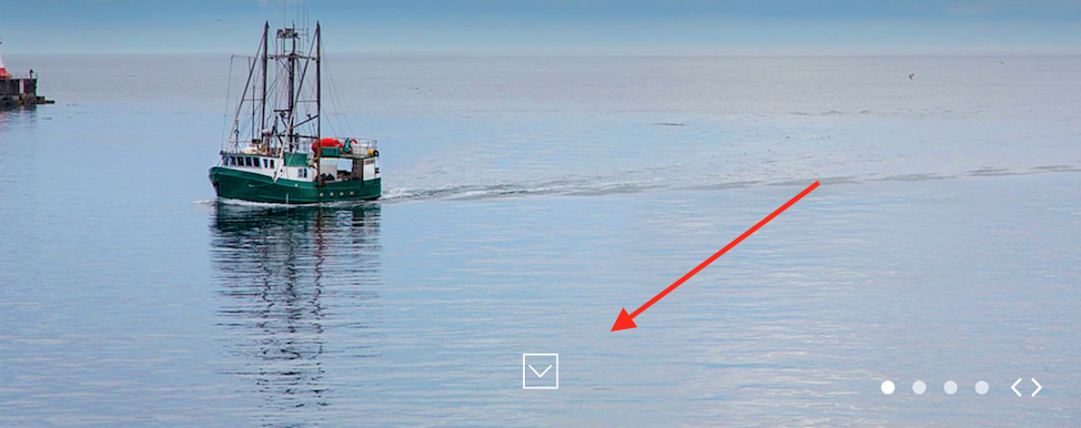
It's called a Ghost Action Button, particularly used on above the fold for full-sized websites. Since the top fold fills up entire screen the users might assume there is nothing more to scroll down and see.
This button informs the users that there is more content below the fold, so that they can scroll down and consume.
Update
Referring to @jacob's comment - a couple of helpful sources to back my post:
Use Visual Cues
Inform users that most of the content is below
the fold
Suggest scrolling with design elements so that every user can quickly
see how the site works. A subtle visual cue, such as an arrow pointing
off-screen or a copy “scroll down”, can inform users that most of the
content is available below the fold.
Keep Scrolling Please ↓
The danger with using the full screen
as a form of introduction is that users may not realise there’s more
to be found by scrolling. Our very own Envato home page negates this
with a “scroll” icon, suggesting you should take a peek below the
fold.
Another study from NNGroup; Why the page fold still matters:
The two quantitative studies produce slightly different estimates of
the fold’s impact on the user experience. But both numbers are big:
we’re not talking a 5% difference or a 10% difference between
information above vs. below the fold. The difference is on the order
of 66%–102%. If you want a single number as our best current estimate,
let's take the mid-point of this range: 84% is the average difference
in how users treat info above vs. below the fold. Huge. Believe in the
fold. It’s there, and the user experience changes drastically at that
spot.
Users don’t scroll for fun. They scroll for a purpose. So if talking
about the fold puts the focus on what’s first on the page, let’s
continue the conversation.
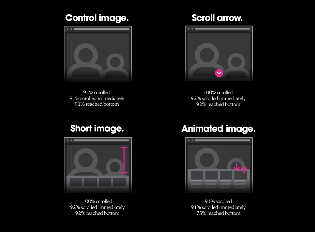
This study here is talking about some alternatives to look at:
Dear web designer, let's stop breaking the affordance of scrolling


