3

Hows does everyone feel about the solution below where there is duplicated CTA buttons at the top and bottom of a module?

We've some data to show that both buttons are being clicked but is this good practice? Does this have a negative impact that we might not be aware of?

Is this considered a "dark pattern"?

Any thoughts or comments would be appreciated.
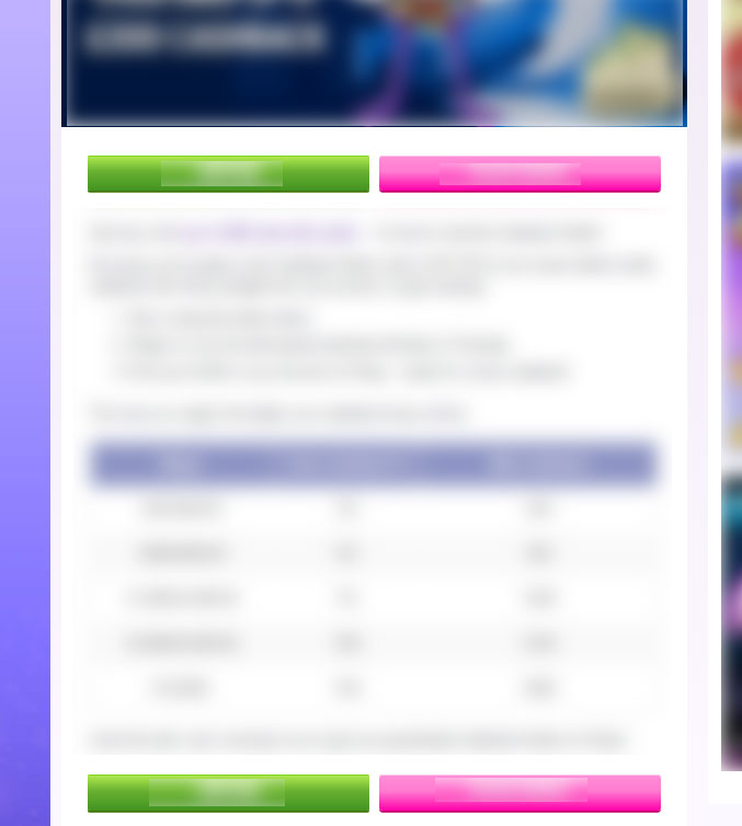
two CTAs

6
  • what messaging does your cta contain? What is the use-case?
    – NB4
    Commented Jan 31, 2017 at 12:34
  • "Opt in" on the left and "Join Now" on the right
    – Adam
    Commented Jan 31, 2017 at 12:40
  • "Opt in" or "Join Now" for creating account/service? or something else?
    – NB4
    Commented Jan 31, 2017 at 12:43
  • If you are duplicating the buttons (and creating some kind of déjà vu) maybe it would better to keep one set fixed in the window?
    – Alvaro
    Commented Jan 31, 2017 at 15:44
  • Yes, so Opt-In lets the user Opt-in to the promotion, the right button is "Play Now" (not join) which lets a user play a game.
    – Adam
    Commented Jan 31, 2017 at 15:56

3 Answers 3

1

Nielsen Norman Group recommends against using multiple links to the same page for several reasons:

  • People spend more time making a decision when there are multiple options
  • The links compete with each other for the user's attention.
  • Users don't necessarily know the link goes to the same place and are frequently disappointed when they go to the same page they just visited.
0

I think it depends on what there's between the two twin sets of buttons.

If there's a ToS, you should absolutely ditch the upper set of buttons since the user is supposed to have fully read the text (and hence scrolled it down to the bottom). In this situation, the user will naturally find the buttons at the end of the text.

If there's anything else relatively unimportant (such as a long list of social media posts or feeds) and that takes quite a lot of space, you can keep both sets of buttons as it will be annoying for an user to scroll back up all the way.

1
  • So the left button says "Opt in" The right buttons says "Play Now" The aim for doing it is to increase conversion however I'm not sure it's the best solution.
    – Adam
    Commented Jan 31, 2017 at 15:59
0

I think duplicate buttons will create confusion because some users might not understand them and ask themselves:

  • Are the buttons different?
  • If they are different why do they say the same?

If the buttons don't actually appear at the same time the former questions might be accompanied with "didn't I see those before?". Rather than clicking in any or both, you might get some users that won't click because they are not 100% sure what are they clicking. My point is that it looks like there is something strange, either on purpose or by accident.

If you want to keep the CTA present all the time why not keep it fixed in some part of the screen?

2
  • I agree with all your points and the solution you've suggested. I also think it's confusing..however there is a business push as it "drives conversions" - without running a A/B I'm not sure how I can counter this with data
    – Adam
    Commented Jan 31, 2017 at 16:37
  • Without data it will be difficult to say, but it would be interesting to see the original proposal vs. fixed buttons one.
    – Alvaro
    Commented Jan 31, 2017 at 17:10

Your Answer

By clicking “Post Your Answer”, you agree to our terms of service and acknowledge you have read our privacy policy.

Not the answer you're looking for? Browse other questions tagged or ask your own question.