3

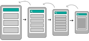
I'm working on an e-commerce site and I'm considering using the nested doll approach for the content pages. You can currently access the shop via the nav on content pages however I wanted to remove the shop nav to add more focus to the article content.

enter image description here

On mobile this method works, as I would swap out the current navigation with a back button as per the diagrams.

I guess my question is regarding desktop. Should I allow the user to access all the navigation items? On mobile I'm removing them to add focus to the content which I would still like to do with desktop however there is more real estate on desktop so should I go for the increased focus of removing the shop nav? Or should I allow the user to return to the shop if they need to? The only way they would be able to get to the shop would be by clicking the logo.

1 Answer 1

1

On the desktop version of the site, you have more space, so it would be better to allow the user access to the whole hierarchy of the navigation.

This guide to navigation on Google's Material Design guidelines recommends the Cascading Navigation Drawer design pattern for desktop apps, but then doesn't tell you what it looks like. On a desktop, it seems to be what used to be known as a flyout menu (which I find difficult to use). I think I would suggest the type of navigation that is in use on the material design site itself - i.e. sections that bahve like accordions.

2
  • 1
    Actually it does show an example of the cascading navigation drawer further down the page. Commented Dec 1, 2016 at 17:12
  • Thanks Yvonne, I have to admit I do prefer this nav, and the majority of our customers are mobile users already anyway. Thanks for your answer.
    – BoneStarr
    Commented Dec 5, 2016 at 14:37

Your Answer

By clicking “Post Your Answer”, you agree to our terms of service and acknowledge you have read our privacy policy.

Not the answer you're looking for? Browse other questions tagged or ask your own question.