10

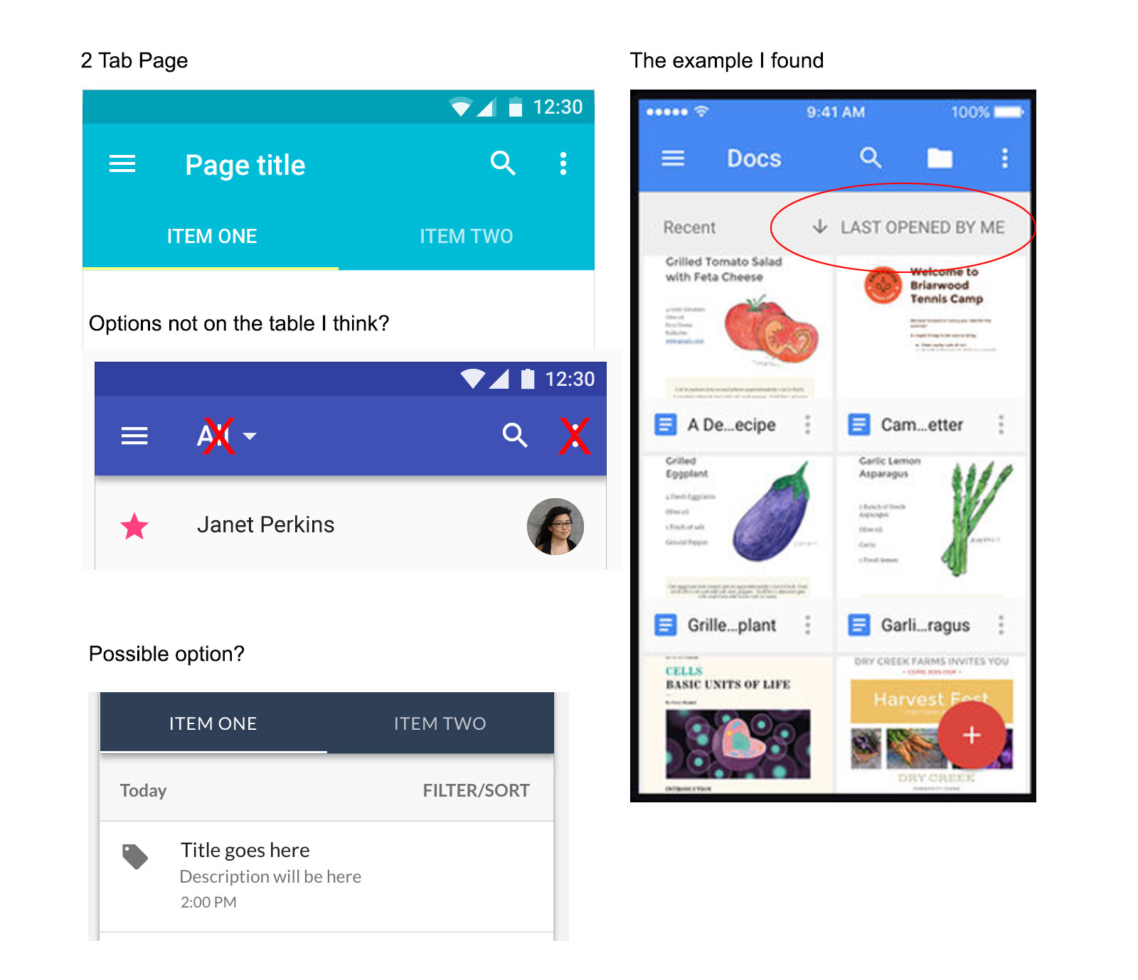
What I’m trying to do I’m trying to find out what the Material Design best practices are for adding independent filter and sort options to EACH tab in a tab layout.

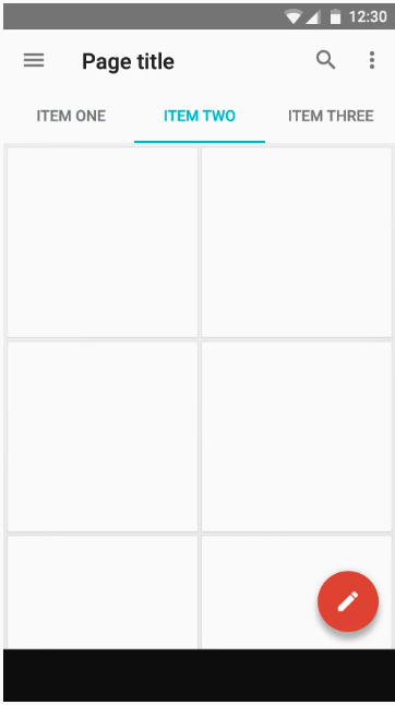
What I have proposed I’m proposing putting a Filter/Sort text button under the tabs next to the first list sub-header.

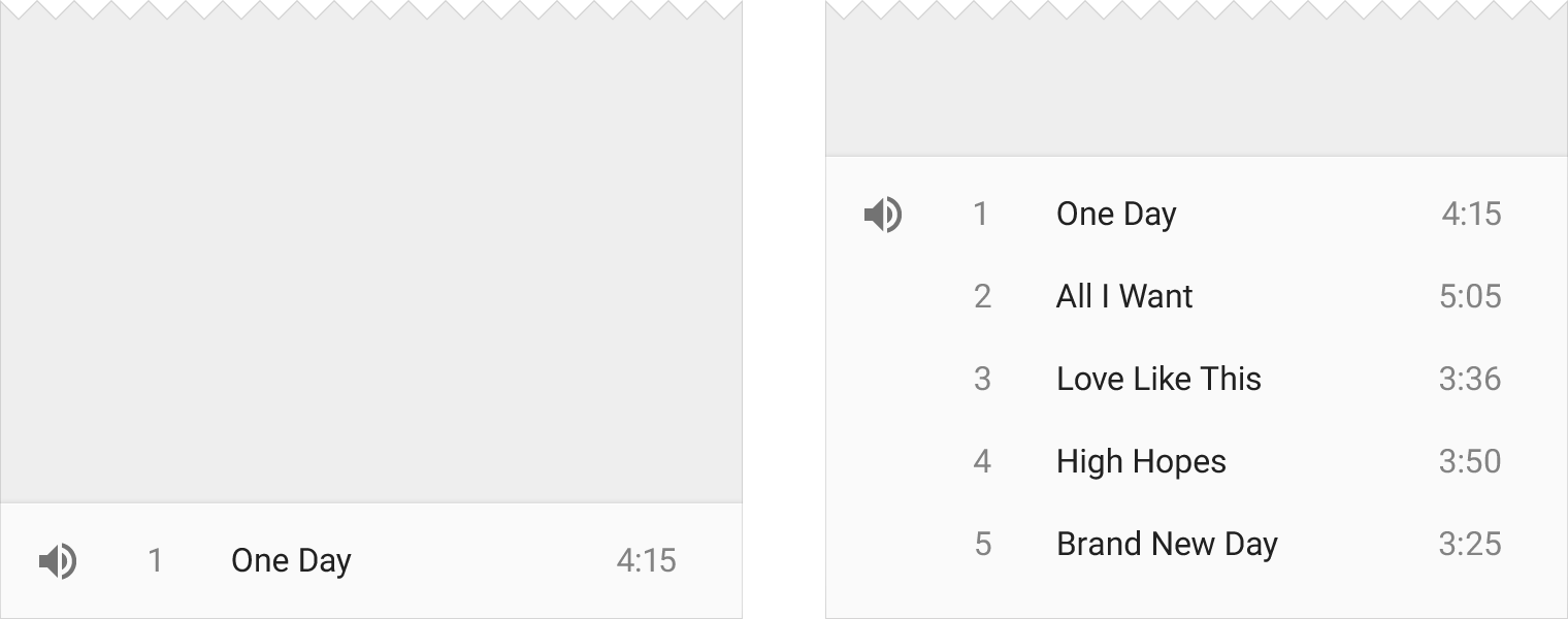
What examples I have found from Google Apps I have examples where the designer have put sorting options in the first list subheader.

I understand that Material Design doesn’t cover every aspect of UX, but there seems to be overlap when they suggest how to filter lists (i.e. List Title Filter).

Searching further this quite similar question to the below link, except I have sourced examples from Google in hope of the correct answer.

Mobile - Sorting Items on one tab

What I think is not a solution

List Title Filter is probably out of the question as it’s a tabbed page. Adding an icon in the Toolbar is not available as its already full of fixed content.

enter image description here

4
  • 1
    I can't understand this question. Can you try to articulate exactly what you're trying to do, what you have, what you need, etc. Break it down so that it can be seen for the problem it is, rather than trying to frame it to what you perceive to be a potential answer and a situation where there may or may not be "best practices". This may require actual design rather than rule following.
    – Confused
    Commented Oct 28, 2016 at 2:31
  • Sure no probs. I have edited the answer. Does that help clear it up?
    – Rhys
    Commented Oct 28, 2016 at 3:56
  • why can't there be different tabs for sort and filter? why combine it into one?
    – NB4
    Commented Jan 27, 2017 at 11:13
  • What happens to the overflow menu when you're viewing it in a tablet or laptop? Doesn't it flex right to the point that the user doesn't "see" it. I mean it's there, but you're not really looking for it so it's easily missed.
    – mfortner
    Commented Oct 3, 2018 at 4:44

5 Answers 5

2

Great question - I have the exact same issue. From what I understand from the Material Design spec there are lots of options.

About My Web App

I have tabs with cards displayed in them. In the information architecture for my web app the tabs equate to the categories of cards (Places to Eat, Things to do, Nightlife etc). But my cards also have tags (Kids friendly, Open Now, Low Price etc). Cards can only be in one category but can have multiple tags applied.

So the options I am considering and which I think are consistent with the Material Design spec are:

Option A - Toolbar

I could use a toolbar at top of the sheet that contains the cards - in this case the sheet is in a tab. According to the spec "Toolbars are versatile and can be used in many different ways." For example (from the spec) on a card or floating:

enter image description here enter image description here

Not sure if you agree but I see your as like a toolbar at the top of a sheet - so totally OK according to the spec.

Option B - Bottomsheet Toolbar

I think I could alternatively make use of a toolbar at the bottom of the sheet that launches a shelf. According to the spec modal bottomsheets can be used to "display a contextual menu, when there is no obvious entry point for a menu." Here is an example from the spec: enter image description here

This would work for me as I don't have bottom navigation already in the web app.

Option C - Buttons

These would be displayed below the tab bar and be repeated in each tab. You could consider using persistent footer buttons if that suits. I like the idea of having the filtering buttons at the bottom of the tab as it means there are fewer controls at the top...and therefore the user is less likely to accidently touch the wrong one.

Option D - FAB that expands to show toolbar or flyouts. A FAB can definitely be used over tabs - see here in the spec. Here is an example from that reference:

enter image description here

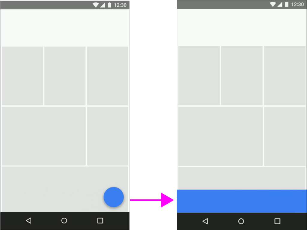
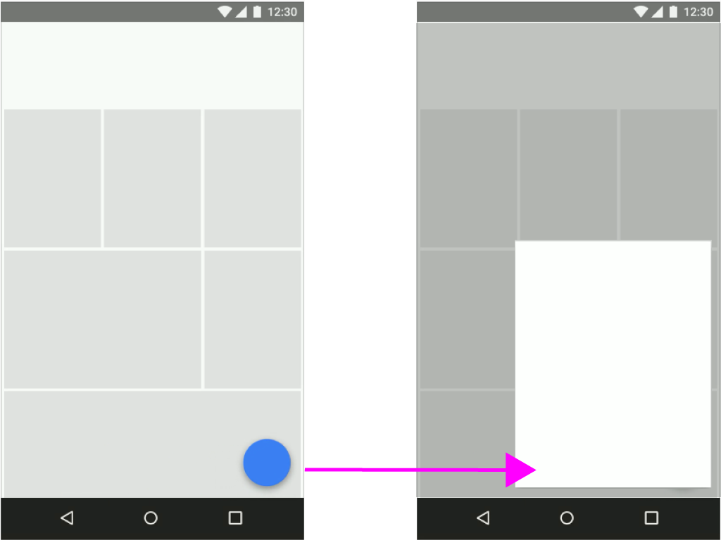
According to the spec a FAB can transform into a toolbar or a single sheet of material which contains all the actions:

enter image description here enter image description here

I like this as for my app the primary action on the page (and therefore what the FAB should be used for) is to filter the cards. Have a look at the spec it has a good video that shows the motion on this - ie FAB becomes sheet of same colour which contains your toolbar (very noice).

Another alternative would be to have it like this, where the FAB expands to an icon avatar for each tag (I like this also): enter image description here

This would only work if you only had 6 tags - as that is the recommended max in the spec. I am not sure how many we are going to have, it might only be 6.

I think I am going to go with the FAB to toolbar option...

2
2

I believe Material Design's backdrop could solve your problem

https://material.io/design/components/backdrop.html

It allows for the back layer to contain multiple filters and controls and the front layer to display the filtered content see the material guideline on the backdrop component linked above.

1

I think some fundamental questions need to be asked:

What happened that caused the outcome to be tabs in need of unique sorting AND filtering?

What are we trying to achieve with this app and its contents?

Is the combination of tabs, filtering AND sorting (on a smartphone screen) compatible with the experience we're attempting to engender?

What other ways can the materials, content, activities and objectives be presented and organised that don't involve the user being burdened with such a complex and busy interactive experience?

Speculation and Commentary for Contextual Problem Analysis:

I suspect you're actually trying to avoid responsibility for making the myriad of decisions required of the many aspects of laying out, designing and incorporating operation of whatever you're tasked with presenting and providing interaction with and upon.

Your decision, to avoid decision making and the actual doing of designing, results in you finding ways of distributing responsibility. Some of which is foisting responsibilities onto the user, Android's guidelines and whatever "best practices" means, today. And the good users of this site.

More specifically, in this endeavour, it seems you've decided filtering and sorting are the means to shirk responsibility of presentation, usage and discoverability, throwing it, instead, onto the user.

Suggestion

Rethink the UI design/structure with a heavier consideration of UX:

Take a step back and look at the content and capacity of touchscreens, and then take some time to feel like a user, and feel for them, too.

This approach, I hope, reveals the problems of conflating sorting and filtering in this manner. Further, I'd hope it reveals the more effective path may well be a rethink of how to achieve the desired functionality, and open a discourse with internal decision makers as to what's acceptable compromises in functionality versus usability, screen space and discoverability, coding and responsiveness.

4
  • You've completely missed my point. That you need to put yourself in the position of the user, and feel and see things from their point of view. Your deflection to one of the lighter jokes in my suggestions avoids the answer, which is that you must consider the users first, foremost and always. And you are avoiding doing that, too. There always a need to consider and work on the what before the how.
    – Confused
    Commented Oct 28, 2016 at 5:06
  • updated answer, hope this helps you see just how much thought and responsibility is involved in actual UX design, and how it harkens back, through and around visual design, layout and mechanics, too.
    – Confused
    Commented Oct 28, 2016 at 5:57
  • While this answer covers the possible XY issue involved with the question, it doesn't actually propose a solution for those who actually need this functionality, in some shape or form. For example, when filtering through lists of thousands of users to find specific ones that you're interested in contacting. People expect to be able to do the searching and filtering required, but usable design patterns are hard to come by. Commented Oct 29, 2016 at 18:01
  • @KevinBrown all of what you say might be pertinent if the discussion weren't about an interface that has multiple tabs with independent filtering AND sorting in both tabs. At the point you reach the decision you need this conflation of presentation complexities, you're due a rethink on the foundational design. At the very least.
    – Confused
    Commented Oct 30, 2016 at 4:41
1

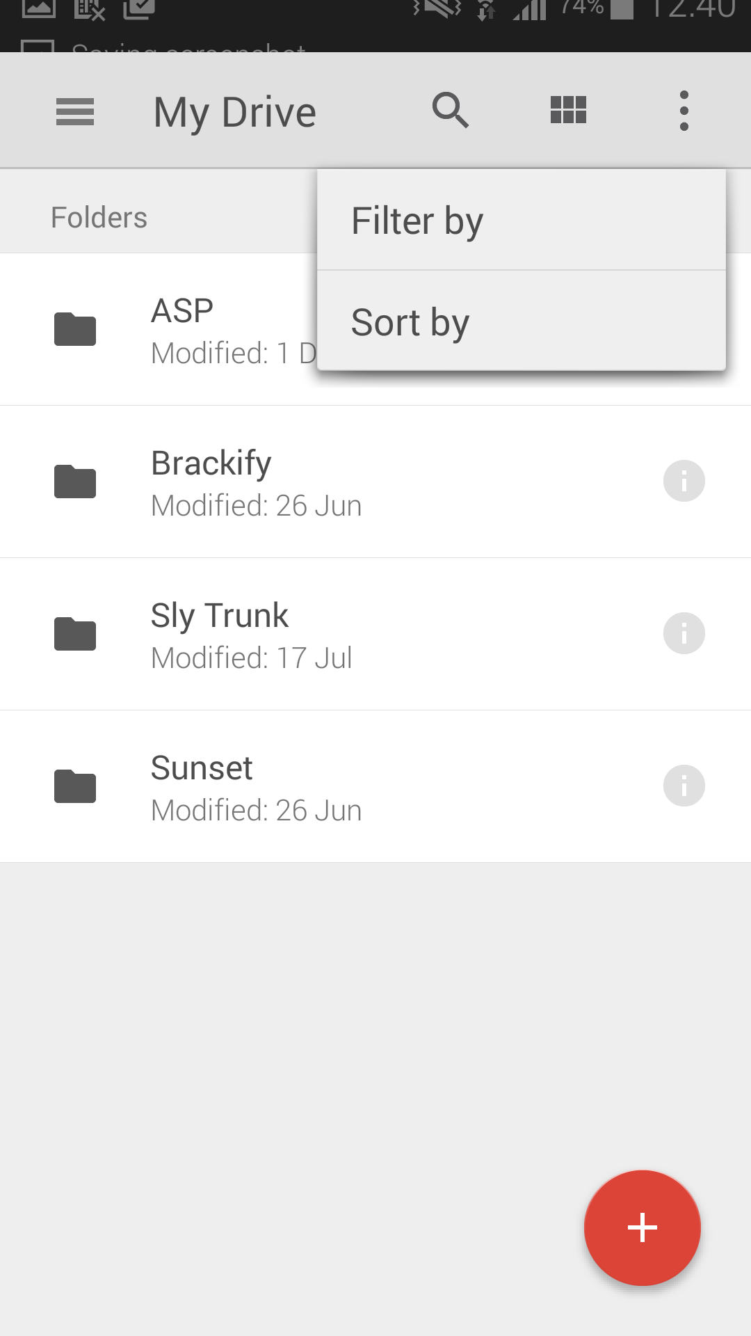
Consider using the overflow menu.

Filtering and sorting using the material design overflow menu

1
  • 2
    You really should add some reasoning why using overflow menu is your solution for this problem. Commented Apr 24, 2018 at 5:13
0

Chips allow users to enter information, make selections, filter content, or trigger actions. Chips should appear dynamically as a group of multiple interactive elements. Unlike buttons, which should be a consistent and familiar call to action, one that a user expects to appear as the same action in the same general area.

Your Answer

By clicking “Post Your Answer”, you agree to our terms of service and acknowledge you have read our privacy policy.

Not the answer you're looking for? Browse other questions tagged or ask your own question.