3

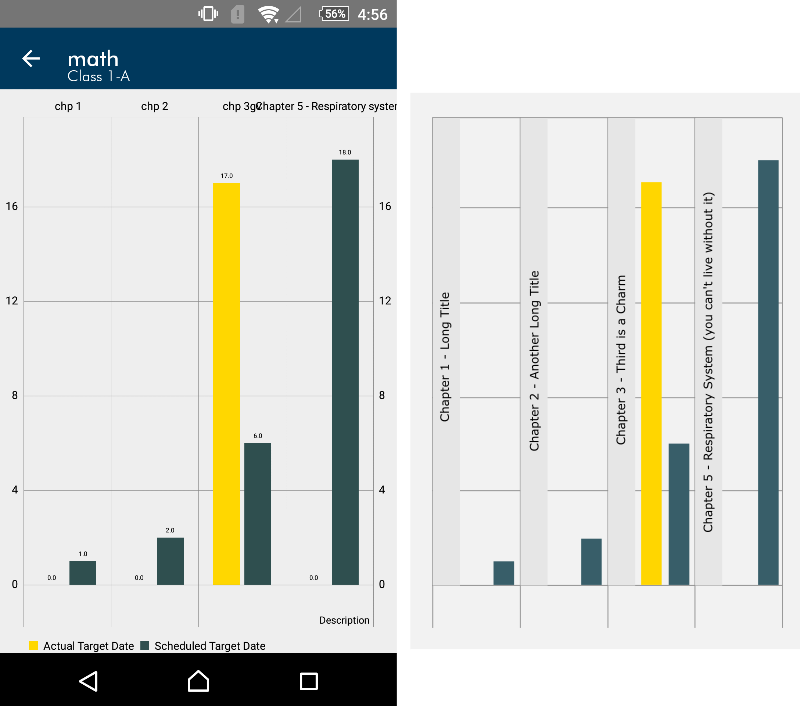
I have been working on a bar graph which needs to be a part of a mobile app. If the titles under the bars get longer, either they start overlapping with the text of neighbouring bars or I have to programmatically break the text into multiple lines, both of which look awkward. There is an option to zoom and stretch the distance between the bars but in that case user doesn't get the view at a suitable scale where he can understand a better picture of the graph as a whole. I have used mpandroidchart plugin (if that counts). In the sample screenshot below, someone added the text "Chapter 5 - Respiratory system" and it just spoilt the view.

Can someone suggest me a better way of achieving this? Do I need to forcefully truncate or limit the user from entering texts larger than a standard maximum? Are there any layout aspects of the graph I should consider?

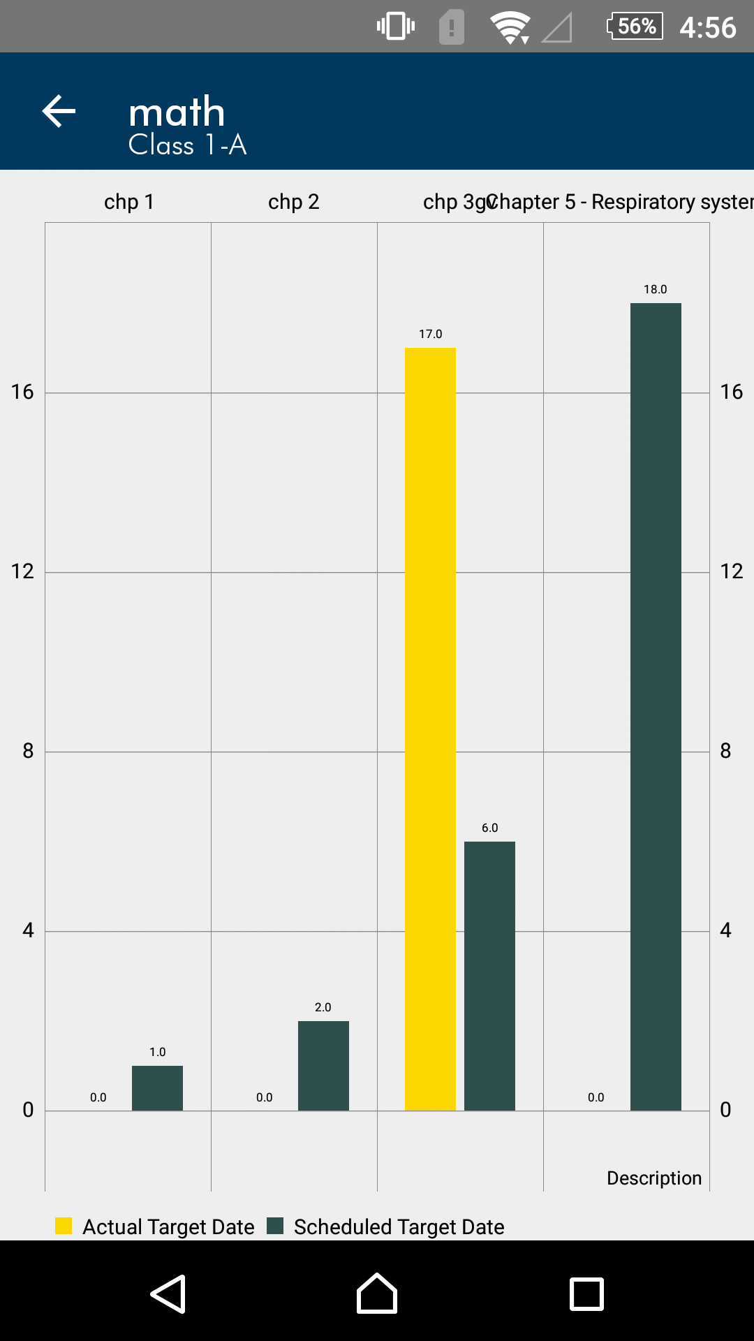
enter image description here

4
  • Regrettably, you're facing a problem similar to the one of putting a liter of water into a half-liter bottle: there's nothing you can do to make it fit. Your best hope is probably to put severely restricted abbreviations for the labels under the bar, and than provide the whole labels as "tooltips".
    – MMacD
    Commented Oct 13, 2016 at 11:57
  • Your "Chapter 5 Respir...." could be "5:RespSys" or even "5:RspSys"
    – MMacD
    Commented Oct 13, 2016 at 12:00
  • This field is totally exposed to end users, the only option that can be figured out is to limit the number of characters they can submit.
    – Zeeshan
    Commented Oct 13, 2016 at 12:17
  • If you're willing to do the extra programming, or can find a lib that already does it (I don't know of one) you could pretty much solve the problem by putting the labels on the bars themselves, rotated 90 degrees. But if you can't do that, then I agree that there's nothing you can do to solve the problem. Specifying a condensed typeface such as Univers 49 or 59 would help, if you can do that, but it won't actually solve the problem.
    – MMacD
    Commented Oct 15, 2016 at 21:32

3 Answers 3

9

A couple of things you might want to be aware of, that if you stick to as a rule of thumb, generally guide mobile information flow in the right direction:

  • Try to keep font sizes around 14pt for legible text, 12 for captions, and no smaller
  • Generally try to keep tappable areas to 44x44 pt as this is roughly the equivalent size of a finger tip pressed on the screen.

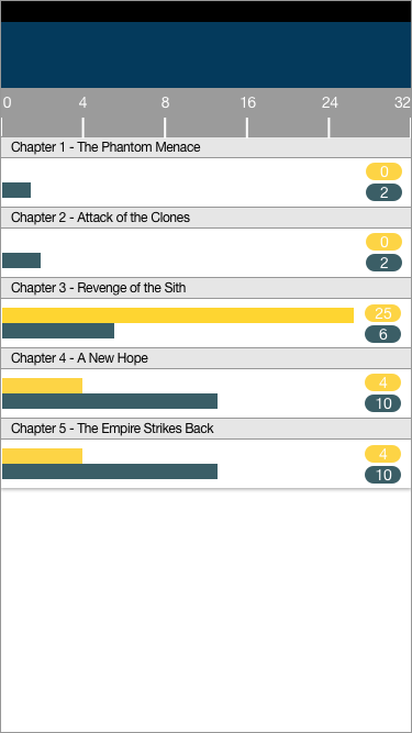
While these do not directly apply to data visualisation, in the example below table rows are kept to a "standard" 44pt height, and text is kept at a generally larger/legible size, and this in turn informs the constraints of the layout:

enter image description here

  • The relationship of the bars is clearly presented, and the layout can grow to accommodate any number of rows, which the user can scroll vertically in a familiar way.
  • Chapter title text is left-aligned.
  • It is simple to navigate to the appropriate "chapter" since they are ordered sequentially (for example, scrolling to chapter 22 would be intuitive)
  • The key information (specific values) are presented in the right-hand column, where they can easily be compared.

I hope that these suggestions start to guide you towards a good solution to your problem.

3

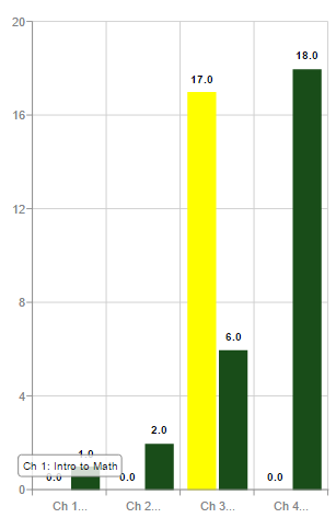
What about scale tooltips? This allows you to display abbreviated scale labels (e.g., Ch 1, Ch 2, Ch 3, etc.), saving valuable mobile screen space. The longer names can appear when the user hovers over or taps a specific scale label (e.g., Ch 1 may elongate to Ch 1: Intro to Math).

Mobile Chart with Scale Tooltips

You can interact with this demo here: https://demos.zingchart.com/view/X6BM6XEI

Furthermore, if you're working with differently sized screens, you can use media rules to change the styling, sizing, and so on of the tooltips, scales, legends, and so on at different breakpoints.

1

If you need to maintain the bar chart for this purpose you might want to consider joining the large elements in the same place. You can't really get away from putting the bars big (and with names of that size I doubt making the labels vertical would solve the problem). So what I suggest is making the chapter name more important and put it on the same level as the bars. For example (and by comparison with your picture):

Barchart and labels

Its a quick montage but a bit of work with the way the label would appear could greatly improve the plot aesthetics (perhaps putting labels over the bars and playing with the letters colors inside and outside of the bar). Try doing a quick search for bar chart infographic in google. It should give plenty of other options although most will only work well for selected data. You'll probably see a lot of people playing with plot perspective but this is usually difficult to do with most chart APIs around.

Hope it helps.

EDIT: Oh, and by the way you can even increase the character limit of this model by using scroll able elements for the chapter labels or ones that automatically slide to show you the full name.

Your Answer

By clicking “Post Your Answer”, you agree to our terms of service and acknowledge you have read our privacy policy.

Not the answer you're looking for? Browse other questions tagged or ask your own question.