2

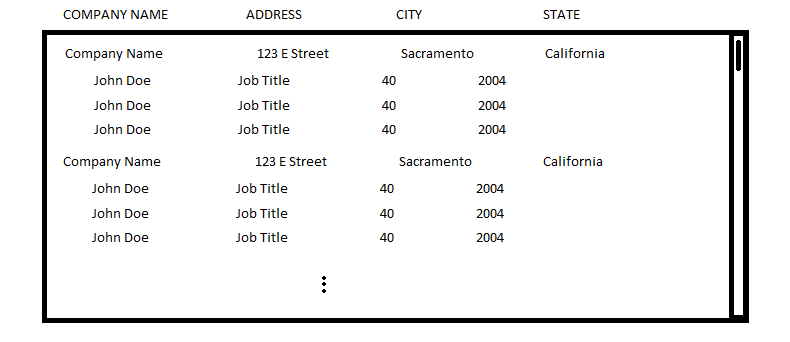
I have a table that looks like this crude paint drawing

Example Table

The table represents employees grouped by the company they belong to. I have a table header for the Company (name, address, city, state, etc.). How do I add a header to the employees to make it more clear what is being displayed? Particularly the non-obvious fields such as 40 and 2004.

I've explored two options I am not thrilled about:

  1. Adding an indented header under the company header. This looks strange and it makes it hard to line up the values with your eyes.
  2. Adding a header on each and every company grouping. This is redundant and looks strange for companies with few employees.

Is there a better way?

2
  • Isn't the most common way to show the normal row headers and no headers for the group? The group name (row) should be self-describing. Checkout samples like examples.sencha.com/extjs/6.2.0-ea/examples/kitchensink/…
    – Timo
    Commented Jul 6, 2016 at 15:15
  • @Timo generally, yes. But the group also has some numbers that need headings to describe what they are, I didn't include that in my drawing...
    – MrZander
    Commented Jul 6, 2016 at 15:43

1 Answer 1

0

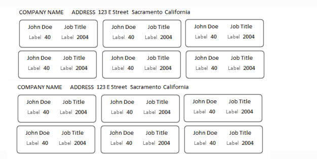
Maybe a tabular data table is not best way to display this information? Perhaps consider using the card UI metaphor where you can dedicate more space to data and their labels:

enter image description here

Note: depending on the data, some information does not need a label because the data describes their purpose.

1
  • This could work. I still feel it is repetitive, but I can't argue it looks bad. Thank you!
    – MrZander
    Commented Jul 6, 2016 at 15:44

Your Answer

By clicking “Post Your Answer”, you agree to our terms of service and acknowledge you have read our privacy policy.

Not the answer you're looking for? Browse other questions tagged or ask your own question.