1

I'm working on a ecommerce website and we redesigned only some of our page at the moment, for example our homepage has a different look from our cart page. How do I tell the user that they are still on the same website but with different page look? I also wanted to make the message short and build confidence when buying.

Im thinking of producing a toast notification below the header middle center with a fade in/out animation. Do you guys think that will be a good approach? thanks!

2
  • As long as color theme and navigation position remain same, user still feel that they are on same website, despite the fact that there is different position or alignment of control for individual pages. Ex - one page has header green and top aligned, after taking action next coming page do show green header on top, else user trust get broken
    – Andy
    Commented May 18, 2016 at 6:28
  • Thanks for the feedback Andy! theme still the same but all elements appear to be more bigger and position has adjusted like buttons and search bar on the header. That's my worries it does break the user trust.
    – Bachim01
    Commented May 18, 2016 at 6:46

3 Answers 3

1

You can put one line below the header in such a way that it will attract the user to read it. The reason is if user read it then they will come to know that the site which they visit regularly is the same.

Another approach is to show small notification window at the bottom right or left which shows message for redesign page which last for few seconds and then disappears!

Below are some messages still I am trying to build more and will add it if I get idea.

  1. So we’ve redesigned it, to make it clean and easier to use.
  2. We’ve updated the layout to make it simpler to find the things you need.

Have a nice day ! Hope this will help you.

2
  • 1
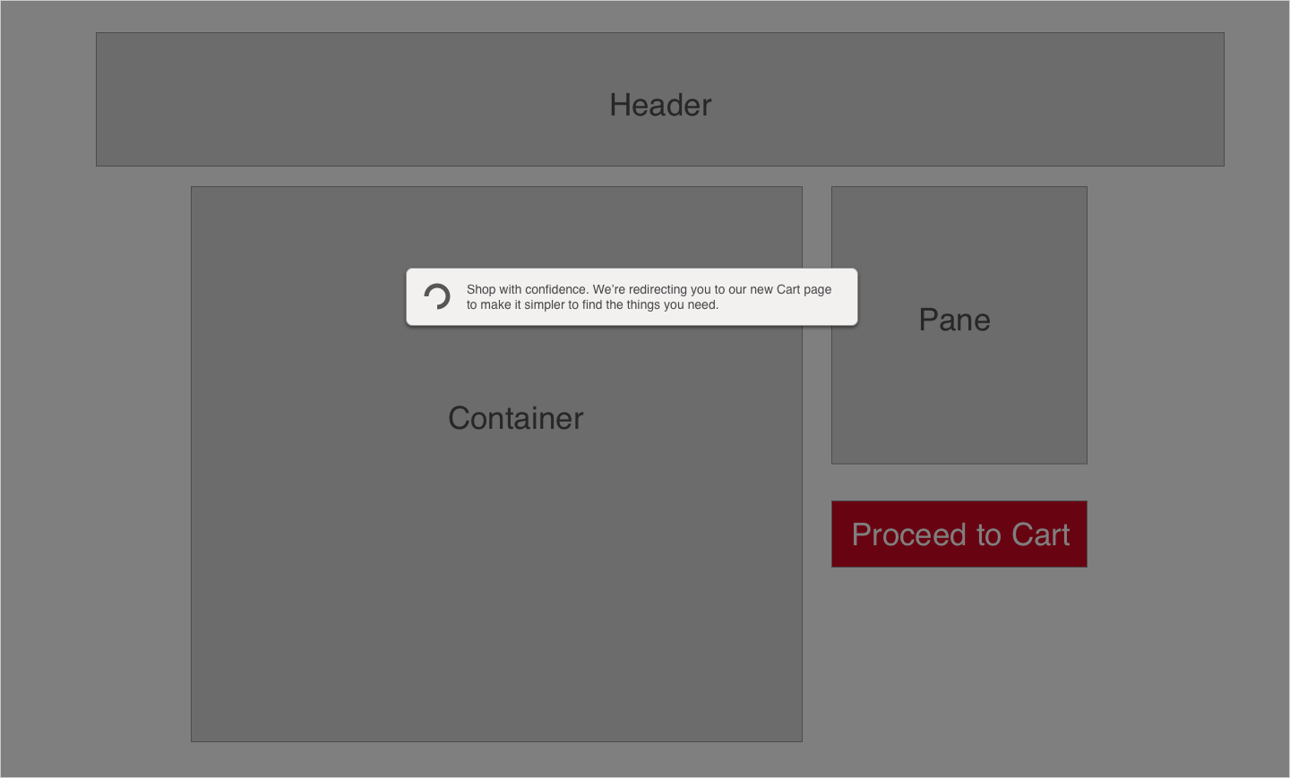
    Thank Jasmin for the suggestion, the bottom corner is great idea with fade animation. I have another solution which is different, when the user click proceed to cart it will show a notification like a pop up with a spinner in the center of the page. "[O] Shop with confidence! We're redirecting you to our new Cart page to make it simpler to find the things you need" - posted image above
    – Bachim01
    Commented May 18, 2016 at 7:07
  • @Bachim01 Yes in the case of particular redesigned page you can use this approach. Commented May 18, 2016 at 7:15
0

enter image description here redirecting - popup like notification with a spinner before proceeding to cart page

0

We often have this on our websites, what we mainly do is make sure the header and footer of all pages are the same design. This is to make sure it looks as if the pages have been redesigned, even though only the top and bottom of the pages have changed.

As long as the color-theme and logo is the same though, users will feel like they are still on in the right place, so I would argue that a message like that isn't needed.

You could show a small popup, something like a cookie popup to tell the user that you've been working on the design to optimize performance and user experience.

2
  • I agree! no need to tell user or have a notification that we are redesigning things thats why its different if logo and skins are there. having popups or notification just complicate things especially in a cart a page which is very critical. that's why a put the notification before landing into the cart page
    – Bachim01
    Commented May 18, 2016 at 7:23
  • @Bachim01 If you feel like to much has changed, you should show a small popup. I wouldn't make an overlay over the page though, as this might feel like you are in the users way of completing what they want to do on the page. I'd suggest doing something like a cookie-bar on either the top or bottom of the page.
    – MJB
    Commented May 18, 2016 at 7:30

Your Answer

By clicking “Post Your Answer”, you agree to our terms of service and acknowledge you have read our privacy policy.

Not the answer you're looking for? Browse other questions tagged or ask your own question.