23

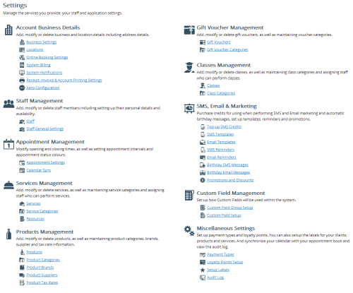
I have a settings page with a fair number of options. See screenshot

Original Settings

Each of the links will take the user directly to a form where they can change the details (ie Business Settings) or a search/list where they can search for and then edit the details (ie Products)

It is a very effective and user friendly layout?

I am considering changing to have each section as an option in a vertical nav on the left and then each link will become a tab on a tabset when the option is clicked on the nav.

7 Answers 7

18

I see two alternative solutions to your question:

1) Keep the the current design.

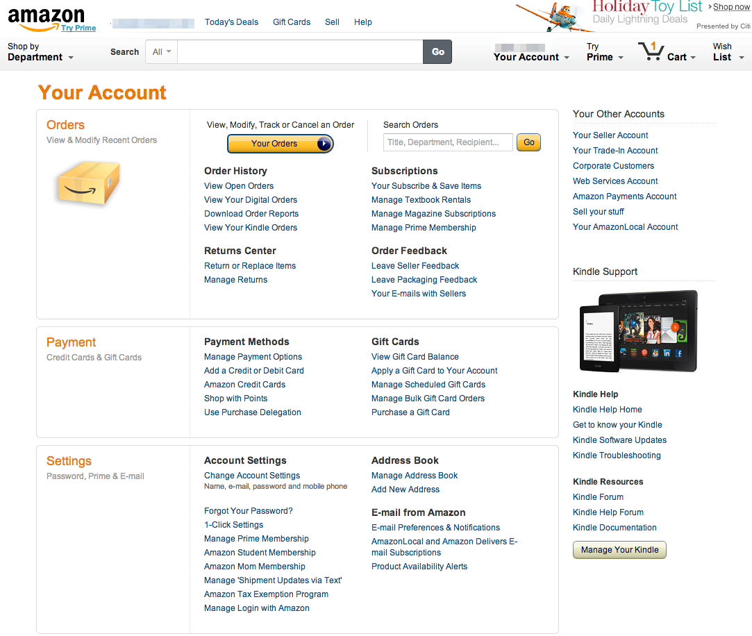
It's good since you expose all settings at once. Since you have so many link groups it could take more time for the user to find out the difference between for examples Services management and Product management. Amazon is currently using this approach and since they're pretty obsessive with usability I would consider this solution a good solution.

Amazon uses a menu page pattern

If you choose this solution I would work more on the visual design. Make it a little bit more structured and compact. The various indents and use of black icons feels messy. Perhaps an Yahoo directory inspired layout could make it more easy to use?

2) Break it up into sub pages

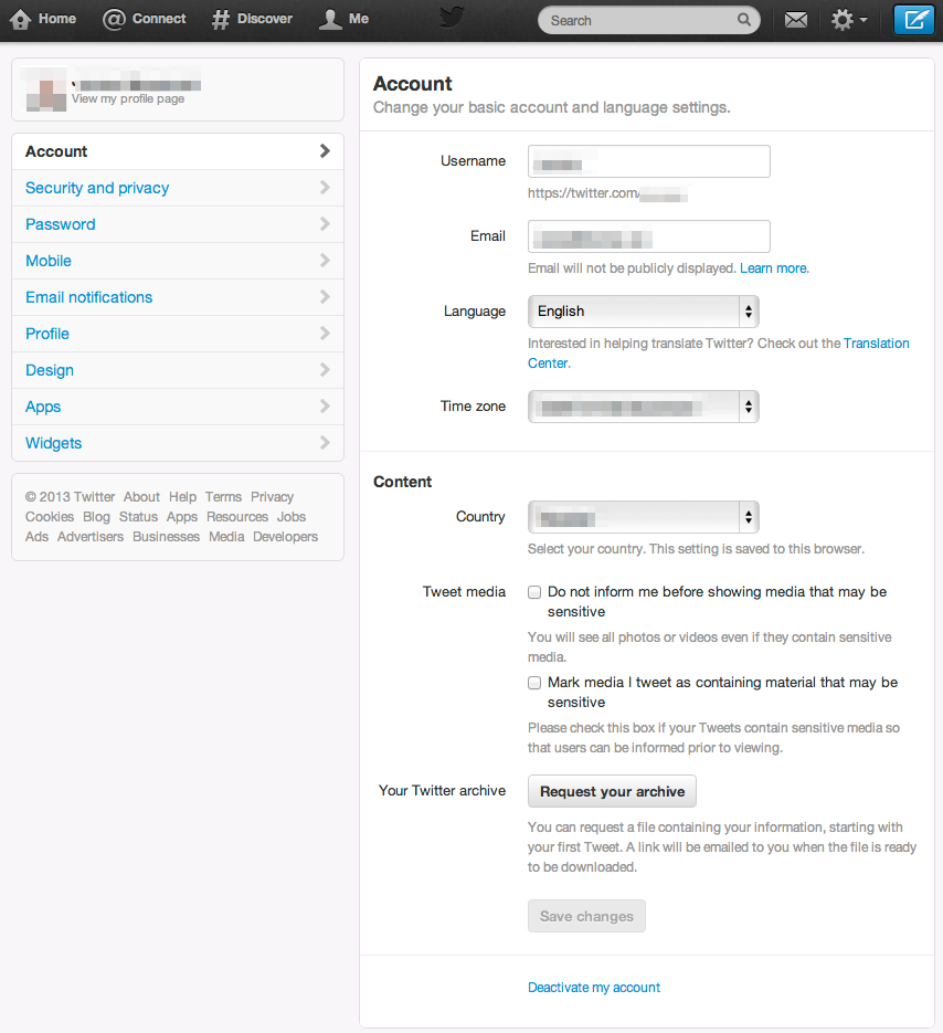
and perhaps merge a couple of groups into broader ones. This is the most popular approach that big sites such as Facebook, Twitter and operating systems such as Windows and MacOs takes. They usually break the Settings sections into the following:

  • Profile (things that are visible for other members),
  • Design (How your page looks like such as background colors, Account details (stuff used by the system such as e-mail, address, phone numbers, country)
  • Site specific settings (this could be for example your Services management)
  • Change password
  • Remove your account

Twitter uses a sub page approach

4
  • 1
    The sub pages idea is good, I will think about it more.
    – Craig
    Commented Nov 19, 2013 at 22:46
  • 1
    The Amazon page looks pretty nice I think.
    – Craig
    Commented Nov 20, 2013 at 9:11
  • Yes, it does I think and not very far from what you've designed. Commented Nov 20, 2013 at 13:31
  • This is perfect. If you are curious to know more about the UX of the settings page, I just read one article yesterday. Check this link. zazzy.studio/jots/settings-pages-ux-importance Commented Jul 6 at 10:18
8

I think the design in the screenshot is next to ideal. Much of the evaluation of this relates to the pros/cons of the mega-menu pattern. Allow me to elaborate:

The Mega Design

The good:

  • All options are visible to the user. This promotes:

    • Findibility - it is easier for users to find the relevant option.
    • Learnability - users can learn quicker the available options.
    • Serendipity - users may find an option of interest by chance.
  • Although there are a multitude of options, they are nicely clustered and the design is inviting.

The bad:

  • The multitude of options increase visual and cognitive load.

Things to consider:

  • Are the subheadings required? Aren't the explanations implied by the content? Do you really need to tell people what can they do on a settings page? Ideally the captions are self-explanatory so the subheadings can be removed. This will reduce visual load. If they are to remain, I would reduce their contrast (use light grey colour).
  • Usage of icons. The icons increase visual load. Most users will read the headings rather then try to make sense of the icons. Only experienced users may be able to locate the relevant item using icons. While contributing little to usability, they may increase aesthetics. Perhaps consider reducing contrast here as well.
  • Underlines underlines are soooo 70s. Consider reducing visual noise by removing these. Many systems nowadays use colours to signify a clickable item.

The Nav Proposal

The benefit of the Nav proposal is that it reduces visual load, but at the same time it also reduces visibility. When subitems are not immediately visible, users sometimes (wrongly) guess where a subitem is. The learnability and serendipity are reduced as well.

Another pitfall of the Nav proposal is that it increases interaction load - on a desktop user are 2-clicks away from their sought option. With the mega design - only 1.

You may want to conduct a quick research on pagination - there is a growing indication that users are capable of handling large data sets (then previously considered usable) and that pagination reduces usability. While mainly applicable for search results, I think it can be used to support the said above.

6

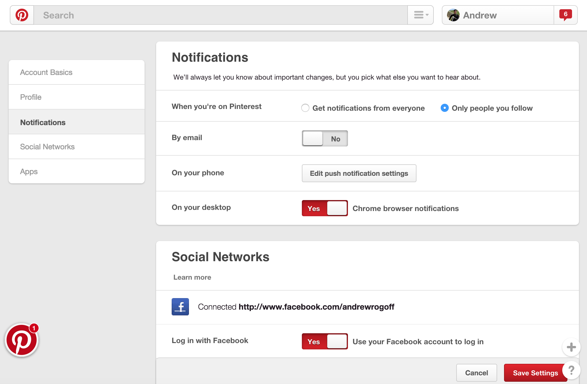
There are some really good answers here. I tend to prefer the "mega design" for the reasons outlined above. Pinterest has a really good hybrid between "mega" and "sub-page" designs. As you scroll it moves between sub-pages. This has the advantage of confining the visual load to the sub-pages but also helps users easily find all the available options.enter image description here

4

It's not "friendly" in the way that the design brings me coffee in the morning, no. But it is useful, since it's a "give me all my options"-page. Now this may break general convention on giving users only the options we know they will use the most. But, this is a settings page, and as such you can have a more cluttered UI, since it's faster to use once you learn it.

Yes, the learning curve is steeper, but you have an all in one page which is nicely grouped into understandable chunks of information.

3
  • Thanks. Learning curve is an issue as the system needs to be as easy as possible without training.
    – Craig
    Commented Nov 19, 2013 at 22:35
  • @craig To minimize the learning effort, training is the best effort. Investing in two 4-hour sessions will make a huge difference. Users will know what to expect, and get a feeling on using the system. All downhill after training :-) Commented Nov 19, 2013 at 22:40
  • How would the proposed design in the screenshot have a steeper learning curve that the low-visibility nav/tabs proposal?
    – Izhaki
    Commented Nov 19, 2013 at 22:58
2

I think your page is fine because:

  1. it's clear to me what my options are
  2. captions under the title tells me what I'm able to do
  3. icons, from what I can see, look appropriate.

Alternative suggestions if you feel like it's too cluttered is the regular title and caption itself, and the user can click on it to expand the options.

I think the page looks fine, but perhaps the one thing I would do is to try to "group" your options into a square grid layout like this: Link (Don't forget to pad between each box as well)

That way, the text from your captions will wrap around instead of expanding to twice the length of your options, and the page itself will look much cleaner. Hope this helps some!

1

It is not necessarily an ineffective layout as is. To help understand if it is effective to your users, you can run it through a series of user tests. For example -- a Card Sort, if you wanted to see what they thought category names should be, or a Reverse Card Sort if you wanted to verify your existing structure.

If you break it up into a vertical navigation on the left you can provide a smaller amount of options for the user to digest per screen, but they have to find the right category first! A user may visit 2-3 different categories before they find the right one. That's just frustrating. (I do this all the time, every time, in Windows Control Panel)

How the information is presented in those categories is also important. If you were to present each of the sub-categories in the tab, the user may again have to hunt-and-peck to find the right one. You should avoid "tabs within tabs" -- a vertical nav just being a different type of tab.

In a "tabbed" layout (versus your existing "flat" layout) you are also increasing the number of actions required to reach the appropriate setting. While increasing the number of actions is not necessarily bad it isn't outright good in the name of organization.

As it is, a user is presented with a lot of information but it can be parsed easily (at least as I interpret it from the image). The information is visually chunked well (see Card Sorting to answer "mentally organized well") and after a few uses a user is likely to be familiar enough (if not immediately) to find what they are looking for quickly.

Short answer: I would suggest the existing "flat" design.
0

I think I'm very late on this, and this might not be the problem anymore, but still, I feel this will not fly with modern consumer expectations.

Pros:

  • You have clear categories.
  • Everything is on the front, so it's perfect for users.

Cons:

  • There's too much cognitive load for the users. You should figure out how to group the settings for better discoverability. Notion does this part very well.

For more details, please check this link (I learned from here) explaining the fundamental UX of settings page design. https://www.zazzy.studio/jots/settings-pages-ux-importance

Your Answer

By clicking “Post Your Answer”, you agree to our terms of service and acknowledge you have read our privacy policy.

Not the answer you're looking for? Browse other questions tagged or ask your own question.