3

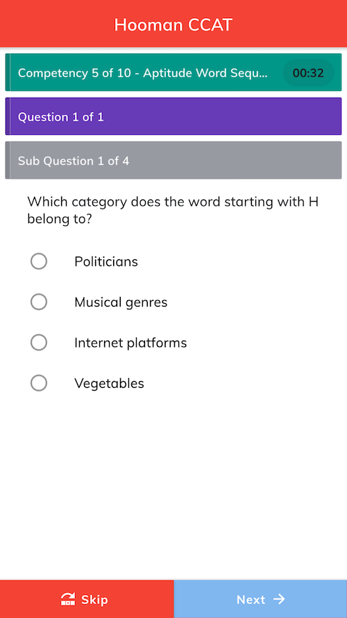
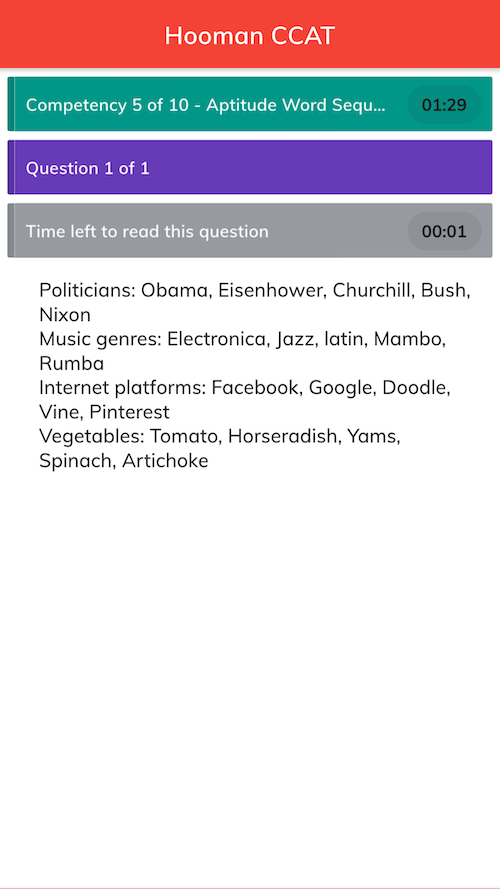
We have designed an assessment test mobile application. Where we need to show 3 levels of information after the header bar. Here are the screenshots:

As shown in the above screenshots, we are showing 3 types of information bars (competency, question & sub-question/instruction).

For better user experience, what kind of colours I should use? I tried creating different Material pallets but not sure if they are eye-catchy or pleasant to view.

This is important because there are about 100 questions in one assessment test.

Tried different combinations from http://colormind.io/ and manually as well. But couldn't get good feedback.

Edit 1 (30th Mar 2020)

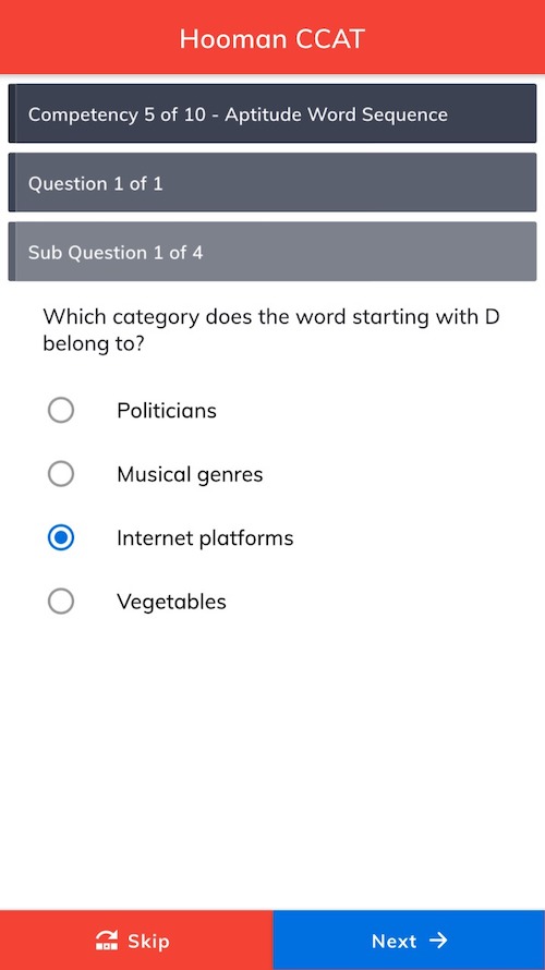
As per the comment from Stacy, adding the screenshots with the modified bars:

1 Answer 1

2

You have a very colorful product! You're probably feeling like the colors are competing with each other a bit, though.

There are a few rules with color in UI design that are relevant to your project:

  • Red banners and buttons are usually reserved for when something "destructive" is going to happen, like deleting.
  • Solid-colored rectangles are used to convey informational messages in many UI systems rather than being used as page "furniture". Green rectangles in particular tell the user that something was completed successfully.
  • Lots of brightly-colored boxes tell the user, "This is important! And so is this! And this too!" The user ends up having to pay equal attention to all the elements, whereas some are more important than others.

My suggestion would be to take most of these elements out of their color blocks and use headings, underlines and other ways to break up the page functions. Examples of timed quiz designs are everywhere -- find some examples that you like, look at how they're architecting their UIs, and start with wireframing based on what you learn.

Use color sparingly and color blocks only on elements that need the user's attention, such as primary buttons and alert messages.

5
  • Thank you, Stacy. I have been looking into various quiz based applications but didn't find anything solid that matches my requirement or implementing something similar. But I have removed colours from those 3 informative (yet important) bars and added 3 levels of greyish colours. Commented Mar 28, 2020 at 7:41
  • 1
    That sounds like a good start. Feel free to post your updated versions if you'd like some more help prioritizing the information.
    – Izquierdo
    Commented Mar 28, 2020 at 16:33
  • Hi @Stacy-h, I have updated the updated version. Please have a look. Commented Mar 30, 2020 at 6:45
  • 1
    That's already starting to look much cleaner! What if: 1) Question 1 of 1 was a large font instead of in a block; 2) Subquestion 1 of 4 was in a subheader font; and 3) the Skip button was very subordinated (you probably don't want a lot of skipping, correct?)
    – Izquierdo
    Commented Mar 30, 2020 at 17:44
  • 1
    Thank you for the constant reply, Stacy. I'll try to change what you mentioned in point 1 & 2. Regarding, point 3, yes you are right, we don't want a lot of skipping. Commented Apr 1, 2020 at 7:25

Your Answer

By clicking “Post Your Answer”, you agree to our terms of service and acknowledge you have read our privacy policy.

Not the answer you're looking for? Browse other questions tagged or ask your own question.