4

Context

We have this situation where we need to display additional information about products that users has selected.

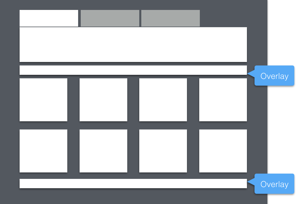
The page in question is the page that houses the products, each product is displayed in a tile with some basic information. we need to display information about a spending fund and information about calculation made to get a final price based on the products the user has sign-up for.

enter image description here

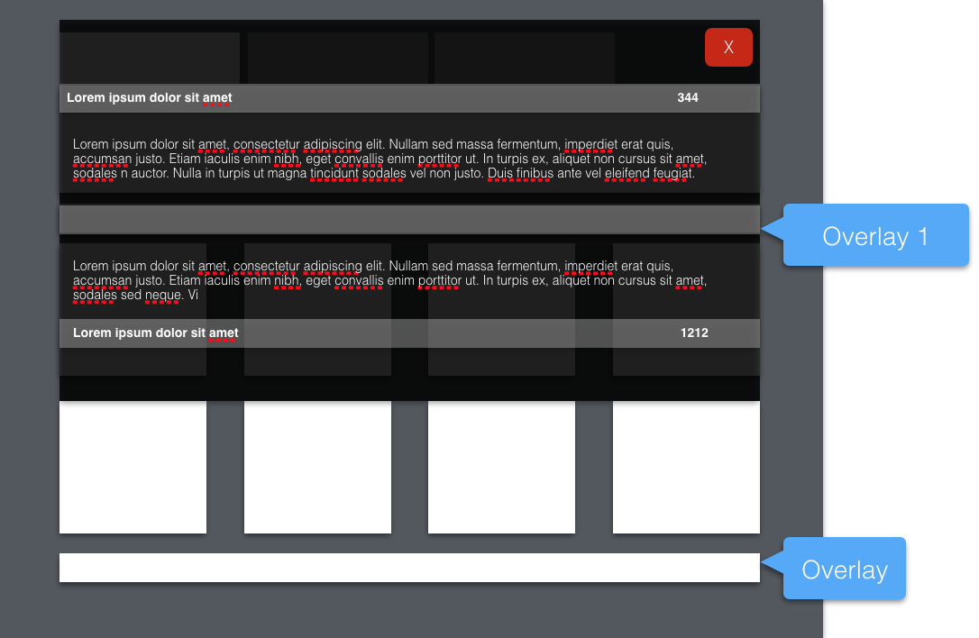
Overlay size & Content

enter image description here


Solution

The proposed solution suggests we use an overlay accessed from a link just above the tiles to show spending fund info & another overlay accessed from a link below the tiles to show how calculations have been made.


Questions

  • I feel that the use of overlays is hiding a structural problem, do we need a dedicated page to show these financial details?
  • Is there a way to incorporate these details within the page itself and how could that be done given the use of tiles?
  • I think that the use of overlays is quite distracting particularly if the overlay has to display large amount of content. Is there any research or findings around the use of overlays or popovers?
  • I have tried to find clear definitions & distinctions between different types of UI Components overlaid on top of content, but it seems there isn't really any definite and evidenced answers regarding this. There are perhaps some issues with synonyms or lack of clear terminology to describe these components. Anyone aware of comprehensive reference or framework to use?
9
  • do you mean tooltips? Are they always there or do users have to hover? If so users can't hover on mobile so that's something to consider as well. It's quite tough to answer this question without seeing the design. In terms of UI components that overlay content you would have modals/pop-ups, full screen overlays, tooltips, toasts and notification banners as options
    – Chris
    Commented May 13, 2016 at 11:40
  • @Chris its more like full page of content when users click above or below the tiles.
    – Okavango
    Commented May 13, 2016 at 11:47
  • sounds like you should have some dedicated widget or summary box on the page? how much content is in there? can you show a wireframe with some content please? it's difficult to get the full picture
    – Chris
    Commented May 13, 2016 at 11:55
  • @Chris just added a rough mockup.
    – Okavango
    Commented May 13, 2016 at 12:07
  • 1
    perhaps worth making the cart much bigger and including the extra information in there?
    – Chris
    Commented May 13, 2016 at 14:07

2 Answers 2

0

Have you thought about making the section title collapsible? That could solve the problem with the section details. You'll just need some indication that there is more information to be seen.

For the calculator, I'd add a "footer" for every section with the total price for that section a link to expand that footer into a small section showing how the price was calculated (if that's your goal).

It's hard to suggest something specific without understanding the content. Designing for the content is key.

1
0

Overlays are only cool when the information being displayed is not very much. To avoid distraction from the main view itself.

Since you have a lot to show and its particular to products that have been selected or added to cart, the best place for this type of information is the product page; a section solely dedicated for the information that was meant to be on the overlay.

However, make sure to use the correct microcopy on each product in the products page stating it clear that more info about the "calculations".

Your Answer

By clicking “Post Your Answer”, you agree to our terms of service and acknowledge you have read our privacy policy.

Not the answer you're looking for? Browse other questions tagged or ask your own question.