4

If you Google for microwave keypad you can see that there is no standard user interface for them. Most of the time, you have to press the buttons in a specific order, otherwise nothing happens.

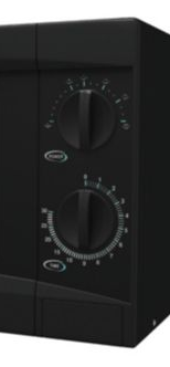
However, the microwave dial is much easier to use:

microwave dial

I assume that the purpose of the keypad and associated buttons is to try to guide you towards cooking specific foods for the correct amount of time (but the food packaging is the best guide to how long to cook it for anyway).

Can anyone think of any valid UX or functional reason why microwave manufacturers would move away from such a simple and effective UI?

(related question, but not the same: Why do Microwave oven UIs fail?)

6
  • Actually that related question almost answers my question... the consensus was basically "Marketing made me do it" - but that isn't a valid UX reason :) Commented Feb 26, 2016 at 16:56
  • 4
    Actually, "Marketing made me do it" is a very valid UX reason. UX is not an isolated element of the larger process; nor is it performed by a single or small number of individuals within that process. UX is an element within each stage of the process, of which Marketing is a part. Requirements come from multiple different stakeholders, which need to be accounted for. Commented Feb 26, 2016 at 17:06
  • 1
    The same applies to washing machines: 50 options and most people only use 5 of them.
    – PhillipW
    Commented Feb 26, 2016 at 17:20
  • Perhaps the mechanisms for the "touch" buttons are cheaper to source or assemble, especially if similar parts are used in multiple appliances.
    – Nate Green
    Commented Feb 26, 2016 at 18:22
  • Of course I think that Marketing are stakeholders and should have an input as it is their job to know what the market wants - that doesn't mean they should be the main drivers of the decision on what features to include Commented Feb 28, 2016 at 21:33

3 Answers 3

4

"Marketing made me do it" is so unsatisfying in many respects as an answer, though I fear I have mostly anecdote/speculation to add to the question.

Personally, the key addition that digital displays/interfaces add over mechanical dials is precision. While the difference between 2m30s and 2m40s isn't much for a ready meal, if you are looking to soften butter the difference between 3s and 13s is HUGE and will leave a molten mess to clear up!

In addition to the standard imprecision when looking to select a specific point on an incremented scale (on the line vs between the lines vs somewhere around it..), anecdotally the older microwaves I've used have an issue with them not actually stopping at "zero". Following years of manually forcing the dial back to zero, springs/dials/internals have stretched and/or moved out of place leading to the what's on the dial not actually matching what it in supposed to represent.

Once digital microwaves with a keypad to select the time became possible, years of development has led to the introduction of pre-set options for various foods. This seems, in my opinion, to have driven the development of significantly hamstrung UIs.

To summarise the above, I am convinced that analogue/mechanical interfaces are no longer ideal and cannot cope with the additional features built into newer models. Unfortunately, they no longer " do a few things well" and instead have veered into "doing lots of things to a mediocre standard".

2
  • accepted as the answer because you're right about the difference between 3 seconds and 13 seconds when trying to melt butter Commented Feb 28, 2016 at 21:28
  • 1
    My lovely daughter softened a couple tablespoons of butter in the microwave for 5 MINUTES instead of 5 seconds. Strangely, it didn't even raise a red flag for her that most of the butter mysteriously vanished; she just continued on to make strangely crumbly cookies. Commented Feb 29, 2016 at 18:06
5

Shall we make that the answer then "Marketing Made Me Do It"

Or to put it a slightly longer way there is a school of thought that the perceived value of a product is higher if it has more 'features'.

Don Norman discusses this in The Design of Everyday Things

I start with the impact of competitive forces that drive the introduction of extra features, often to excess: the cause of the disease dubbed “featuritis,” whose major symptom is “creeping featurism.” p258

1
  • Thing is, feature-creep can actually reduce the usability of a product. Think about the Swiss Army knife - more features means it becomes more unwieldy and the additional features obscure the essential features. books.google.co.uk/… Commented Feb 29, 2016 at 14:20
1

You could make a microwave that has both dial+LCD, like an altitude control on an airplane?

The knob doesn't have be big. It just needs satisfactory 'clicks' as you turn, with each click representing 5 seconds. When finished, push the knob to start.

(Resetting the clock would be so much easier too if the small knob worked in conjunction with the LCD screen.)

Want more granular settings, or much longer settings? A keypad is still useful. Just like there are some keypads in an airplane cockpit.

enter image description here

2
  • This is a UI that I would personally find very useful and I very nearly up voted, when I realised that it doesn't answer the question to turn it from an extended comment into an answer. Perhaps you could offer an edit?
    – kwah
    Commented Feb 27, 2016 at 12:10
  • I really like this suggestion for an improved UI but it didn't answer my question. Though something like this approach also occurred to me. I wish microwave UI designers would look on Stack Exchange for ideas Commented Feb 28, 2016 at 21:30

Not the answer you're looking for? Browse other questions tagged or ask your own question.