0

The "Grid VS List" question has been posted before. The answer seems to be: it depends on the contents you are displaying: grid for products in which the image counts a lot (shoes, dresses, etc.), list for products in which informations counts more than image (computers, hi-fi, etc.). Ok it sounds good to me.

Now, I am working on a site with a huge database of musical instruments. Interviews with users showed that they want to acquire informations about instruments, but I don't like very much the idea of a infinite list of products. Do you have any idea or examples of a mixed style of a grid/list products page?

1
  • can't you just let users drill down into a menu of instrument like you would in the filters on amazon? i.e. All Instruments > Stringed > Guitars > Acoustic > Classical. And from there show the details next to different models or types. Instruments are so broad and varied that you should probably let people navigate to something more specific before you start worrying to much about the visualisation. After that you can test tiles or lists though I suspect lists with a thumbnail icon might prove more popular if people are predominantly going to want details over images (like amazons list view)
    – Chris
    Commented Feb 12, 2016 at 12:21

3 Answers 3

1

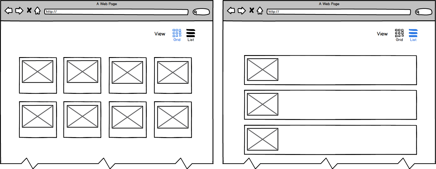
I suggest instead of choosing which one suits best: grid or list, why not provide the functionality to toggle between the two to fit the preference of the user. The List view though provides the user with more information about the instrument so that would be the default view. (Which is also backed by your user interview)

enter image description here

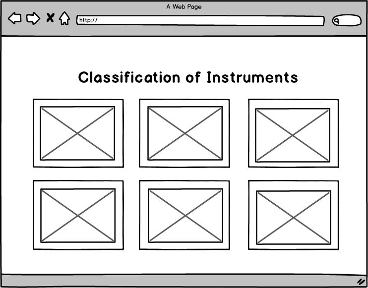
However, there are some styles you may consider to enhance the usability of the musical instrument site you're working on by breaking it down into classification of instruments before you present them with the results.

enter image description here

This way, instead of having an infinite scroll of all products, users can just select which specific type of instruments they want to view.

You may also provide a good navigational menu for your users to easily explore the page. One good example is a horizontal slide out menu.

1
  • Thank you. I omitted this, but yes, instruments are first divided in categories and after that, user can navigate through subcategories with tabs. So, the user is already in the subcategory of choice. The idea of a switch between grid and list seems to be a good idea! Commented Feb 12, 2016 at 13:53
1

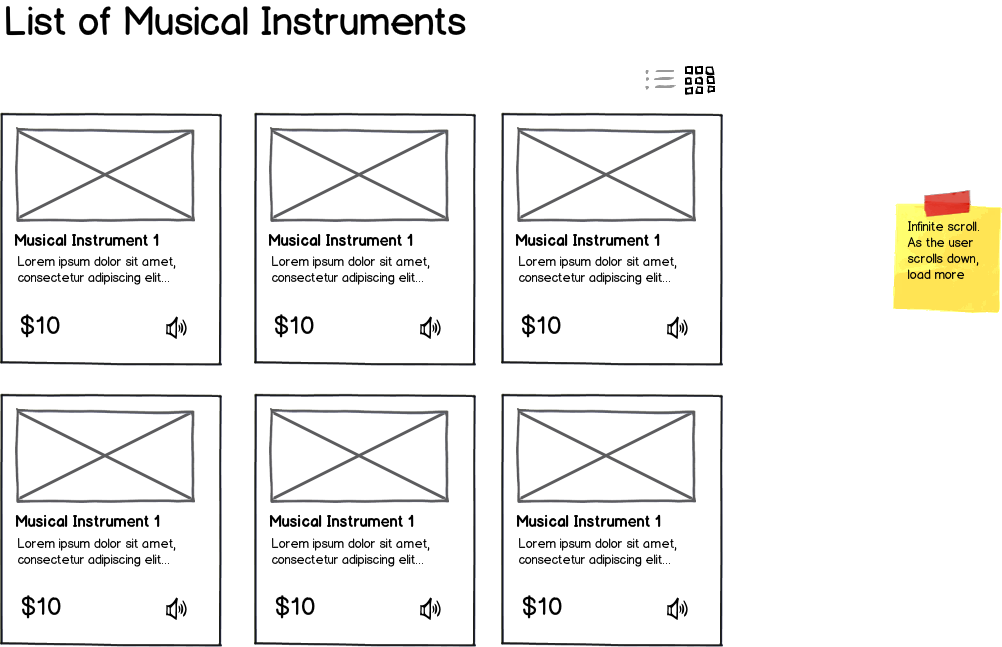
It is good to have a toggle between the thumbnail and list view. Using the card paradigm, to indicate each card as unit of info in with a thumbnail and additionally, allow users to listen to the musical instrument that they are seeing.

A better experience can be delivered by as I see an opportunity here.

The Card based thumbnail

mockup

download bmml source – Wireframes created with Balsamiq Mockups

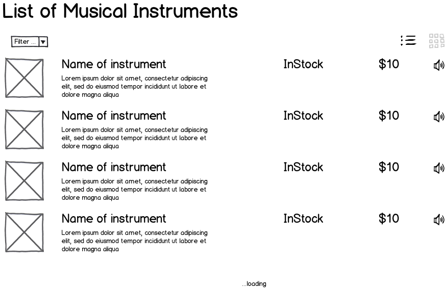
And the list view can actually just reduce the size of the thumbnail. As shown below.

mockup

download bmml source

0

The answer couldn't be easier, as with most such lists just allow the choice between the two views with a grid/list toggle.

Your Answer

By clicking “Post Your Answer”, you agree to our terms of service and acknowledge you have read our privacy policy.

Not the answer you're looking for? Browse other questions tagged or ask your own question.