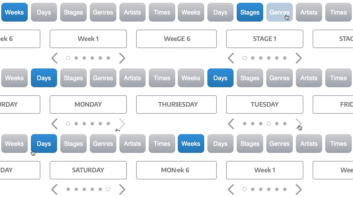
I'm trying to figure out a good way to create a 6 level selector + filter on an app that shows me a schedule for a festival with artist slots and allows me to book artists to form my own schedule (or if it's used for a conference sessions/presentations for example)
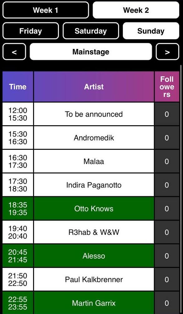
This is how my app looks currently. Me and 1,000 other people that used it seemed to love it and find it easy to understand

The way I think about the hierarchy of data I want to select/filter on is:
Weeks (3 items): [All weeks] [Week 1] [Week 2]
Days (4 items): [All days] [Friday] [Saturday] [Sunday]
Stages (15 items): [All stages] [Mainstage] [Freedom] [...] [...]
Genres (40-50 items): [All genres] [House] [Trance] [Drum'n'bass] [...] [...]
Artists (200 items): [All artists] [Armin van Buuren] [Martin Garrix] [...] [...]
Times: (10 items): [All times] [14:00] [15:00] [16:00] [...] [...]
I don't want to clutter UI too much and show all 6 right away, so I was thinking of just showing first 3 as I already did with Weeks + Days + Stages, and maybe have a button at the top with the filter button that would expand it and add Genres, Artists, and Times. I'm also heavily aiming at mobile users, as I want it to be very mobile first, as people will use this during the festival and don't want it to be confusing or cluttered. For stages you either tap the arrows left and right or tap on the stage, that opens a simple modal with just a list of stages in rows that you can tap on and it selects it, since it's 15 items, I wanted to make it simple to select it in 2 taps and still see the whole list
Few ideas I had was to make everything into a dropdown and show the extra 3 dropdowns later on, but then it might be more cumbersome to have maybe checkboxes next to Stages in case I wanna select Mainstage and Freedom stage let's say. The other option I'm thinking is having some kind of a open dialog box, where the top could be a search input that filters down the list below, and have it like that for all the things that have more than 5 days to make it simpler for the user
Maybe the best would be to have both? So for example have "filter off" and "filter on" mode, which would be toggled by a button above, and the behavior would be:
Filter off - show only weeks + days + stages in the exact same way as we have today and without "All weeks", "All days" "All stages" option. This worked already well
Filter on - transform Weeks + Days + Stages into dropdowns, where you can select multiple options you want and add Genres + Artists + Times below it as 3 extra dropdowns
This feels a bit inconsistent for me tho, since in "Filter off" mode I will only show slots for Week 1 > Saturday > Mainstage for example, where as for "Filter on" I will show all the slots from all weeks, days, and stages, but maybe that's okay?
Please help me understand how to do this better and clearer for the user, so they can easily see their options and tap on it, and not do too much friction with tapping 4-5 times or something

