173

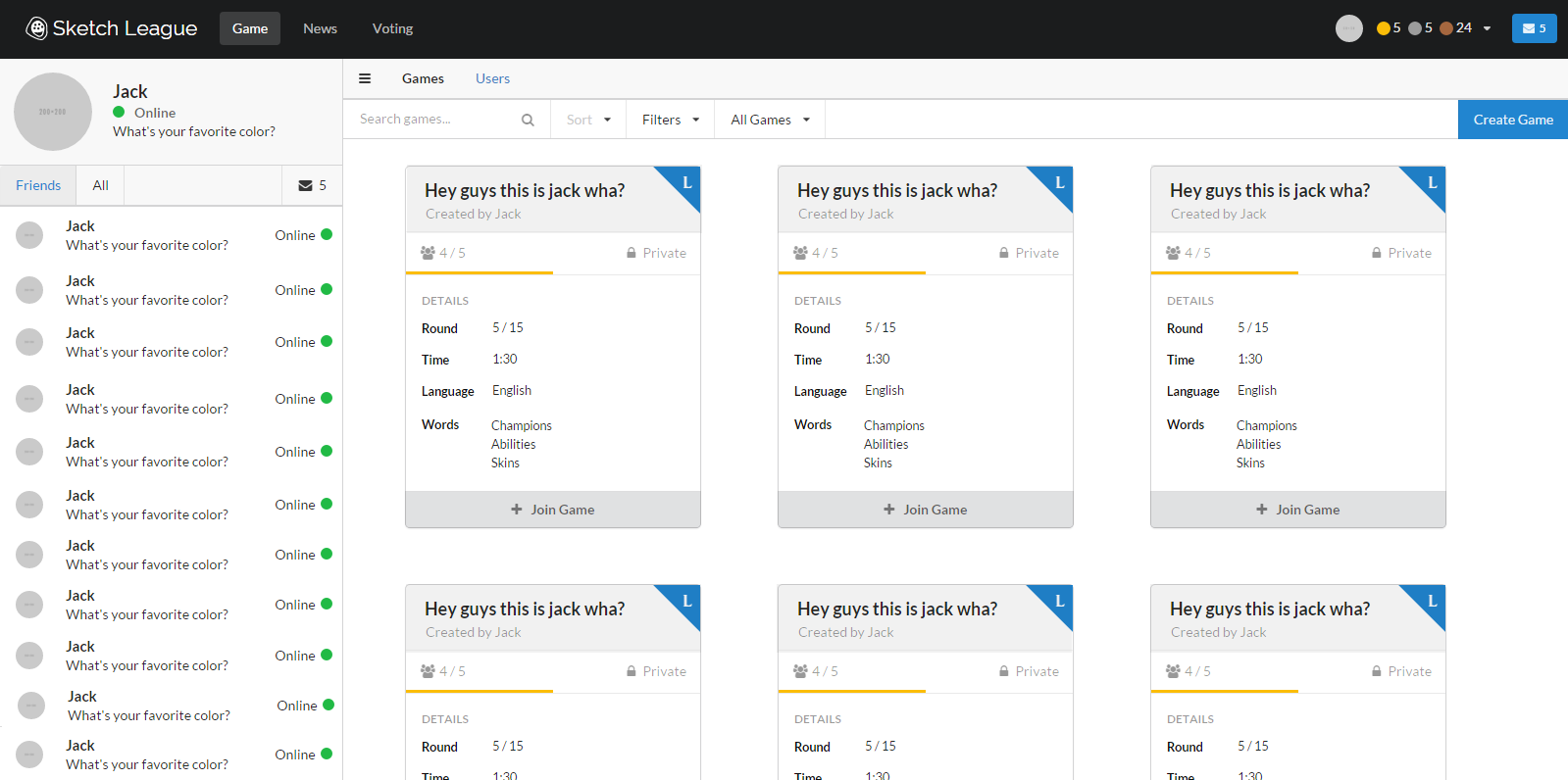
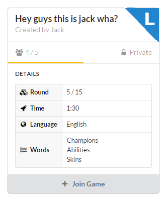
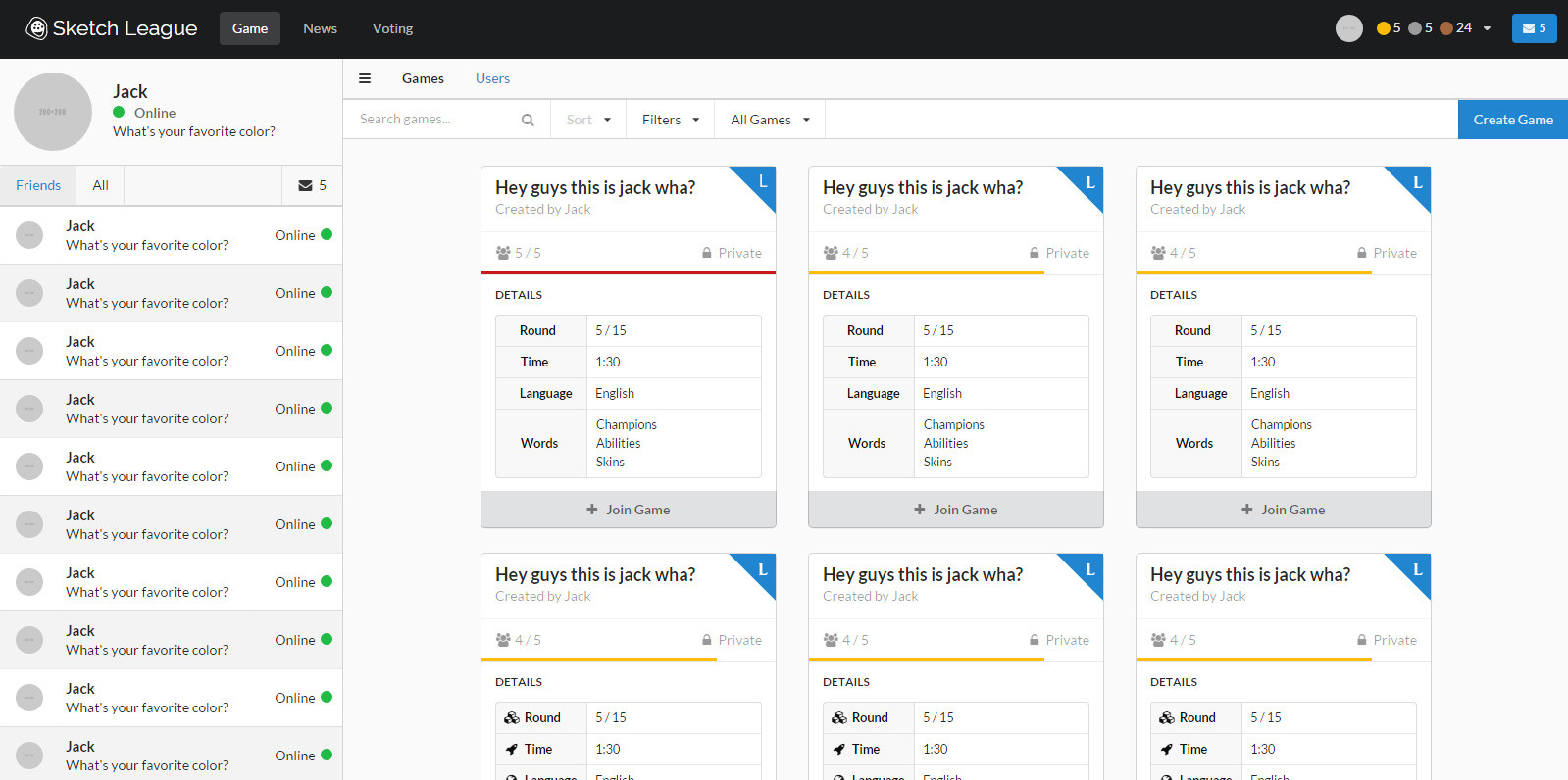
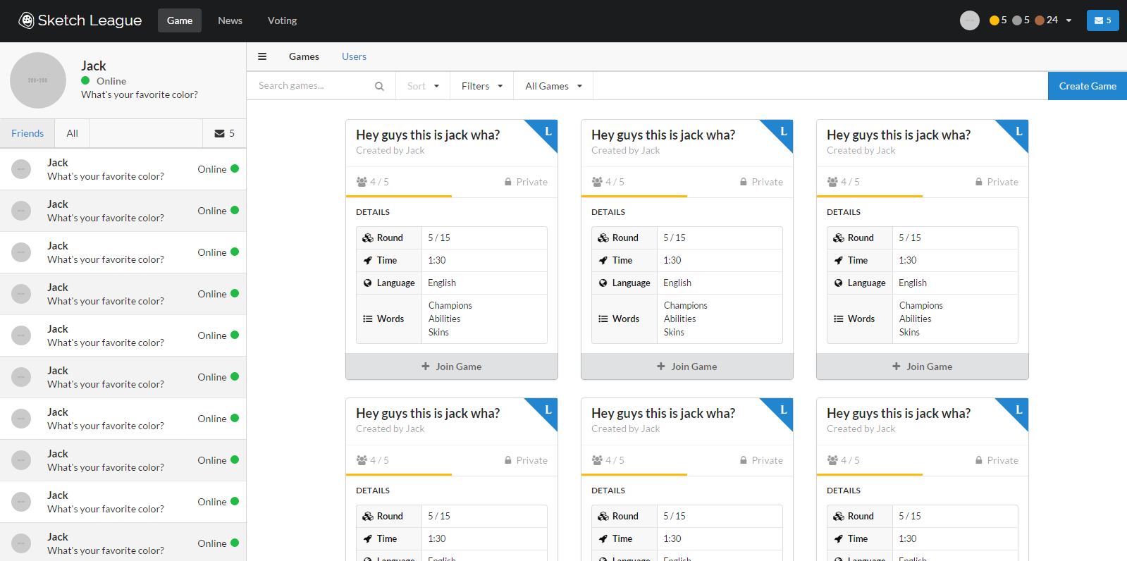
I'm developing a web app for Desktop and Tablet browsers. All of my UX knowledge stems from personal experience and iteration - I've never been formally trained. I took great care in presenting the information on this website to keep it as organized as possible, but many people who have given me feedback describe it as "cluttered" and "overwhelming". I'm struggling to find how I can present the same information whilst improving it.

my website

What elements of this card-based, dual menu, side-bar design are triggering this response?

17
  • 38
    I love this question so I hope someone gives a good answer. I would guess that the issue you're having is that no data is elevated and there is no hierarchy to your view. When everything is equally important, in essence nothing is important. I'd like to see what others say and hopefully someone can give a better answer than I could.
    – invot
    Commented Dec 10, 2015 at 16:53
  • 28
    If you get feedback that a page is "overwhelming" then that may be a signal that you do not need to "present the same information whilst improving it" but instead present less information in that page.
    – Peteris
    Commented Dec 10, 2015 at 19:40
  • 2
    I tried to count all the different UI elements, and found 26 different elements. (I.e. I counted those 6 blue corners only once). That's a lot. Just to throw in some random suggestons: the cards seem to have separate "4/5" and "private" labels. Move those to the table below, and drop the "Details" table header. Also, replace one card by a big "+ Create game" sign so you can drop that blue button from the top right.
    – MSalters
    Commented Dec 11, 2015 at 11:58
  • 12
    It may be one of those cases where it's overwhelming at first, but experienced users love being able to see so much without page loads/ping-ponging/popups. The problem is for anything new you only have new users. You need to consider how it will really be used (regular users or casual, fast intranet or slow mobile connection) when deciding how to weight your feedback.
    – Chris H
    Commented Dec 11, 2015 at 13:10
  • 25
    Part of the issue may be that your dummy data contains no variations. With so much repeated content, it's really hard to discern what exactly we're looking at. I'd suggest updating a lot of that dummy data so that it clearly illustrates other use-cases.
    – Lindsey D
    Commented Dec 11, 2015 at 20:33

13 Answers 13

171

This is where UX gets hard

There's nothing inherently wrong with your interface. It appears to be handling a large amount of information in a reasonably clear and standardized way.
But there is something wrong with your interface: The users don't feel comfortable in it.

That's a complicated problem to solve, but it is the heart of every UX design project. It's totally dependent on the audience you serve and the context they will be using your app in.

Where to start

  1. Make sure you're not over-valuing the opinions of a small subset of users. That's the whole "squeaky wheel" problem. They may have some valid concerns, but you need to be sure they are representative of the larger population of users.
  2. Sit down with real users doing real things with your app. See what happens, what tasks they try to complete, where they get stuck or confused or frustrated.
  3. Test one solution at a time. The more atomic your changes can reasonably be, the more you can accurately take away from the test.
  4. Circle back with your users when you think you've fixed something. Collect lots of feedback and make sure you solved what you thought you solved.

tl;dr

  1. Understand exactly what your user wants to accomplish.
  2. Eliminate every
    [ action, word, picture, icon, color, shape, pixel ]
    that that doesn't make them better at #1.

General observations

Disclaimer: I am not your user and I may never be. Take my observations for the unqualified guesses that they are.

Hierarchy

The card headlines definitely draw my eye first, thanks to the little corner triangle. That seems like an important element. So where do I go next?

The Create Game button sounds important once I find it. Locating seems like too much work since it's hiding over on the edge of the screen and uses the only highlight color you have, which is already used elsewhere.

How about the Games and Users things toward the top that look like nav? Currently, I'm not sure which one is active or what they would do.

Generally speaking, there is a lot asking for my attention. That leads me to ...

Visual noise

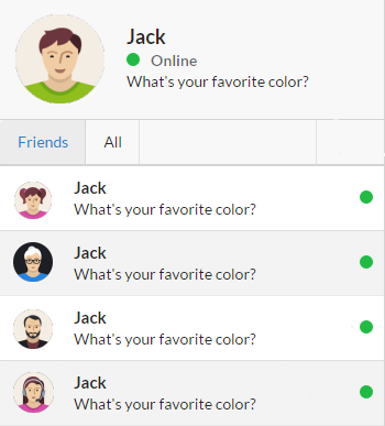
Try cutting down on the number of discrete things by refining the things that are there. For instance, could your Online indicator lose the circle and be simplified like so:
Online indicator in text only.

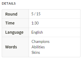
Another opportunity is the in the card details. How much of this info is needed at the overview level? Could you expand some of it on hover/tap? And the details icons don't add any useful information, but do add a lot of visual noise to the page due to their frequency. Why not just text labels:
Details table without icons.

Also in the game cards, I have no context for the yellow-orange line. At first glance, it looks like a tab indicator under the people icon and there may be another tab for Private. As soon as I think that, I realize that doesn't make any sense. More wasted attention.

Monotony

In spite of the complexity concerns, there might be room to add something to break up the monotony. Would there be meaning to allow cover images for games? Or possibly use that blue L corner as a full header color (assuming they wouldn't really all be the same)?

16
  • 8
    This is fantastic feedback. Now that you bring them to my attention I see a lot of the concerns that I've just become accustomed to having stared at the design for so long. For context, the corner labels are colored to make the game they represent immediately identifiable to my users. So you think this should be more prominent? Additionally, the second menu bar with "Users and Games" is a hybrid tab menu but will also show bread crumbs "e.g. Games > current | Users". How can I allow users to toggle between these tabs without making it appear as though "users" are underneath "games"?
    – Jack Guy
    Commented Dec 10, 2015 at 17:33
  • 2
    For the second menu bar: It's either navigation or a breadcrumb, don't try to do both. For the game icon: I would do something bolder that gives the app some personality, like a cover image or bigger color area. Commented Dec 10, 2015 at 17:37
  • 3
    Tearing something like this down to mobile scale is going to require a lot of decisions -- decisions I couldn't help you with without considerably more information. A standard mobile solution is to show the top-level area and the current page with the ability to step up or open a menu of views. The Material Guidelines are a good place for inspiration. Commented Dec 10, 2015 at 17:50
  • 39
    Try adding real content. Repeating the same content multiple times does not help with understanding. Commented Dec 10, 2015 at 22:01
  • 4
    Scott Simpson's comment is extremely important. Having the exact same icons/text in each location means you don't really know WHY you're seeing all this stuff. If they were unique, it would be more obvious that having multiple items on the screen has value.
    – barbecue
    Commented Dec 11, 2015 at 20:28
74

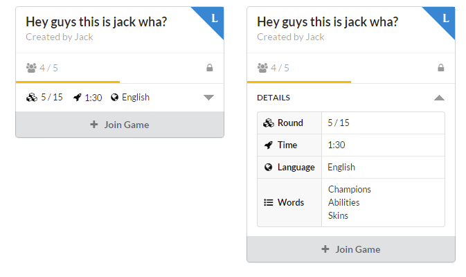
Repeating those table row labels for every game box is contributing a lot to the perceived clutter IMO. Also is all that information necessary? You could perhaps try simplifying, but add the ability to expand if necessary.

enter image description here

6
  • Great answer. I love the concept on the left but I don't think it's decessary to expand it.
    – BlueWizard
    Commented Dec 12, 2015 at 21:16
  • I like this, and the exact details (such as the rocket icon indicating time) can be easily added via a hover pop-up, such that the information isn't repeated everywhere Commented Dec 14, 2015 at 15:48
  • 1
    What context do users have for the icons? At that point, I think it would be better to just have the values with no icon. Expand still tells the rest of the story. Commented Dec 14, 2015 at 19:59
  • Possibly none at first, but I am going to assume the are (or will become) recognisable by users. Also, they can exapnd the box to get the uull table and labels. Commented Dec 15, 2015 at 8:00
  • 1
    A tool tip for users to understand the icons would probably be prudent.
    – Knossos
    Commented Dec 16, 2015 at 14:58
34

You have a good UI but a few things strike me that perhaps can be improved:

  • Too many lines (you can remove most of them I believe)
  • Too little contrast between the different parts of your design (try bluring your eyes and see if you can still discern the different parts of your design). The cards are especially problematic. Make them pop.

I removed some lines and made the cards stand out a bit more and I think this makes your design a little bit less cluttered. Judge for your self.

enter image description here

1
  • 1
    Wow no kidding - this looks a lot better. Not sure if that's at the expense of clarity, but I will keep investigating. Thank you!
    – Jack Guy
    Commented Dec 12, 2015 at 0:37
17

The data being displayed by the cards would make a lot more sense in a list or a table. Each card has the same exact fields with different values, and you're displaying the labels for the fields each time. A table with headers would only display the "Time", "Language", etc. labels once.

As a note on cards, they seem more suited for mixed or free-form content, where each card presents a unique UI tailored for its unique content. Your content is a list of available games, so representing that in the UI with a list makes sense.

4
  • I have never quite been able to fit the number of details that are relevant into a width that is permitted by tables. I find them pretty restrictive overall. Do you have any advice for maximizing room in tables?
    – Jack Guy
    Commented Dec 11, 2015 at 21:59
  • They would seem more generic inside a list. When visually presented in cards it gets obvious that every entity is on its own and not related to the others. List Entries look like having less importance
    – BlueWizard
    Commented Dec 12, 2015 at 21:09
  • 1
    @Harangue You can do a brief overview in the table rows and then expand the selected item to show the full details and present the user with an action button. The table doesn't have to be a strict table, you can think of it more as a list of short, wide cards. The advantage lies in keeping the data aligned for easy comparison and removing redundant labels. Commented Dec 14, 2015 at 14:06
  • 1
    Also, I like the idea of cards, and I think the current design would work great in a sort of "Recommended for You" (aka News Feed-like) page, where you could recommend open games that the user may like (fits their history) as well as score results from their friends, friend recommendations, etc. However I think a "browse for open games" view would make the most sense as a list. Commented Dec 14, 2015 at 14:09
11

personally, I don't think it's cluttered, but yes, it's a bit overwhelming.

Basically, I see your screen and have no idea where to look and what to do. The most important aspects seems to be an L in a corner and the fact that someone is online (this is because of your use of colors), then you mix information giving everything the same level of hierarchy. CTAs are grayed (!!!!), your breadcrumb is weird based on given screen (you are displaying games yet your breadcrumb display Users and this is a level under Games, which is weird as well, unless you mean Players), you have a message/chat sidebar that somehow seems to be related to main content, yet it's really hard to find a connection... well, it's bit confusing. The good news is that all these aspects could be easily changed, your main problem seems to be the focus on hierarchies, what is important and what not. Just change a couple colors (mainly the CTA) and test. I'm sure you'll see results immediately

Anyways, I think you should do some EXTENSIVE testing, study behaviors and interactions and ask questions to real users, not friends, not colleagues

4
  • 2
    Hey thanks so much for this feedback! Pardon my ignorance, but can you clarify what "CTA" refers to? Also what about the sidebar makes it appear related to the main content in a confusing way?
    – Jack Guy
    Commented Dec 10, 2015 at 17:36
  • 4
    "CTA" is "Call To Action", ie. the most important elements on a given page that if your users only have one interaction, you want it to be with your CTA, such as a Form Submit; in your case they would be Create Game/Join Game?
    – HC_
    Commented Dec 10, 2015 at 17:47
  • Just saw your comment. But yes what @HC_ said. Plus, the accepted answer above was edited to expand on my answer, so guess you're covered by now
    – Devin
    Commented Dec 11, 2015 at 15:03
  • Yes, testing is very important. I'm very new to this industry but i learned you should test every aspect as early on as possible. People tend to just go thru with their rhing and then want to present it as a whole - without having the possebiluty if adjusting the concept.
    – BlueWizard
    Commented Dec 12, 2015 at 21:14
8

The answers provided here are great, but a few observations:

  1. Put the avatar of user in a grey circle (multiple grey circles looks cluttered), same way put meaningful information in all game cards.

  2. Keep only the green circle as a notion for online users, remove text i.e. 'Online' from the list of friends, but keep the text in the logged in users statuses as it will help them understand the meaning of various colored circles like green = online, red = offline, orange = idle etc.

  3. Remove the mail icon from the 'Friends | All' header as it's already placed in your app header. Refer to the following image for these 3 points.

  4. Put your menu Games and Users in navigation tab like this.

  5. Increase the size of the top-right corner and the letter like this.

5
  • 8
    Do not use a colored circle alone to indicate contact status. You're designing usability failure into the interface for every color-blind user (a notable percentage of men). As for the tabs, there are plenty of ways to style them but I wouldn't say that the Bootstrap default is the best solution. Commented Dec 11, 2015 at 15:44
  • 2
    @plainclothes Agreed, the word 'ONLINE' in green would be better, ditch the circle.
    – Prinsig
    Commented Dec 11, 2015 at 16:11
  • I like symbols over text—for me there's less clutter and quicker understanding—but completely agree with @plainclothes. Another symbol-based approach that addresses the usability point would be solid green for online and outlined red for offline. With tooltips, of course. And good contrast ratios.
    – DocMax
    Commented Dec 13, 2015 at 6:46
  • @plainclothes you can have a filled circle for online and an empty lighter circle for offline
    – icc97
    Commented Dec 14, 2015 at 12:22
  • @icc97 : There might be more than 2 status :)
    – IT ppl
    Commented Dec 14, 2015 at 13:28
7

I have some fundamental guides to offer, which should apply to all UX, and is especially important here:

Convenience doesn't have to compete with clarity.

A designer is supposed to take maximum advantage of screen space while presenting information which doesn't confuse or overwhelm the user. But this doesn't mean that we designers need to trade the amount of information available for the clarity in which it's presented. Take advantage of dynamic design, with user interaction.

By becoming comfortable with a fluid design medium...

We designers typically find it natural to design interfaces in a vector layout editor, where we arent wiring up a bunch of animations, transitions, and transformations. This is what limits many of us in our ability to design innovative layouts which expose (and hide) information through through user interaction. So, first learn to design in an environment where you can build moving, animated, transforming interfaces. I personally just design my interfaces with HTML, JS, and CSS - after a while, it becomes a natural design medium.

...we can create environments that expose and hide information, while pulling the user's attention.

Then, take advantage of the fluid freedom that you have in designing your interface to display hints of information that "pull" the user's focus from element to element in the order that you want, or the order that they need, and interact with the interface to access different information groups.

By focusing on dynamic user interaction, we can use a simple interface hierarchy to guide the user to the information they need, when they want it.

You want to expose lots of info to the user, but there's a limit to the amount people feel comfortable with at once. Limit the number of details exposed by relying on user interaction linked to smooth and simple animation, especially when dealing with duplicate information tables like this case.

For example, in your case, instead of showing all of those game blocks with duplicate information, try showing blocks with only a label identifying the game, and then when the user interacts with it (on tap or hover for example), show the details of the game. That change alone would drastically simplify your interface and make the user feel less pressured to absorb so much exposed information at once.

6

Well, good answers but not helping you with the cause other than "Monotony" - which is not a great term, but close.

Great design in Magazines, Posters, and User Interfaces is the product of font, font size and whitespace, further improved with color, and not harmed with line.

These properties: Font, Font Size, Whitespace and Color train the user to understand (a) what is important, (b) how to scan for information, and (c) how to see patterns in the data at a glance rather than think about them directly.

Reading is a very costly effort for people, so scanning to identify "which of these things doesn't look like the others" or some variant of the principle is what you want to find.

Spatial location develops over time with expertise, once the user has subconsciously memorized the user interface. (Experienced users like an Excel-style interface and new user's don't.)

In other words you cannot rely on introspection when designing an interface unless you know whether you are 'testing' the design for an entry level or experienced user.

You 'train' the user how to look through the information by use of font size (priority), font style (fonts convey relative meaning). After fonts use shapes (such as the corner tab someone else advised). After shapes use color. Color should be last.

Color should either indicate type, or it should indicate 'this thing is like the others'. If you have to 'decorate' with color, (a colored bar or background) this usually represents a failure, since it has no 'meaning'.

Test your design by doing separate elements in 'layers' and then turn layers on and off. Your eye should tell you.

Card interface

Now, you have combined 'cards' (spatial layout), but use a 'table' fonts and colors.

It certainly doesn't appear that cards are a good UI model for your solution, so first make sure you are helping the user. Cards work primarily if they hold images, and must be constantly rearranged. Otherwise tables are usually better, because they're easier to scan.

For example if you take a pack of playing cards and throw them on the floor you can still tell them apart no matter their direction. If you throw your 'cards' on the floor, then they will all look the same.

So you are relying upon positional indexing by your user, then you are either using the wrong model, or must solve the playing-card-metaphor.

Helpful hints

I try to advise people to find a magazine page layout to work from. Of course, the gold standard is the NYT paper and web site. All type and white space.

But starting with a visual model (the monopoly board game for example) usually will help designers avoid the 'boxes problem' that plagues amateurs.

5

When we humans look at something somewhat structured, like a UI, we tend to build a mental model.
In order to achieve that goal, we scan the UI in an instant, unconsciously, and take note of each and every item in said UI.
In this process we consume "mental power", an amount depending on the number of elements in the UI. This is related to cognitive load.
After doing that a number of times we get "tired", depending on the cognitive load consumed.

Well, your UI has quite a number of items, and what your users complain of is the amount of cognitive load required for each and every scan.
The number of elements is not the "Hey guys" panels, but the number of icons, text pieces, lines, everything!
This is good news because there is a lot of headroom for improving.

I'll enumerate a few examples in order for you to understand my suggestion:

  • each "Hey guys..." has a number of internal lines that, if removed, would lighten the cognitive load without hindering the user understanding
  • the line under "Created by Jack"
  • the cell boundaries of the table under "DETAILS"
  • the "DETAILS" word itself
  • the "Friends | All | ✉5" artifact lines (show like a button on hover)
  • the zebra-stripes under the Friends|All artifact
  • the "Online ●" could be only the color part but with a green ✓ instead and a red cross else
  • in Sort / Filters / All games try setting the dropdown arrow closer to the text so they become a single thing
  • instead of round pictures use square ones reaching all three borders
  • etc ...

As a first test, try expanding the "DETAILS" table so it touches all its four boundaries (losing its nice round corners and the "DETAILS" heading) and you'll see.
It will get simpler and thus easier to grok.
Then you might believe and embark in a visual element deletion frenzy.

4

Ideas:

Create Game

Maybe the first card could be your big create-game button! I'd really like it to have those type of inputs where you can just click on the text you want to edit and fill it in right there. I'd think about making it responsive too, so maybe when you see it, it's very simple, just has a "+" and "Create Game" and then on click it smoothly animates in those automatic input fields. (Say the card does a flip in 3d. There's endless options for creativity here!)

Game Cards

Similar idea for responsiveness: remove the join-game button and have it appear on hover as one of those semi-transparent-overlay effects. I do like the idea of screenshots/game-art as wallpaper.

Here's what I just realized about these cards, though: It's actually not necessarily the best approach for this kind of data. Every card has the same details and information presented. Why not just a table of some kind? Then players could sort them by field.

You could get creative and have the field labels on the left or right, and then still have a wide card-like orientation with wallpaper. Endless ideas here too! Maybe then they can scroll from left-to-right, AND scrolling up-and-down could shift the group of cards by classification, maybe game-type. (Arrow keys can now get involved!)

Player List

This (and maybe the header) is the part that seems a little cluttered. I think what it is is just a lot of visual information in the peripheral. So how could we fix this? Again, there's lots of options, we just have to get creative! Again, let's start by going with wallpapers. And then maybe an accordian interface? Maybe instead of "online o" you could have a filled-in circle vs. a half-full or empty circle. Or any other thematic indicator, like a ribbon! (or use a semi-transparent gradient with a hollowed out icon.)

One idea is to maybe even only include online people in it, while the offline are just listed below as comma-separated links, kind of like what you see in forums:

Qwerty Uiop, Plok Min Juhby, Wes X Qwaz, Kip H.G. Jolumny, Ferd 3rd, Chasbyn Q Jon Klimp-Werdguft ZCXV, Guy T. Fred, Ty Hug

(BTW, my mother and I came up with these names when playing a game to see what we could make with regions of the keyboard.)


Those suggestions are just to get it started. Hope it helps!

3
  • Add more contrast to make the important content stand out more (the card games), by adding a darker background color for example.

  • Make the yellow stroke more meaningful by increasing the size by the percentage of players that are currently in the room. A full room would get a red stroke for example.

  • The font of the blue "L" seems like it's another font, which makes it really odd.

  • Arguably: Remove the icons before "Round", "Time", "Language" and "Words". They're fun but also distracting and don't seem to add any logic as the text itself is enough.


Note that I only changed the first 2 boxes 100% (the 2nd box does still have the old L though, it was just to show as indication).

New design

1
  • The L is actually a minimalist version of a logo. :) It varies depending on the game type.
    – Jack Guy
    Commented Dec 16, 2015 at 18:12
2

According to Jonathan Ive of Apple, a good interface only presents information that is IMMEDIATELY relevant to the user. Check out https://www.youtube.com/watch?v=3q6ULOT9Q4M

This may be a bit of a minor point, I had the same problem. With my client the issue is having too much WHITE SPACE in the interface. For a CARD based layout like yours try:

  1. Adding a background color like #EEE to the main content section

  2. For the sidebar chat, remove the extra line in grey

  3. Have the option to make the cards collapsible, on if you have to present numerical data as comparison, try charts/graphs

2

Lack of hierarchy and definition of elements on the page is the main problem. Using highlight colours, scale and an understanding of how you want the user to interpret and digest the information you present to them will help it

Not the answer you're looking for? Browse other questions tagged or ask your own question.