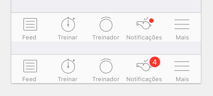
I didn't find anything about this. I would like to know if there is any problem in using just a floating circle, warning the user about new notifications or should I display the number of notifications on the badge?
3 Answers
There are certain things at play here, when looking at the variant which shows the number of items.
One of them is that it's an (upcoming) convention. Most people that have come into contact with notifications, have found this way of implementing it and will almost automatically associate it with being "notifications". More so, not complying could actually give more room for interpretation as to what these colored balls mean. There's a chance it could even be completely missed out as it blends into the icon thus allowing for a slip to occur.
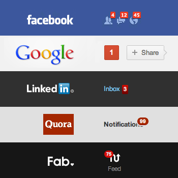
Another point, is simply the fact of quickly and easily reading of changes in the system, e.g. linkedIn shows me a 3 pending connections, as I'm still on the fence for those connections I'll let them 'be', however, when I look some time later, I see that another request came in, as the number has increased to 4. This may seem as a small thing, but in some situations it actually comes as a 'reward' to users, and behaves just like drugs e.g. facebook with a lot of friend requests = "I'm popular".
Related to my previous statement, it also works as a reminder that there is stuff going on, the reminder part is very explicit in e-mail apps where the amount of unread messages is displayed or it also indicates if something is going terribly wrong e.g. many errors in a system could potentially be a very dangerous situation.
This is also true when overwhelming the user with unneeded notifications, for which the user will only see it as a nuisance, after which either they will be completely ignored, or the user will simply delete your app as it causes too much stress!

Conclusion
In most cases I'd show the number of log-items, as users will not likely be offended by this information. Even more, I wouldn't even put more than one ball on top, as, especially for colorblind people, this might not be clear what they all mean just by looking at the color. As an another answer nicely suggested, this would only make sense for binary status notifications e.g. user is online/offline.
More reading material
- http://techcrunch.com/2015/02/05/the-psychology-of-notifications/ interesting article regarding the correct usage of notifications and their timing
- http://www.sitepoint.com/5-mobile-design-patterns-successful-app/
- http://therecoveringpolitician.com/contributors/jyb3/john-ys-musings-from-the-middle-facebook-and-dopamine
- http://www.uxbooth.com/articles/understanding-conventions-when-being-unique-is-a-bad-thing/
- http://www.errordiary.org/?page_id=7339
-
2this is a very nice answer that deals with several psychology factors. It obviously isn't the same to have 1 notification than 100. The only thing I would add is that sometimes having a lot of notifications is really bad and usually related to the end of use of the application by the user since user can't cope with that. It would be really interesting to know what is the middle point between "Wow, I'm popular" and "Bummer, I'm overwhelmed"– DevinCommented Sep 29, 2015 at 20:31
-
That is an excellent point that you made, indeed, that could be the case, in general I'd think it's kinda the same as the example I gave regarding 'a system that has many errors' - after which you'd probably be in the 'overwhelmed' state and see it as problem, although this time not with the system but with your state-of-mind. I think this would be very personal, but it would be interested to understand those human factors, thus far I've not found research regarding that topic - if you have anything, I'll be more than happy to add it and credit you for it :-)– XabreCommented Sep 29, 2015 at 20:37
Do you NEED to? No.
Would it be helpful to the user? Probably.
Question to ask: For your app, would it be helpful for the user to know how many pending items that are to process?
Under most circumstances, the answer would probably be yes. And you see this in the design of most notification badges.
The only time I've seen this sort of dot indicator is for "on/off" statuses e.g. Is a user online, or denoting color for showing item groups.
e.g.

(source: invisionapp.com)
-
nice answer, specially pointing out the "dot indicators" part, I thought the same when I saw the image at first– DevinCommented Sep 29, 2015 at 20:32
The number in the badge is definitely suggested. With just a little red mark there it is very unintuitive what the app is trying to tell you
-
Who recommends the number, and why is a red dot with a number in it any more intuitive than just a dot for indicating that there are notifications? Commented Sep 30, 2015 at 0:26


