8

I am working on a project which needs to support color contrast accessibility.

Currently on our system disabled data is presented as grayed-out, but now we need to support color contrast for accessibility which means that there should be a really good contrast between background and foreground colors and the light gray text on the white background doesn’t pass the contrast test.

0

2 Answers 2

6

From WCAG 2.0, which is generally accepted as a way to be 508-compliant in your product:

1.4.3 Contrast (Minimum): The visual presentation of text and images of text has a contrast ratio of at least 4.5:1, except for the following: (Level AA)
Large Text: Large-scale text and images of large-scale text have a contrast ratio of at least 3:1;
Incidental: Text or images of text that are part of an inactive user interface component, that are pure decoration, that are not visible to anyone, or that are part of a picture that contains significant other visual content, have no contrast requirement.
Logotypes: Text that is part of a logo or brand name has no minimum contrast requirement.

Basically, what this means is that if the disabled element is incidental, e.g. does not convey important information for the user that is not conveyed by any other means, then it is not important that it meet the color contrast guideline.

For example, buttons that are disabled because they cannot be used yet (like these below) don't have to pass color contrast because once they are enabled, and therefor actionable, they will pass.

mockup

download bmml source – Wireframes created with Balsamiq Mockups

However, if the content is important and not conveyed another way, you can use Chrome Developer Accessibility Tools or a Color Contrast Checker that will tell you what you need to change your color to in order to make it accessible.

For example, you have a series of options that the user can select and one of them is always going to be true but you still need to tell the user about that option, you might disable it.

mockup

download bmml source

2
  • 1
    Hmm, while i'm sure this does meet WCAG guidelines it just doesn't sit right with me that you can have inactive button states in inaccessible colour contrasts. The fact they're inactive is still useful information to impart across to the user; if they were so unimportant that people didn't need to be aware of them at all then why are they shown on screen in the first place? I'm not saying your answer is wrong (I don't think it is) but I just don't think I agree with WCAG on this one.
    – JonW
    Commented Nov 4, 2014 at 17:00
  • I agree. When I came upon this answer when working on my own product I didn't like it, but especially in our current design world where grays are king, convincing a designer than the minimum disabled color was #767676 was just not going to happen.
    – elemjay19
    Commented Nov 4, 2014 at 17:05
2

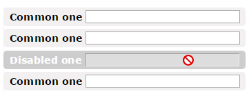
Probably not the best, but some options to improve the situation:

  • Background and font color.

  • Not-allowed pointer on hover. (CSS=> cursor: not-allowed;)

enter image description here

2
  • Nice idea with the NOT ALLOWED, I had seen it implemented before in other sites but it didn't come to my mind when I started designing my disabled fields :) Commented Sep 21, 2017 at 11:20
  • 1
    ewwwwwwwwwwwwwww
    – zero_cool
    Commented Jan 24, 2018 at 4:50

Not the answer you're looking for? Browse other questions tagged or ask your own question.