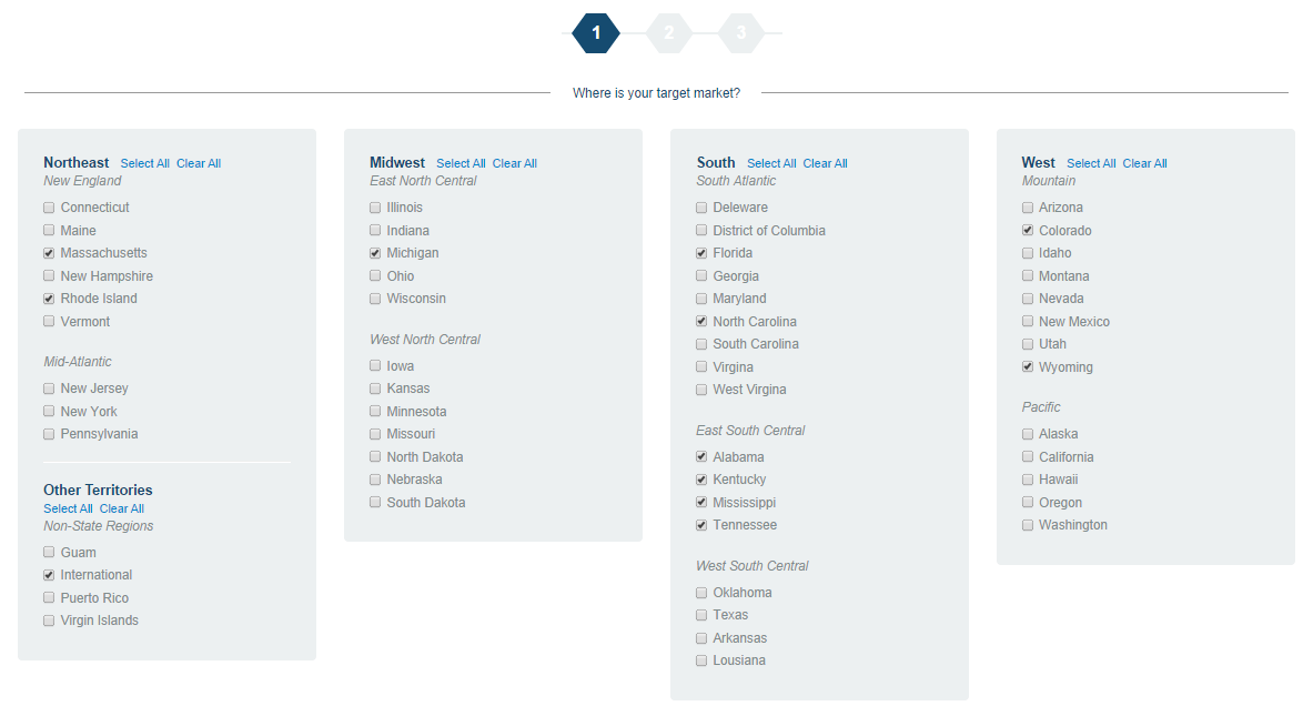
I am currently working on a project to create a "wizard" for users to customize dashboard. One step is to select the states they are interested in. There are so many states, but I don't want to split them into several pages because we already have four, including the state page. I am a beginner in html/css and javascript, so I want to know whether there is a better way to display all the states? I really appreciate you take the time to read the question and give me some ideas. Thank you!

-
What you have did above is good enough UX. To improve, you might want to have the state abbreviation next to it...– SimonTeoCommented Nov 5, 2014 at 8:20
-
What is your target audience? Are you sure they know the states "as they are" (see @Grubermensch's answer)? Often the user model is different from the world. If some of your target audience is not from US (like me) and I want to see information on a state I know by name, I'll be lost when you present it as a map. On the other hand, if I'm interested in information on wheather for vacation planning, the alpha list won't help. So in addition to the target audience, know the tasks they want to complete. Please update the question to increase your chance of a good answer.– virtualnobiCommented Nov 5, 2014 at 8:54
2 Answers
What's wrong with an alphabetical list? Split them into five columns of 10 states each with the states read from to top to bottom before the next column.
Use a map
It's often best to present information to the user in the way that is most natural/familiar for it to be presented. A map presents the states as they are rather than in a contrived ordering such as alphabetical, which is unable to play on users' existing knowledge of the states.
Web visualization libraries often use a map of the United States as a demo, so it should not be difficult to find a library and use it to fill your needs. You can indicate selection of the states by changing their color, which is a standard presentation of map-based selection.
What about the other territories?
Unfortunately a map will not scale well to include the Pacific and Caribbean territories of the United States. For those, you'll be best off falling back to textual labels. You should take care to integrate the aesthetic of those labels to match the map (which of course should be labeled too!) so that the entire selection widget feels unified.
-
Thanks for this idea, but I am a beginner in programming and I don't think I am able to achieve this. Commented Sep 29, 2014 at 15:36
-
Have a look at this example: click-to-zoom-via-transform. You only need to change the
clickedfunction to add/remove from the current selection and you're there. Commented Sep 29, 2014 at 15:44 -
As a 28 year old, natural born US citizen, I would advise against this. lizardpoint.com/geography/usa-quiz.php -- I was able to get 75% after some practice. Labels would help with accuracy, but would not necessarily reduce the effort required.– bdimagCommented Nov 4, 2014 at 22:47
