0

So I have a checklist for inspections of some technical goods. Each of those goods has it's own criteria that can either be 'fulfilled', 'not fulfilled' or, if the item doesn't have the relevant accessories or properties 'not applicable'. Also each of the criteria needs to be able to take a comment. So as a naive example:

criterion pass fail n.a. comment
gauge working X
faucet free X
valve in order X Doesn't have a valve.

Now I have the following requirements:

  1. Since one might have to check a lot of criteria in (hopefully rapid) succession, I want only one click to finish an uncommented criterion. (So, no drop downs menus.)
  2. The form needs to communicate to externals very clearly whether a criterion is
  • not checked at all or
  • a pass or a fail (Simply not checking neither pass or fail box, doesn't seem clear enough for me.)
  1. There should be as much space for the comment as possible. (Which means three radio buttons are not ideal, even If I assume I can say 'passed'/'failed' with narrow icons. It's much harder to find a clear icon for 'n.a.' - suggestions welcome, by the way - so this doesn't seem like an option to me.)
  2. I don't want a key/legend to explain what each control means.

Since I'm originally a programmer, in code I would write the relationship between the 3 states something like that (Javascript):

if (!non_applicable) {
  if (pass) {
    // passed
  } else {
    // failed
  }  
} else {
  // n.a.
}

So, what I mean is there is some hierarchical element to all this.

What I thought of so far (and why it's not good):

  1. Checkboxes just for pass and fail, and none checked means n.a. - Doesn't communication n.a. very well.
  2. 3 Radio buttons for 3 states - Too long, also not communicating the hierarchy.
  3. Tristate switch - unclear to externals what the 'n.a.' setting means. Also needs to clicks to get from state 1 (n.a.) to state 3 (fail, most likely).
  4. Two-State switch for pass and fail plus a checkbox ('n.a.') that, when checked disables the switch. - Seems too complicated and not clear enough and also hard to get those two different controls visually working together side-by-side.

Any ideas how to fix this would be greatly appreciated.

7
  • What percentage are typically "not applicable"? Commented Feb 22, 2023 at 21:14
  • It depends on the type of good. On average 5 to 10%, I guess.
    – ifox12
    Commented Feb 23, 2023 at 7:02
  • Do you have a lot of power users? Or mostly new users? Commented Feb 23, 2023 at 12:48
  • Suggestion: automatically focus the comment text field when pass or fail is selected. Commented Feb 23, 2023 at 12:54
  • @bloodyKnuckles 95% non-technical users. Autofocus comments:That saves a click in some cases, good idea.
    – ifox12
    Commented Feb 24, 2023 at 9:24

1 Answer 1

1

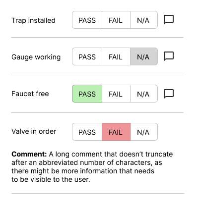
If your user is on a mobile device running the checklist out in the field, you might offer a three-state compound button with an icon that can trigger a comment box.

checklist with three-state pass/fail buttons

The horizontal rules can keep the comment contained with the criterion (on Desktop viewports, you'd have room to move the comment to the right of the buttons).

(It's a little unclear whether N/A should be selected by default, or if there should be an empty state, but this design provides for both.)

6
  • I think a preselected N/A saves a few clicks, so I'd prefer that.
    – ifox12
    Commented Feb 23, 2023 at 7:03
  • Also, I think the comment icon is a nice touch, but since users will mostly use relatively large screens (tablets and notebooks of different sizes, but the infrastructure could handle phones as well) I'm worried a little about a lot of unused space with a compact design like that. Also I have a soft requirement, that the result should look like a printable page, since I need to make a printout of the checklist data and just painting a pdf with a properly sized webpage seems way less work than designing a separate pdf for each sheet.
    – ifox12
    Commented Feb 23, 2023 at 7:10
  • Use responsive deign to only collapse the comment text field on small screens. Commented Feb 23, 2023 at 12:54
  • Upvote for default selected N/A. Commented Feb 23, 2023 at 12:55
  • Just a random opinion - you might not want to set N/A as a default, because a totally empty state communicates that the check wasn't run. N/A confirms that the check was run, and the technician acknowledges that it didn't apply.
    – Izquierdo
    Commented Feb 23, 2023 at 15:35

Your Answer

By clicking “Post Your Answer”, you agree to our terms of service and acknowledge you have read our privacy policy.

Not the answer you're looking for? Browse other questions tagged or ask your own question.