2

I'm currently designing a mobile app for Android and iOS and I don't quite know which pattern I should use.

The user is setting up his profile and he has to select the gender. In iOS I use tabs and the user can tap on "Male" or "Female".
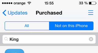
Tabs iOS

I haven't found quite the right pattern for Android.

Should I simply stick with 2 radio buttons? I have found they were confused with check boxes quite often and left unchecked, when they're mandatory.
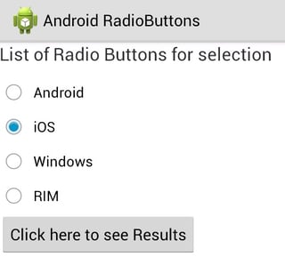
Android Radio Buttons

1
  • You should be aware that gender isn't binary (for different ways to ask your question see: totb.org.uk/forms ) however it is even necessary to collect gender data in the first place?
    – Fractional
    Commented Jun 5, 2014 at 11:27

4 Answers 4

3

I'm facing the same issue at the moment. This is my solution so far: 2 radio buttons horizontally. I recommend this one because you need just one tap to make a choice, and it saves vertical space.

delivery / collection

I do not recommend using a Spinner, or the solution provided by @nashmaniac, as this will increase the number of taps you need to make a choice.

3
  • I don't understand what you're recommending. You say to use a spinner (but don't state what you mean or how it would be used), you then say to use Nashmaniac's suggestion and then leave an image of some radio buttons. That is three different suggestions in one, and none related to eachother. Can you expand on what it is you do recommend, and more importantly - why you're suggesting it?
    – JonW
    Commented Jun 5, 2014 at 7:59
  • I do not recommend to use Spinner in this case. It is additional tap for something which can be done with just one tap. My solution on the image attached in previous post. 2 radio buttons horizontally. I recommend this one because you need just one tap to make a choice and it saves vertical space.
    – klefue
    Commented Jun 5, 2014 at 9:17
  • 1
    OK, I've edited your answer to include content you made in the comment and to make it clearer what it is you're suggesting. It's best to include as much description and detail as is helpful when you leave future answers to save any confusion.
    – JonW
    Commented Jun 5, 2014 at 9:27
1

The radio button would be the correct pattern for android because it indicates that you only can select one item of that list, the tick means you can select more than one.

For an even better understanding and design of this option you could also use icons like yahoo did for example.

http://www.android-app-patterns.com/apps/app/176/screens/1311

1

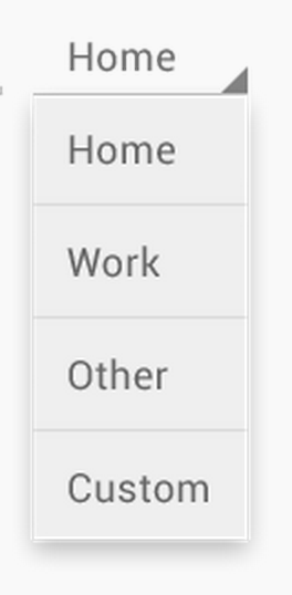
An Android spinner would be an appropriate choice as well. It's a radio selection without the necessary space needed for radio buttons.

http://developer.android.com/guide/topics/ui/controls/spinner.html

enter image description here

1

Just stick to radio buttons! Oh, and leave them blank by default, not nice to record a default if someone forgets to make a choice. :-)

Another alternative would be the android spinner (already mentioned), but I'd say that's redundant when you only have to pick between two options. And you're forcing an extra click on the user which you can easily avoid. :-)

1
  • Yeah, this is one of the major reasons we don't use UISegmentedControls often in our iOS apps - having a default option selected is rarely a good idea for us
    – powerj1984
    Commented Jun 5, 2014 at 19:54

Your Answer

By clicking “Post Your Answer”, you agree to our terms of service and acknowledge you have read our privacy policy.

Not the answer you're looking for? Browse other questions tagged or ask your own question.