15

The app I'm working on is a little like a set of sub-apps within one app, so the structure is basically as follows. Note that the subsections are a mix of tools and content (i.e. this isn't an app full of content like Google Play that is categorised) - it's functionality too.

Home
    Section 1
        Subsection A
        Subsection B
        Subsection C
    Section 2
        Subsection D
        Subsection E
        Subsection F
    Section 3
        Subsection G
        Subsection H
    Section 4
        Subsection I
        Subsection J
        Subsection K
        Subsection L

The subsections are not suitable for side-swiping as some include pinch-zoom on content.

My plan was to do this:

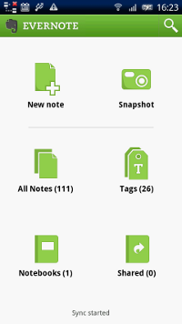
A. Home uses the Dashboard pattern, a grid of icons for each of Section 1, 2, 3 etc. I know the suggestion now is to show content on entry, but there is no suitable content in this app to surface so a grid of section icons seems appropriate.
enter image description here

B. Use ActionBar spinner navigation (like Google Maps or Calendar) to move between sections, once inside the app

ActionBar spinner navigation

C. Use ActionBar Navigation Tabs to move between subsections A, B, C, etc.

ActionBar Navigation Tabs

However unfortunately it seems the ActionBar supports EITHER spinner drop-down navigation OR navigation tabs, but not both and the client needs the full set of Sections to be visible across the app. They're asking me to put a row of buttons across the bottom of every screen (a la iPhone) and I'm uncomfortable with that as it's an iOS pattern, and doesn't fit well with Android, but they may have a point that relying on Home/Up for people to find the other sections of the app may be asking a lot.

That suggests I use the dashboard pattern for the user to pick a Section, then actionbar nav tabs for Subsections, but my concern is the user can't see all the Sections once they're in the app, and it relies on them knowing to tap Home/Up to see the list.

Can you see a better way to handle two-level navigation, without resorting to an iOS UI pattern of bottom buttons, and where the Sections are very clear to the user?

9
  • Nice question! Could you add an image or two it would be much easier to follow your reasoning. Hint: in editing mode, try out the smiley icon which leads to Balsamiq editor for mock-ups Commented Mar 15, 2012 at 15:17
  • 2
    I've added screenshots of the relevant UI elements from other apps, that hopefully makes it clearer
    – Ollie C
    Commented Mar 15, 2012 at 15:22
  • What kind of an app is this? Content consumption or a utility?
    – dnbrv
    Commented Mar 15, 2012 at 16:05
  • +dnrv Both. There are screens of content (static), but also utilities/tools/calculators.
    – Ollie C
    Commented Mar 15, 2012 at 16:07
  • the images are a bit huge :) but good question.
    – Zelda
    Commented Mar 15, 2012 at 16:44

4 Answers 4

3

Like I mentioned in my comment, I'm working on a similar app.

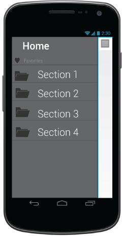
IMO, Facebooks' dashboard will work fine for your Sections. The link is available from all screens (subsections) so your requirement "client needs the full set of Sections to be visible across the app" is also fulfilled (more or less).

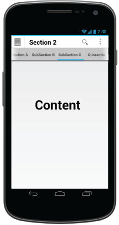
And for your Subsections corresponding to each section you can have Scrollable tabs like in Android Market. (Or even fixed tabs if they're fixed).

enter image description here enter image description here

1
2

Question and answers here are old, but the challenges when it comes to some kind of multi level mobile navigation are timeless.

The most obvious choice is the NavigationDrawer (left sliding menu). It’s the prefered pattern if you have really complex and feature rich structure from the beginning. Another scenario is when you are just starting and need the ability to scale fast and easy, to add core features effortless. When your base navigation is with a drawer, subcategorization is straightforward since every element from the menu redirects to a standalone screen.

IMHO tabs are always better when possible.

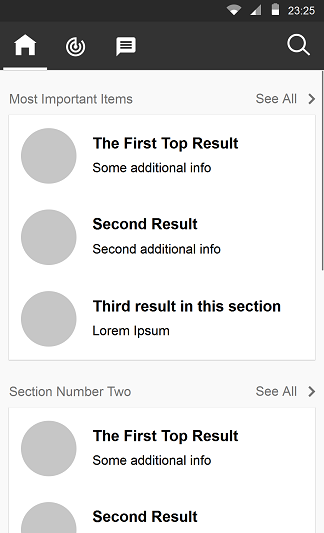
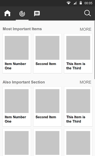
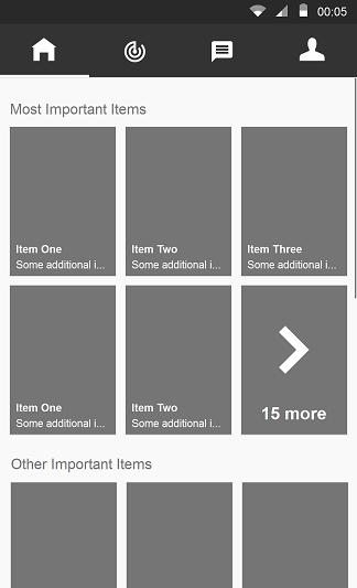
Here’s an idea how to organize subsection with tabs for main navigation

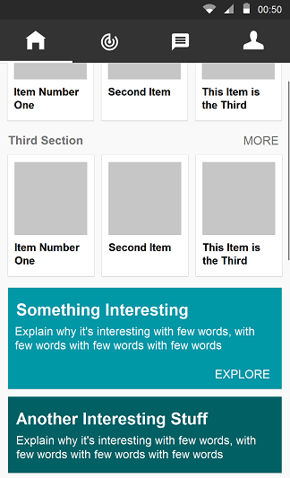
enter image description here enter image description here

enter image description here enter image description here

Showing a “demo” of each section with a “show all” action redirecting to dedicated Subsection Screen.This way you provide content rich scrolling experience, and the user has a quick access to what he finds important.

Not suitable for every app, but it’s actually very flexible: you can add auto-horizontal-scrolling (presentation like) headers; welcome cards on top; you can mix lists with grids; add call to action cards in between subsections or at the bottom; you can add widgets like a search on top; many other things - you have plenty of room to be creative

1

Interesting question!

Here's my two cents:

The problem is how to represent a multiple 2-hierarchy tree structure for navigation with 1-2 screen, constrained by hierarchy hints should be visible in the root/child screen. We can do a bit of analysis of the two popular options:

Dashboard pattern is great for the scenarios that knowing the root category first is important, before diving into details (like in the Evernote case); As a start point of your app, it highlights the important functionalities/categories, clean & rich in design, and can contain 6-12 top root node. However, if content is more important than top categories/functionalities (Like facebook case), using Dashboard as first screen may additional step for users in most cases.It is better to directly go to one of the detailed screen/leaf node. Therefore, the following cases are better to use dashboard pattern as starting screen:

  • Pure Utility Apps
  • Mixed Apps but more on Utility
  • Content Apps but has a lot of root category that are equally important

ActionBar/Tab pattern can highlight the categories/functionalities, provide easy navigation, and highlight one of the content tab (facebook, twitter, google+), therefore it is good for

  • Content Apps in general

  • Mixed Apps but more on Content

  • Utility Apps that have one category/functionalities is more important than others

Therefore, depends on your needs, you can choose one as a primary first screen, and modify it accordingly, adding the following UI component on root screen:

  • Expandable list (Google Now)
  • Drill down/Spinner (Google Maps or Calendar)
  • Accordion Menu

or adding the followings on the child screen:

  • Sidebar (facebook)
  • Window shade (android notificationbar)
  • Breadcrumbs
  • Drill down/Spinner (Google Maps or Calendar)
1
  • Any screenshots or mockups to illustrate your answer would be awesome :)
    – Adriano
    Commented Dec 17, 2014 at 15:48
0

This is a great situation to take advantage of multi-pane layouts in ICS.

They key thing to keep in mind is that you can't make your application look the same in both landscape & portrait layouts while keeping top-notch usability. As a result, you can't show both levels of navigation plus the content at all times.

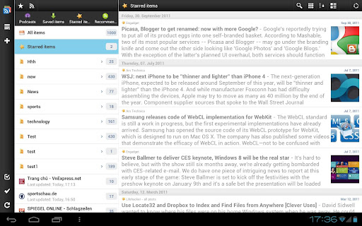
Let's look at the landscape layout first since it provides the most horizontal real estate. In this layout, users will be able to see everything at once. You just need to put the top level navigation into the Action Bar Tabs, the second level goes into the small pane on the left, and the content/apps go into the large pane on the right. For example, gReader tablet view where there are buttons to switch views above the left pane, which contains the list of feeds, and the content of the feeds is on the right:

enter image description here

Portrait layout is far more limiting. There isn't enough space to show more than 2 levels at once. The solution would be to show Action Bar Tabs on top of the screen with the top level navigation with the list of the second level options under it. When the user taps any of the level 2 items, the content/app is displayed in nearly full-screen mode.

You can also try replacing the content of Action Bar Tabs with the level 2 navigation when viewing the app/content. However, this needs to be user-tested to make sure there isn't any confusion with navigational paradigms.

2
  • I should have made it clear that this app is a phone app, and will 99% of the time be used in portrait. Sorry for not making that clear. I'm not sure I understand your last paragraph. If you're suggesting using two rows of tabs and the lower set as sub-tabs, I'd be concerned people wouldn't realise they were a level down.
    – Ollie C
    Commented Mar 15, 2012 at 17:07
  • 1
    If the device allows easy switching between 2 orientations, you have to consider both in design (although one might be more comfortable than the other). As for the last paragraph, I'm suggesting only 1 row of tabs (changing their content) and that's why I said it needs to be tested.
    – dnbrv
    Commented Mar 15, 2012 at 17:12

Your Answer

By clicking “Post Your Answer”, you agree to our terms of service and acknowledge you have read our privacy policy.

Not the answer you're looking for? Browse other questions tagged or ask your own question.