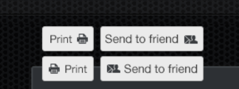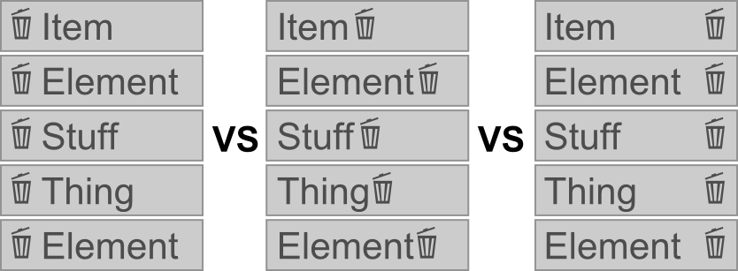
Assuming I'm optimizing for making it as fast and easy as possible for most users to find the button they need, what's the optimal ordering?

Assuming I'm optimizing for making it as fast and easy as possible for most users to find the button they need, what's the optimal ordering?
I would probably suggest icon first, then text; the text after the icon could then theoretically be any length (within reason), as opposed to the 'text first' approach which would leave your icon trailing behind in the distance.
Also languages like English, Greek and Latin, or ones written in Cyrillic script are all written and read from left to right (unlike languages like Hebrew and Arabic, which are right to left), so if your product is in the English language then it makes sense to have the icon before (to the left) so that it doesn't disrupt the flow of the button text.
See more text direction info here: http://www.w3.org/International/questions/qa-scripts#examples

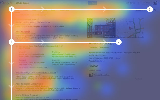
The human brain scans images much faster than text. This makes sense, as our visual systems are just giant image recognition systems evolved to scan a constant stream of images for important patterns (a predator, a fruit that isn't poisonous). As a result, familiar images don't have much cognitive overhead. Reading text however will generate much more load, as you are processing multiple images and putting it all together to figure out what the text says. On a web page the user will not read (or even notice) every detail on the page. Rather their eyes will scan (top to bottom, left to right in western cultures) without reading more than 1 consecutive word until something that might be what they were looking for catches their attention.
Your job is to make scanning easier, so put the icon where the user will see it first (on the left in western cultures). If you don't have an instantly recognizable icon for something then put the most informative word first.
Icons first and text after.
Read more here: Should Arrows be Placed Before Link Text or After to have a better understanding some reasons behind it, although the icons might be different but certainly serving the same purpose.
You can see from Apps like Google Mail

Great question! As you correctly assumed, icons can be used to improve site navigation speed, as web design is a search problem.
The Nielsen Norman Group's eye-tracking research claims that users tend to scan a web page in an 'F' pattern-horizontally first (the F's top bar), down the page a bit, then a short horizontal distance (the F's lower bar), to finally scanning the left side of the page vertically.
 F-shaped scanning derives from the users' desire to minimize their interaction costs, which inadvertently increases their chances of missing potentially important information. Good design will reduce F-shaped scanning and any other scanning patterns.
As web designers what approaches could we use to make discovering important information innocuous for the users?
One effective approach is the mindful use of iconography.

Icons serve as effective visual aids. An icon placed before a button text will save users the cost of reading further than they desire, thus improving their ease of page scanning and ultimately contributing to a pleasant experience to their session.
However, there is a caveat (there's always a caveat). Icons that come after text are not always purely decorative, but are status indicators on labels or are explicit signifiers on CTA buttons.

*A great rule of thumb that's helped me is to think of icons as bullet points. Both share some similarly important purposes:
My opinion on this is that it is better to have the 'fixed width' element (the icon) on the left, this means that if your interface contains several of these buttons atop each other the icons will line up nicely assuming your buttons are left aligned.
This will allow users to quickly scan over the area and identify what the buttons do without having to read the full text. On the other hand if you place the icons on the right users will have to scan over the whole text anyway to find the icon, not only will this take longer but makes the button moot in the first place as an aid in speeding up recognition of the button's function.
There is a point regarding right to left languages focusing differently on interfaces, however if you wished to customize for these languages properly you would want to make the whole layout based around right aligned elements instead of just moving icons across a button, in effect there are more issues involved and you may be best crossing that bridge when you come to it.
Unless you have the resources to conduct your own Human Computer Interface research, your best bet would be to follow the Institutions who have the means to conduct such research. Google's Material Design is one of the best resources on the topic, and they put the icon on the LHS:
Example from the sample page:
Also keep on mind your two types of users: new and returning. Sometimes, it is returning visitors are more likely to benefit from an icon. For example, when I pull up Google maps directions, which I do often, I have learned to look for "mode of transportaton" icons. There is no text, but if there were, having it in front would be disruptive. A lot of Google's UI innovations optimize for the long term, require initial learning but then are very efficient.
I would recommend using one or the other but not both. However, if you are set on using both, I would, as others have suggested, consider the cultural reading order and place the icon in front of the text. In english it would be on the left, and in say Arabic it would be on the right.
Icons, in my humble opinion, should serve the purpose of foregoing the user reading text, allowing them to be more productive. This is why the quicklaunch buttons in Microsoft Office Applications (and others) work, even without text. The assumption is that the disk icon will save, the curly arrow left will undo, the curly arrow right will redo, the printer icon will print the displayed document and the magnified page will preview the document.

Keep in mind though, this only works if you use the icons in the context that they are commonly understood. If a user clicks the printer icon but something other than printing occurs then the icon isn't used correctly and your users can get frustrated.
If you are using icons to simply make the user experience feel more "pretty" and productivity isn't as important, then I would say image before text, any other time, I would suggest one or the other.
In english and other left to right (LTR) languages it makes most sense in having the icon first.
The icon on the left is also a very common pattern among most software, if you think of it as a "bullet point" for the label, it becomes a simple way that draws attention to the button and is more recognisable for the user.
For example a user wants to print, they see the print icon and without reading the word - they click print. Where as if you had the icon last, they would scan the button ltr and read the word then seeing the icon taking more time.
If the user doesn't recognise the icon, they will see the icon and then read the word - and after multiple use would become to recognise that icon becoming faster in selecting that action.
We ought to remember that we are visual beings, we associate better with pictures and colors rather than text. So, icons shouldn't just be cosmetic enhancement when used in buttons. The icon should be obvious enough for users so that they could easily recognise what that button does without even reading the text.
So, based on the theory above, I believe that icon should be the primary focus of the button and hence should come first.
And do notice that on some responsive websites, texts inside the buttons are hidden after you resize the browser to certain width.

download bmml source – Wireframes created with Balsamiq Mockups
If you have to read the text first before you get to the icon, then there's really no need for the icon.
(Put the icon first)
From a graphic point of view, if you have the icons before the text, then the button will be heavier on the left side and will be unbalanced because:

By having the icon after the text, and filling in the space between the text and the icon with space, you will have a more symmetrical look. The heavy weight of the icon will compensate the asymmetry posed by capicalization (left-side heavy, right-side light).
