3

It seems like many websites go to great lengths to make the logout link/button very difficult to find or click on. For returning users hiding the logout link/button doesn't make sense because they already know where it is, so unless it keeps getting moved around I don't see the value it making it difficult to access.

For new users, it would be frustrating not to be able to locate the logout link/button, especially if the application is looking to create a good user experience and trust with the users.

Is there an actual practical consideration for doing this from an user experience point of view? What is the functional or business purpose for implementing this style of design for the logout interaction?

3 Answers 3

3

Warning: This is an opinion and have no way to demonstrate the validity of the answer other than the Duck Test or Occam's Razor.


It's not that they don't know what they're doing. They did have easy to find logout buttons before. Now they don't, for what it appears to be another chapter in corporate wars

The whole philosophy behind this is to keep the user as a hostage so to speak. With the new trend of social media login, now you can choose to login with several different services, such as Facebook, Google, OpenID, and so on. Now, when one of these services allows you log out, they literally let you choose what to do, when they could have you signed with their service for any other 3rd party. Thus... they make it hard so you use their service instead of competition's one.

This could be easily tested... here at StackExchange Network (btw, do you know how to logout from UX.SE?). See options below: enter image description here
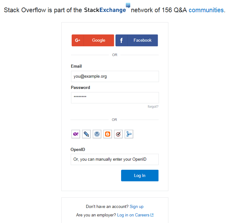
As you may see, there are many ways to signup, being Google and Facebook the main ones, a regular account the secondary one (creates an account on StackExchange Network), then OpenId and some small buttons as last resources.

Now, based on feedback from one of my employees who tried to create an account on one of the SE sites (specifically WP.SE), I did a test a few weeks ago: using a computer from which I never visited any site at SE Network, using Chrome, I tried to signup while I was logged to Google. Again: I signed to Stack Exchange Network.

After that, I got redirected to a page letting me know that I needed to check my email to confirm the account. I did it and when clicking the link... got a 404 page. Tried 3 times with different mail accounts and username, always the same. However (as I expected since my employee told me about that), when I visited the site I had my account... only that it grabbed my data from the Google account. Nice, huh?

And Google is not alone. You have probably seen many signup/login instances where the site asks you if you are [Facebook User] or [Google User] or [Twitter User]. And if you check the Terms and Conditions of such login services, you'll see they basically own your data and your information and whatever you do while signed. So they basically own your information, which is the main asset for their business. Simple as that.

Now, in terms of usability, ask yourself: is this dark-pattern preventing you from using Google or UX.SE? Maybe. But this is a number's game, and reality is most people might be annoyed, but they won't give up their mail or social media accounts. They're used to the invasion of their privacy, so this means absolutely nothing


end of humble opinion

1

There are two reasons why some websites make the logout button difficult to find:

Ignorance - for example designed by an engineer who doesn't know about user experience.

Deliberate - for example this is dark ux pattern, deliberately designed to confuse because it benefits the company in some way.

However in the situation you describe this does not sound like it is Deliberate, because I cannot think of how this could benefit the company in any way, so I am assuming this is either user experience Ignorance or an inexperienced UX Designer, e.g. there are many inexperienced UX people coming into user experience at the moment just because UX is in high demand right now.

3
  • 1
    Can you say in which category Google belongs with their hidden logout, please? And if it's deliberate (I suppose so), what is the benefit on Google's side?
    – yo'
    Commented May 5, 2016 at 11:14
  • I just checked Google. I am only guessing that it is deliberate, because it is Google, but the motivation either to them or their users is not clear to me. Perhaps the motivation is altruistic, e.g. they automatically log you out when the browser is closed, thus saving you some effort of manually clicking Log Out. Google are obsessed with keeping things simple and clean.
    – SteveD
    Commented May 5, 2016 at 11:39
  • It's the other way around; they never lock you out, even for weeks. It's really something I'm yet to understand (and one of the few things I hate about them).
    – yo'
    Commented May 5, 2016 at 11:48
1

I like Splatz answer, but I'd like to add why some deliberate attempts make sense:

The logout function is not that used on some websites, such as some email providers. Lots of users only read their emails at home on devices they trust, so they never logout. When using a public device they use the private mode of the browser they're using, so closing the tab or window is easier than finding and clicking the logout button.

About the effect on the user experience, just like you said, it would degrade if the user wants to logout but can't find the button. As is often said in UX experience groups, "If your users can't find a function, it doesn't exist".

About the practical reasons, if you know your users won't use that function frequently, hiding it in a menu (for example) gives you free space that you can use to add new buttons that your users want or to make the interface "cleaner".

Your Answer

By clicking “Post Your Answer”, you agree to our terms of service and acknowledge you have read our privacy policy.

Not the answer you're looking for? Browse other questions tagged or ask your own question.