1

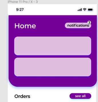
I'm designing an app aimed for older generations. In that sens, I've decided to use a text button instead of an icon button for the notifications. I find it easier to identify what that button do if it is written.

I find it quite interesting as it matches my other buttons such as the (see all) button.

Is this a good choice? Are there any guides I should follow to understand readability of buttons? How to differentiate between generations of users.

screenshot

1 Answer 1

1

Different types of users will find it easier to pick up or read things differently, and so if your app is directed at a specific audience or particular needs, then you might find that you should cater more for their requirements. It might not necessarily be true that older users prefer text over icon (or vice versa), since there could very well be other factors at play.

Having said that, since both text and icon alone have their downsides, if you were to use both then changes are you will most likely improve the readability of the buttons. This will of course also depend on the choice of your button label (which should be consistent and have the right tone of voice) as well as the choice of icon paired with the text.

Your Answer

By clicking “Post Your Answer”, you agree to our terms of service and acknowledge you have read our privacy policy.

Not the answer you're looking for? Browse other questions tagged or ask your own question.