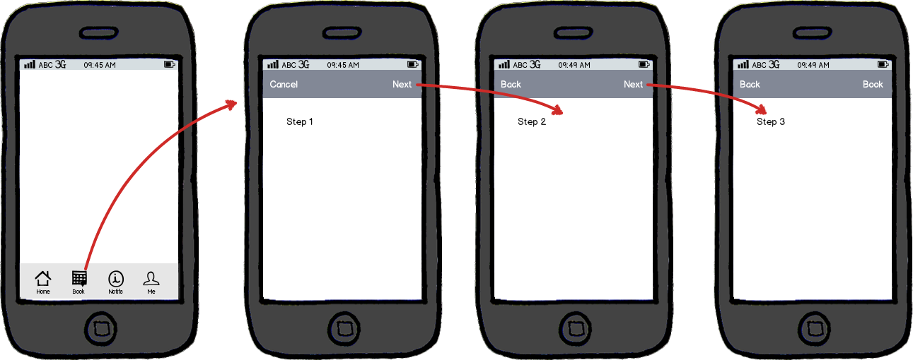
I'm having a bit of dilemma here.
As the user moves through the different screens in my booking wizard below, I'm a bit worried about the buttons at the bottom of the screen, how can I standardise or add some consistency to the buttons on each screen.
For example, the user should be able to cancel the booking at any point, but the moment they can only cancel the booking on the third step.
Can you suggest any improvements I can make?
Note that on the 3rd step - pressing the pencil icon allows the user to jump to either stage 1/2 to make the necessary changes.

Also, you might notice that I've kept the tab bar along the bottom, another issue I'm worried about is that a user might inadvertently tap an icon and unwittingly abandon their booking process. Generally, checkout / booking forms can be focused experiences, so should I remove the app-wide tab bar along the bottom? How would this change the wizard style form?

