2

I'm building an online quote tool for pretty detailed products (referred to as models). Each model has a lot of different options. The quote will be filled out using a wizard. Each model on the quote get's it's own tab where the user selects the options on the model. A user can add multiple products to a quote by clicking the + tab (or by clicking Add Model button on the bottom of any model tab).

My question is about the quote totals. The users may want to see totals for the entire quote and/or just a specific model. Currently I'm planning to show these as floating totals boxes above tabs, but I'm not sure this is the best way. I thought about putting them in a right sidebar (maybe a collapsible one?) I'm looking for UX feedback on this design.
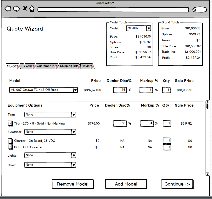
enter image description here

Based on suggestions I have moved the totals out into their new window (a dialog) and only show the grand total on the screen. By clicking on the grand total you get the modal window with the breakdown of pricing for every model as well as overall grand totals. Is this a step in the right direction?
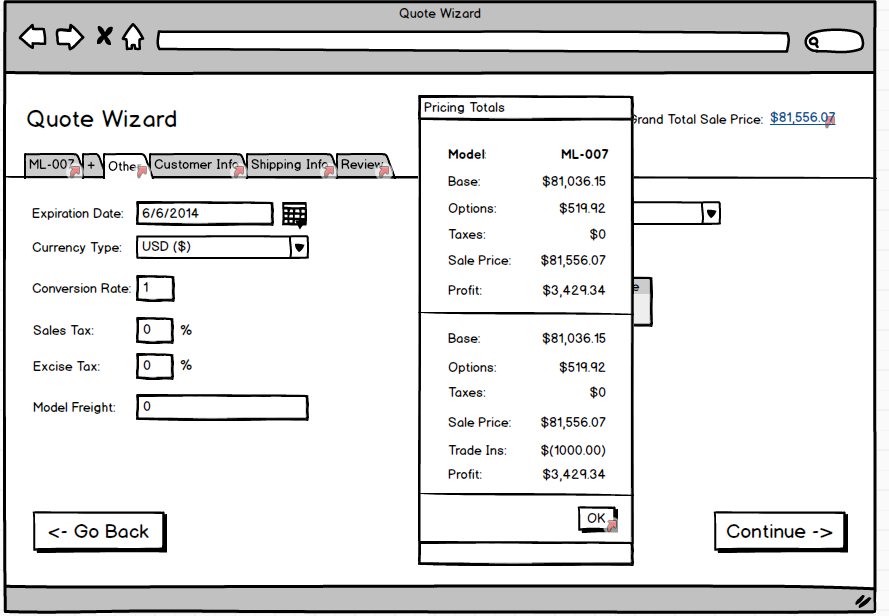
enter image description here

1 Answer 1

2

Perhaps looking at this for the first time, the screen seems overwhelming. Without actually knowing what you are selling though, I would suggest looking at car sites for this sort of thing. If you do a build your own on websites like Chevrolet.com you should certainly be able to find a much better user experience.

However if you want to work with something like this what I would suggest is the following:

  • Make totals float on the right or perhaps above. Do not show the details, just show the total. Allow the user to click on the floating object to see the details.
  • Improve the add model / remove model flow. Use that current screen to show the list of all the added models with the totals on the right (that includes the options) and then at the bottom of the list show the total for the entire order. If they want to update options they can click on each model to update them.

The idea is to limit what users can see and interact with at a time. You can show all the details and options when they are on the confirmation steps. I've found that the best user experience comes from services who limit the amount of interactions to a few things on each screen. Of course you don't want to bombard the user with additional steps. A few extra steps will improve the UX and in many cases the UI to make a far cleaner and easier to use one.

8
  • A single model may have 20+ equipment options. I'm not sure if scrolling to the bottom of the screen to get to the model totals is practical. Equipment options must always be selected for every model, and every model has a set of unique options and unique categories. Equipment options is really the main meat of the application, which is why I put them on the first screen of the wizard. Not sure I'd want them to have to expand a model or do something to uncover the options. The totals boxes I could just show the total for each and hyperlink it to a modal that shows the details. Commented Apr 28, 2014 at 18:11
  • I moved the totals to a dialog window. Does this help the UX in your opinion? I think it definitely does clean up the wizard screen. Commented Apr 28, 2014 at 20:03
  • The reason I suggested making it hover "like it is coming out of the right side" is that if you are scrolling up and down, that total will always be visible, but not sufficiently in the way. The modal is certainly an improvement though, my only concern is that it would be lost once the user scrolls down. Commented Apr 28, 2014 at 20:07
  • As for the options. The reason I made the suggestion is that it would work more like traditional websites we encounter every day. We are used to navigating through products, we find one that we like and then we "add it to cart". The only different here is that when you add to cart, you are asked for the options before it is added. Though as I said without knowing your product, it could be hard for me to make good recommendations. Let's see if we can solve the totals problem first! :) Commented Apr 28, 2014 at 20:09
  • So instead of the grand total at the top there would be a floating box somewhere in the right area of the screen that would be expandable? Something like an accordion? I do like the idea of keeping it on the screen. Just trying to visualize your implementation. Thanks. Commented Apr 28, 2014 at 20:42

Your Answer

By clicking “Post Your Answer”, you agree to our terms of service and acknowledge you have read our privacy policy.

Not the answer you're looking for? Browse other questions tagged or ask your own question.