1

This is a basic question from a programmer who would like to get the design 'right'.

In the example Twitter Bootstrap, where would you place the 'failed login attempt' message?

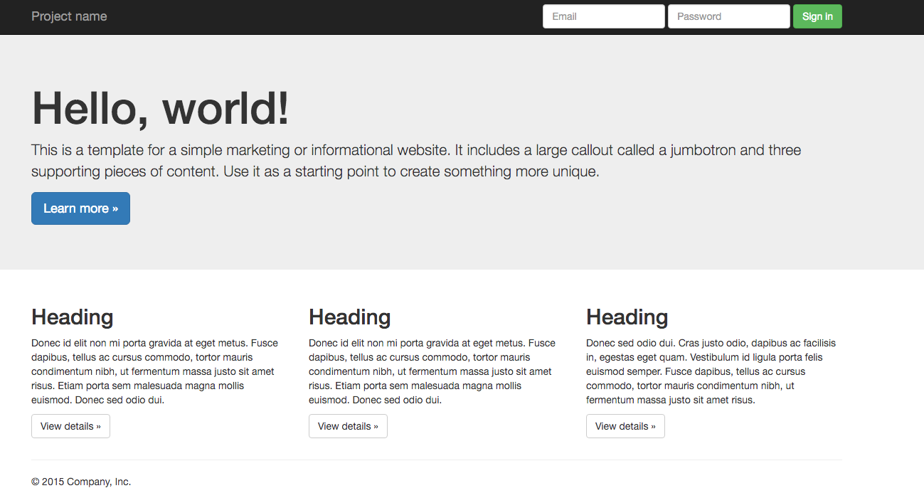
Here's a link to the basic example, http://getbootstrap.com/examples/jumbotron/, with the login for top right.

It seems to me the options are:

  • In a javascript alert, but this requires additional user clicks
  • In a new page (after redirect), but this seems unnecessarily complex
  • Beneath the login form (in the header). This seems the most natural place to put it, but would mean increasing the height of the header for a single element

I guess the question is... Where would Mark Otto put it?

Sorry if this is not very relevant.

2 Answers 2

2

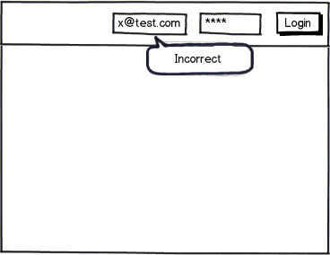
How about something like this. This makes it clear what went wrong (well, not my dummy text) and does not get in the way of the two fields or the input button. I am using a tooltip for the error message.

mockup

download bmml source – Wireframes created with Balsamiq Mockups

1
  • 2
    I agree with this solution, although for security reasons I wouldn't show which input is the wrong one (I'd show the dialog below the button instead).
    – Yisela
    Commented Sep 10, 2013 at 1:23
0

If you're not going to indicate which field is the source of the error, I would recommend doing a more global style alert above the header in fact. Also, make sure the error messaging is friendly, and clearly describes what happened and how to recover from the error. Also provide a forgot your password link in the message.

Something like this:


We're sorry, it seems the email password combination you entered is incorrect. Please try again. Forgot your password?


enter image description here

Your Answer

By clicking “Post Your Answer”, you agree to our terms of service and acknowledge you have read our privacy policy.

Not the answer you're looking for? Browse other questions tagged or ask your own question.