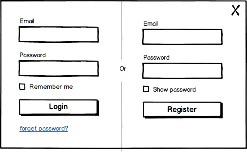
They should be two separate calls to action as people will have a certain term in mind when looking to login or register.
The two things are not identical in the mind of the user, even if they are very similar in terms of functionality. So label them Log in & Register, or Log in & Create Account, or Log in & Sign up, but beware Sign in & Sign up can be confusing side by side!.
Regarding the use of links versus buttons - links open pages and buttons make an action. Clicking something to open a login or register form should be a link not a button.
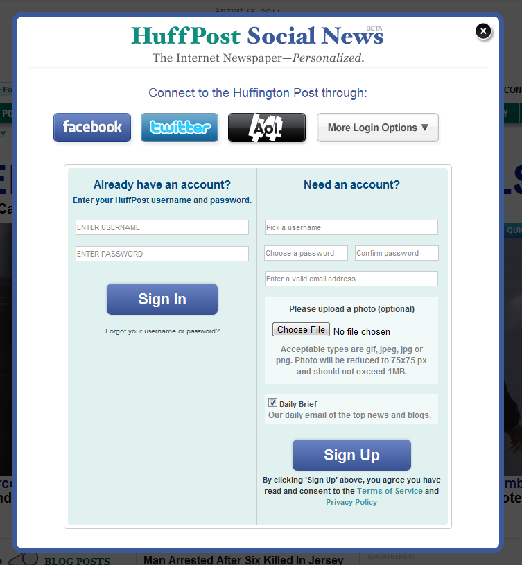
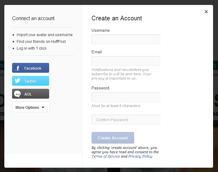
Having the login and register forms side by side is not the norm and I would say is being moved away from rather than towards. For example Huffington Post used to have a Log In and a Create Account link going to the same place (as below), but have now split the two into simpler cleaner looking forms dedicated to the task. This is what it used to look like (with current implementation also shown further down).

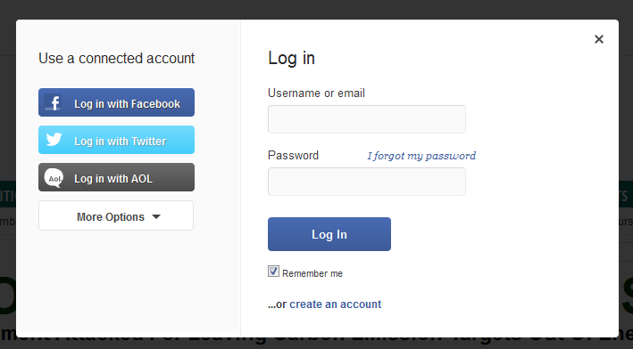
And this is what they have done now - making for a much more task oriented experience.


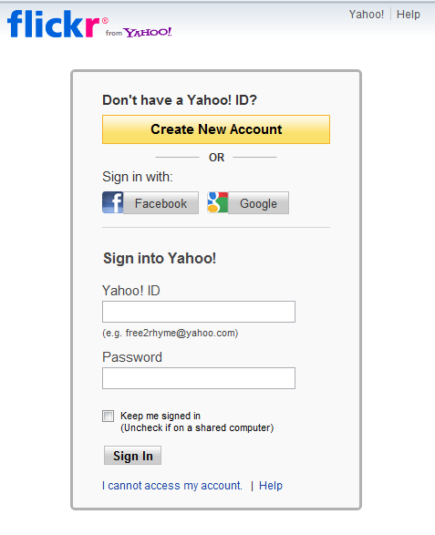
flickr's approach meanwhile is to take you to the same place, whether you click Sign in or Sign up (but note they have two separate links for this). This is probably because the user may already have a Yahoo ID, and while not having an explicit account with flickr, the ownership of a Yahoo ID means that the login or signup process is identical.
Personally I think this confuses the issue as some users may well confuse signing up for a Yahoo ID with signing up to flickr and click the big bright attractive Create New Account button anyway. This is a good example of providing too much information and too many options in what should be as simple an environment as possible in order to maximise efficiency. And that's probably what drove HuffPost to split their combined form.

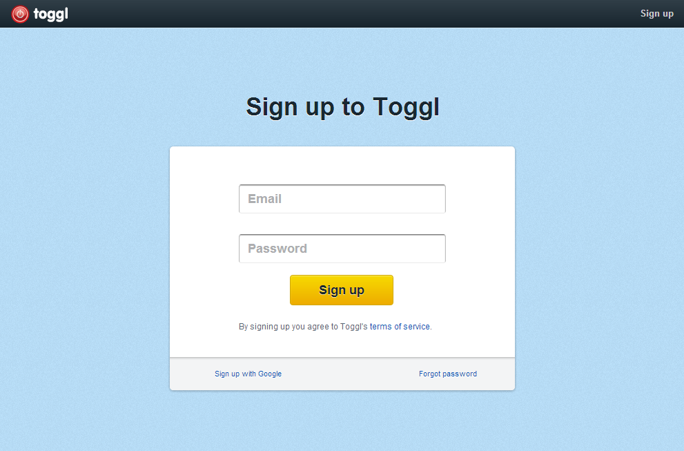
Regarding the comment below about concerns over emptiness of the form, here is one of my favourites - the signup form from Toggl. I have absolutely no qualms over the simplicity of this look. I love it.
