2

First I will introduce myself by saying that I am not a web designer and non native speaker of English, so I apologize in advance for my bad designing explanation and English.

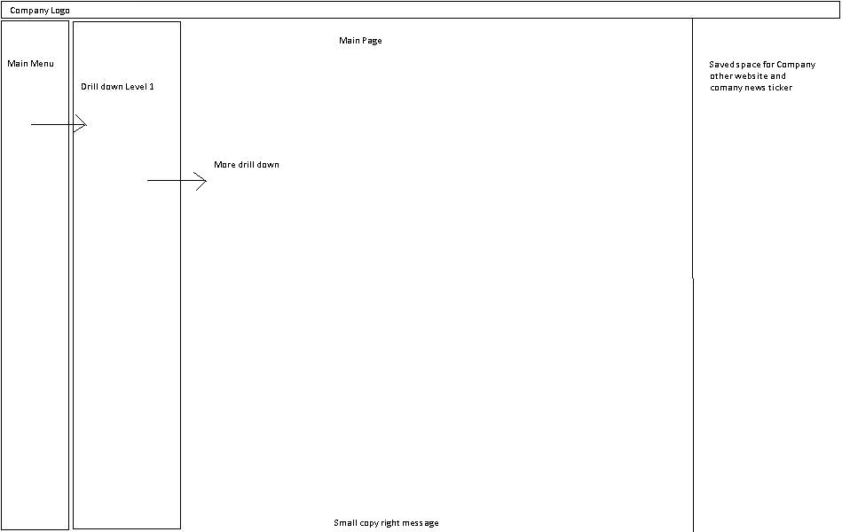
Actually, I am developing a company website which has massive amount of data (in different division to be shown up in one page). I have come up with a design to show the data which is shown below:

Some points:

  • Above menu and below copyright message is company specific and I have no other choice but to keep it.
  • Main menu will show domain and once the domain is clicked it will show different departments under that domain. and after that if the department is clicked it's information will be shown up on the main page.

My problems:

  • As one department have many information to be displayed which includes Company News, Event information, Blog entry preview of CEO/CFO/CXO, Pictures, Video.. etc.. which itself is a menu and can have sub-menus ex: Pictures can be subdivided into Year wise event or News can be sub categorize as date wise.

But I have left only "Main Page" section to show all these things

  • Is there any better way to represent the same architecture?

I am sorry for the dirty design representation, I don't have any other tool rather than Microsoft Paint :)
enter image description here

I will be pleased if you can also redirect me to some template which has markup ready for this kind of scenerio. just hoping my luck

3 Answers 3

2

Congratulations. As you design the UX, you have just become a UX designer! :)

Seems to me that you should approach it like this:

In fact, you are going to build a bunch of sites that will be very similar. Of course they will be customizable and from the visual perspective the arrangement of some specific elements will be different, but still, looking at the functionality they will be quite similar.

I would approach it on alittle bit different basis. If there are two levels that lead you to one of the sites itself, and (correct me if I'm wrong) users will rarely switch from one department to another, you can hide the navigation between the sites as much as possible. Meaning that you don't have to have it displayed all the time in expanded way.

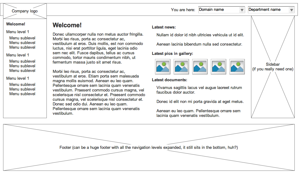
Thus, you can use dropdowns for it, hierarchical ones, put in the top right for example, just at the same level where you have the branding:

enter image description here

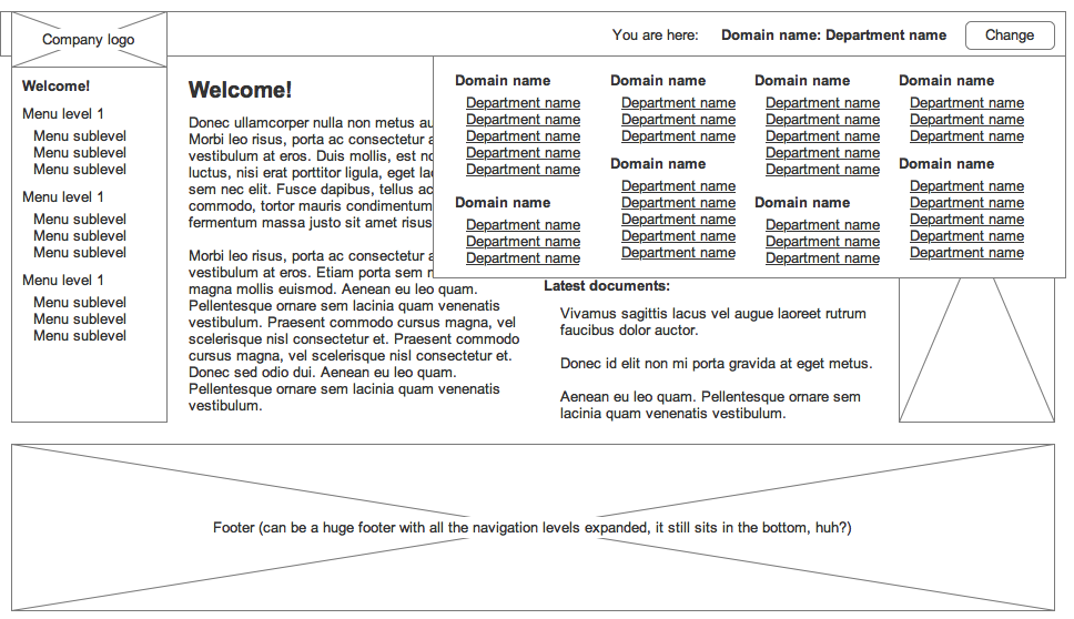
Or, you can trigger a big area including already the two levels:

enter image description here

Of course, there may be very specific things for you to consider, but in my eyes this is a quite reasonable solution.

Two more things for you to consider:

  • you are planning a big and complicated system. It is bad that (with all respect to your engagement) no dedicated, experienced UX designer is on this project. There ARE many black holes in this interface idea (not that I can see them, but there always are, the more the system is complicated the worse). Try to convince the board of directors to use some UX help. You can show them my post :)

  • from the very beginning consider using a flexible grid system (learn about it, they are well described). The power between them is that they are prepared for content division into 2, 3, 4, 6 and 12 straight from the box, and this is very helpful when you need to shuffle content, which is just tailored them for such shifting. The ones I am speaking about are: 960 grid system (http://960.gs/) and 1140 grid system (http://cssgrid.net/) - for using the latter just make sure that all the screens in your corpo are not narrower than 1200px. It will let you fit more content on the screen.

0
2

You can go for a tree menu (folding with minimum indentation)

Existing problem resembles Xp Classical menu(http://cdn3.blogsdna.com/wp-content/uploads/2009/07/windows-7-classical-start-menu.jpg)

Try something like Win7 Tree menu (http://lee-soft.com/vistart/Start-Menu.jpg)

1

If the menu is too deep it is going to be a problem to display. Maybe do like Ikea. Keep the first 2 levels on the side bar but then use the main area to drill down into other content.

If that is still a problem, think about the use cases for the page. Maybe you could have a dashboard instead of a menu.

Your Answer

By clicking “Post Your Answer”, you agree to our terms of service and acknowledge you have read our privacy policy.

Not the answer you're looking for? Browse other questions tagged or ask your own question.