52

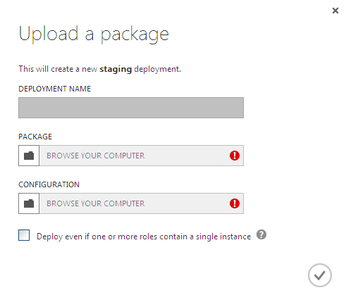
Here's how Microsoft new Windows Azure portal elements look like:

new portal

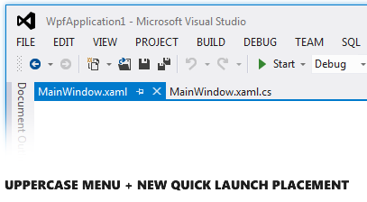
and that seems to be "Windows 8 style". Visual Studio 2012 also has plenty of user elements in ALL CAPS.

For dozens of years ALL CAPS was considered yelling and just bad style and now suddenly ALL CAPS is everywhere.

Is there any research about how ALL CAPS is good or bad in UI and how it got into Windows 8 UI in such quantities?

5
  • Related or even a duplicate - ux.stackexchange.com/questions/11043/…
    – ChrisF
    Commented Jun 8, 2012 at 11:22
  • 9
    The attitude that caps cannot be used as it is perceived as shouting is redundant. Yes this is how it used to be but if you look on websites from the past 5 or 6 years you will find a lot of caps used for titles and navigation systems and is not used as a means to shout but used int he form of direction. It is not a new process in this internet age. Commented Jun 8, 2012 at 11:27
  • 1
    @adriennemarie Exactly! Caps in the sense of messaging or email can be seen as shouting, but this is only in conversational contexts. This argument should not be applied to every other use everytwhere. Commented Jun 8, 2012 at 16:14
  • Just as iTunes changed its icons to a grayscale scheme to help fade back and distinguish themselves from the main content, it appears that Microsoft is doing the same here. By using all caps for user elements in VS 2012, it is distinguishing the VS interface elements from the project's specific content. Commented Jun 8, 2012 at 16:21
  • Context is important here. SHOUTING MAKES SENSE IN THE CONTEXT OF DISCUSSION/CONVERSATIONS. Not so much in field labels. Not sure I agree with the aesthetic definition to go all caps but, well, that's MS for you.
    – DA01
    Commented Jun 13, 2012 at 1:19

3 Answers 3

29

For two main reasons,according to Microsoft posted 3 days ago:

We’ve chosen to use uppercase styling in the top menu for two main reasons: 1) to keep Visual Studio consistent with the direction of other Microsoft user experiences, and 2) to provide added structure to the top menu bar area.

On the first point, the use of uppercase text is becoming a strong signature element of styling for navigation and headings in Microsoft user interfaces. You can see it in the Azure Portal, in Zune, and in the latest Bing search results update.

On the second point, we explored designs with and without uppercase styling. In the end we determined it to be a very effective way of providing structure and emphasis to the top menu area in Visual Studio 2012.

And I myself think Microsoft has made the right desicion, since it's easier to see MENU as headers than using ordinary Menu style:

Visual Studio - All caps menu

The last notion on the blog post is important. If you dislike the ALL CAPS menu, the possibility to change it will be enabled. Hopefully this option will be enabled on other Microsoft products as well.

That said, we will enable you to customize the casing, and we are exploring options for how to expose that choice. We will post again once we’ve settled on a final approach to be available in RTM.

20
  • 48
    I think that Microsoft is making the wrong desicion here. I find that all caps texts are harder to read and much harder to quickly scan, as there are no differences in character hight any more. Those differences are important for recognizing the shape. Adding slightly more font weight would have been more effective, I think.
    – André
    Commented Jun 8, 2012 at 11:43
  • 3
    @André not necessarily because of character height; probably more because people are less used to all caps: ux.stackexchange.com/a/11053/7627
    – Zelda
    Commented Jun 8, 2012 at 12:59
  • 2
    @André Even if ALL CAPS is harder to read according to Wikipedia references: en.wikipedia.org/wiki/All_caps "Studies have been conducted on the readability and legibility of all caps text. Some 20th century scientific testing indicates that all caps text is less legible and less readable than lower case text." Still, this applies to longer text sections - where you have a certain flow in the text. In this case it's targeted for headers only, and not aimed at continuous reading. That makes the difference. If it were a longer text section with ALL CAPS I'd agree with you. Commented Jun 8, 2012 at 13:03
  • 10
    So, it sounds like they're doing it to be consistent with other current MS products - but they don't detail why they initially made this decision in the first place. "We want to be consistent with ourselves".
    – JonW
    Commented Jun 8, 2012 at 13:45
  • 6
    And I thought they did that in VS 2012 because the guy doing the menus had his caps lock on :-) Commented Jun 8, 2012 at 22:57
22

Caps are an effective way of introducing visual hierarchy without increasing point size or using bold. All-caps can make small text seem more important or conceptually higher in the hierarchy than larger text.

Metro, being highly typographic, requires designers have a significant degree of freedom to express visual hierarchy without resorting to colour or other factors older, more conventional design languages might use, so text case (all-caps, all-lowercase and sentence/title case) becomes one of the most useful, flexible tools in its arsenal.

In Metro (at least in Windows Phone 7), all-caps text is used for text that is higher in the logical hierarchy but less important in the context of a given activity (things like the app's name which is important and logically the "parent" of all the screens inside the app, but itself as useful to the user while they're using the app as the screen names). For example, here's Evernote for WP7:
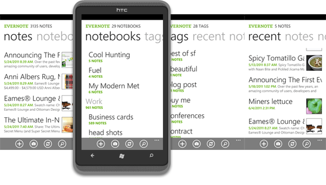
A screenshot of Evernote for Windows Phone

Image taken from theappnews.com

…and here's the way it's used in the Windows Phone Marketplace app:
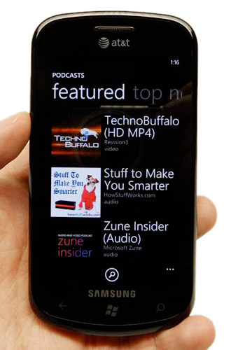
Windows Phone Marketplace app showing the Podcasts download interface

Image taken from PCMag.com

2
  • 4
    You do realise that in the two examples you've shown the menus are actually all lower case and not all caps don't you? So you've confirmed by your own example that all lowercase menus are more pleasant to look at than all uppercase menus and are more typical of the user experience
    – user28381
    Commented Mar 12, 2013 at 13:39
  • 3
    @Clara: the question was about elements being in all-caps. My answer shows two valid examples of all-caps text used to show hierarchy. There are also no visible menus in either of my examples. If it helps, let me say outright that I think Microsoft has done a pretty terrible job applying Metro to Visual Studio.
    – Kit Grose
    Commented Mar 12, 2013 at 21:15
17

Thought this was funny ... someone has already created a hack to turn the visual studio ALL CAPS Menus back into lowercase. (I realise Microsoft have said they will expose this functionality themselves... but this demonstrates someone with a level of urgency).

The point here is that many people really find ALL CAPS hard to read and/or aesthetically painful (despite Microsofts attempts to increase spacing between the Menu items).

This is backed up scientific studies by Colin Wheildon and others. As the Wikipedia entry on ALL CAPS puts it: "His conclusions, based on scientific testing in 1982–1990, are: "Headlines set in capital letters are significantly less legible than those set in lower case.""

Headlines must generalize somewhat to Menu's. I would guess Microsoft must have done the user testing to see how it works in menus.

Can't find any references to them yet but I am sure others will be doing tests more publicly soon. Would be very easy to test now that you can show versions of Visual Studio with and without ALL CAPS. Just see how quickly a bunch of users find certain menu items et voila.

Fascinated to find out.

Visual Studio with lower case menus Visual Studio with ALL Caps menus images from here

1
  • 4
    That's an interesting point: in the Windows Phone examples I linked in my answer, the all-caps text is non-interactive; it provides contextual information only. It's also generally not shown together (as in a menu) which reduces the need to scan a block of text. Metro as a design language is more than simply visual; traditional menus are going to feel out of place in a Metro world no matter what. All-caps menus as a hat-tip to Metro seems like an odd decision. The more "Metro" decision would have been to all-caps "VISUAL STUDIO" only.
    – Kit Grose
    Commented Jun 13, 2012 at 3:10

Your Answer

By clicking “Post Your Answer”, you agree to our terms of service and acknowledge you have read our privacy policy.

Not the answer you're looking for? Browse other questions tagged or ask your own question.