2

My interface has a table (a nice, sortable table with 3 or 4 columns), which represents the summary of some data. Each row represents an important piece of data.

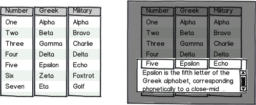
At the moment if users click on a row I create a new div (at the bottom of the page) providing additional information about the row they have clicked on it. The row also changes its look becoming a bit bolder. I also scroll the screen to the newly created div.

This works but I don't think it provides a very good UX.

One solution would be to expand the row within the table, however this is not easy to do for various reasons (the table is a 3rd party component and does not allow it, even if it was allowed scrolling would become very confusing).

Can anybody suggest a better approach than this?

1
  • Is it possible to insert a TR just after the one which is clicked? I'm asking because you can obviously listen/act on click events.
    – Amit
    Commented Jan 21, 2013 at 18:46

3 Answers 3

1

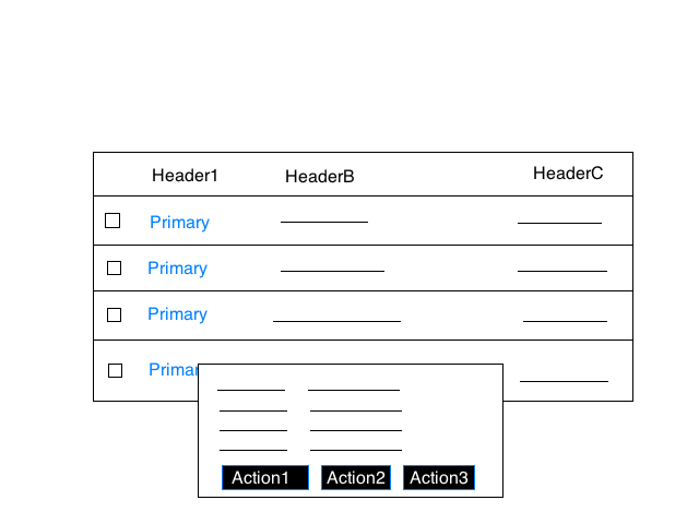
If it is not necessary to show details for multiple rows at once, then one possibility is a faux-modal dialog. Put an overlay on the screen with the details of the clicked row. Clicking anywhere off the overlay dismisses it. This also gives you an easy spot to put row-relevant buttons (delete, edit, etc).

The overlay should appear over and correspond with the clicked row, to have an obvious visual connection with it.

mockup

download bmml source – Wireframes created with Balsamiq Mockups

I did not put it in this mock-up, but you should also have an explicit button to dismiss the overlay, even if clicking anywhere off it removes it.

2
  • Thanks a lot. However as you also pointed out there is one big disadvantage: you can only show one detail at the time. This is better than my solution because it's much more intuitive.
    – charles
    Commented May 11, 2012 at 13:58
  • This is exactly what I was thinking. @charles it sounds like you're attempting to put the focus on a single row's content anyways if when you click on the row item, it auto-scrolls for the user to the new content. However if you wanted to display multiple items in the popup, you could add an button to your grid, something like "View Details". When the user selects one item, it automatically invokes the View Details command on the single item, whereas if a user selects multiple, then clicks View Details, they get all the selected items in the modal dialog.
    – GotDibbs
    Commented May 11, 2012 at 14:34
0

Details information at the row below is outdated model and also it looks odd.

You can show all the information in the mouse hover (using DIV) of row (OR) you can show the details icon for click action to show more information.

If you show the mouse hover for the row, you can add some primary actions also like "details, add note, add payment, add credit etc...."

Example of hover control

@charles, anyway if you use swipe DIV below the row, you can show only one detailed information at the same time.

better you show the maximum details in the list (column wise), then you can hide the others.

Point2: If user move over the row one time, then they will know about hovering.

4
  • 1
    You should never have clickable buttons on a hover control... that interaction for clickable hover controls is almost always bad, especially for people with poor motor skills (such as the young and elderly). Commented May 11, 2012 at 12:56
  • @jelumalai Thanks. Showing things on the hover is okayish. However it fails me in two ways: 1) I can't hover in two places at the same time. 2) hovering over a row without moving away requires some skills.
    – charles
    Commented May 11, 2012 at 12:58
  • @charles, anyway if you use swipe DIV below the row, you can show only one detailed information at the same time.
    – jelumalai
    Commented May 11, 2012 at 13:23
  • @jelumalai if I go to the DIV below I can show all its information and depending on its height many of the divs...
    – charles
    Commented May 11, 2012 at 14:21
0

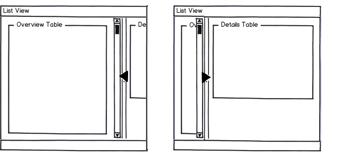
Another possibility is a second panel that you populate then display. Selecting items by clicking them displays them in a mostly-offscreen panel. Clicking the panel divider brings it to the front, obscuring the primary screen and displaying the details of the selected rows. This is a bit more confusing to users (they can get confused over how to display the panel, or not even realize there is one), but has the power to show multiple items at once which a simple overlay does not.

mockup

download bmml source – Wireframes created with Balsamiq Mockups

Having the second panel mostly offscreen allows the user to see the activity (the edge of the details appearing) as they select rows, providing feedback as they make selections, and making them interested in that edge of the screen. If it were completely offscreen, they would have less reason to explore and discover how to display the details panel.

2
  • Your idea is not bad at all. I had thought of that to be honest but I have never seen it before and I am not sure if it provides a good user experience. In fact I think it looks very unfamiliar to any user.
    – charles
    Commented May 11, 2012 at 16:52
  • I agree; it would require testing to see if it works well. I still believe my other recommendation is better, despite only being able to select one at a time. Commented May 11, 2012 at 17:15

Your Answer

By clicking “Post Your Answer”, you agree to our terms of service and acknowledge you have read our privacy policy.

Not the answer you're looking for? Browse other questions tagged or ask your own question.