11

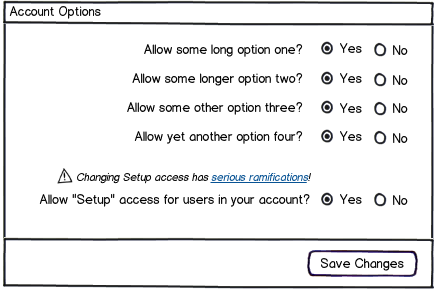
We have a form with a bunch of options that impact how our service will work for a given account. Most of them are positively-voiced questions ("Allow this to happen?"). There is one option that prevents users in the account from being able to change their own settings. We want to discourage the use of this as it significantly reduces the value of the service to the users of that account.

I'm trying figure out if this should be a negatively-voiced question (left-hand option) or a positively-voiced question (right-hand option). I know negatives are harder for users to comprehend while reading quickly. Could this "speed bump" cause the user to leave the setting at the default?

mockup

download bmml source – Wireframes created with Balsamiq Mockups

4
  • 1
    Well, visually it's a lot easier to ignore it in option two only because it's aligned with the others. Are all other options phrased as "allow X" and enabled by default?
    – Zelda
    Commented Apr 4, 2012 at 14:29
  • Thanks for your comment, Ben. The other yes/no options are positive-voice and we want a "yes" from. We do have some other settings that require a textbox response (email address, etc), as well. Commented Apr 4, 2012 at 14:37
  • If you don't want people to change this option (and apparently for a good reason), maybe you should not put this option at all. Commented Dec 20, 2013 at 10:20
  • In your first picture you could consider naming the options 'Disable' and 'Enable' instead of 'Yes' and 'No'. This should make the unwanted option appear more negative to the user. Commented Aug 13, 2014 at 2:41

3 Answers 3

13

I'm not sure you should rely on a copy change alone (or even if it worked, it may not be worth the added confusion - see @joe larson's answer). You might try instead calling out an explicit warning:

mockup

download bmml source – Wireframes created with Balsamiq Mockups

4
  • Thanks for the response. For better or worse, the question on prod now is actually written negatively. Commented Apr 4, 2012 at 15:26
  • If you went this route, I'd still recommend flipping it as I showed to be more easily understood. (With an explicit warning in place, I should think you've acheieved the desired discouragement.) Commented Apr 4, 2012 at 16:17
  • I'd put the warning on as well - but I'd also include some kind of 'Info' link on it so that admins can look up some more information on what it actually does. Warning messages should always try to 'solve the problem'.
    – PhillipW
    Commented Apr 9, 2012 at 9:00
  • @PhilipW totally agree (I almost did that in the orig mock)! Updating mockup... Commented Apr 9, 2012 at 14:26
3

I get what you are trying to do here. But if you flip only one of a long list of "Allow? Yes/No" to "Disable? Yes/No", instead of discouraging undesired behavior you'll most likely just get confused users doing something they did not intend.

This is similar to those jokes where you ask a long string of questions with a similar answer and then throw in a curve ball to get that same answer.

It's also reminds me to grocery store checkouts which typically ask "Do you want cash back? Yes/No" and then "Confirm charge of $1.23 Yes/No". Most of the time you are going to press "No" then "Yes". But this still trips me up from time to time.

This can even be a problem with a single choice. About a year ago a Java plugin update came out with some security improvements. The result was that users would load an applet which they'd been using happily for years, and a security warning would come up. The default choice was essentially "Yes", but that "Yes" meant "Yes, I want to not use this applet". This caused great confusion for users and extra work for support... Though possibly this had more to do with users reflexively barging through security warnings without understanding them than anything else [which is kind of what you are dealing with here].

So in general, I'd say the principle is first make a list of yes/no choices consistent in their positivity/negativity. Second, when possible make "Yes" mean "move forward/confirm/continue", except when it violates the first principle.

One totally different solution would be to move this question to a separate area and deal with it using a different UI control (toggle button, dropdown, etc..)

2
  • Thanks for the response, Joe. I see your point. "Quick clickers" is def something I'm worried about with this. Commented Apr 4, 2012 at 15:32
  • 1
    It's an interesting take with regards to consistency in behavior.
    – dnbrv
    Commented Apr 4, 2012 at 15:41
1

In our UI, we changed the responses to match the tone of the question: Allow/Disallow vs. Enable/Disable vs. Yes/No.

The UI itself could still be radio button/slider/(your favorite). Make sure that the default answers are "internally consistent" - i.e. most secure, most useful, etc. since when in doubt, users dont change them.

Your Answer

By clicking “Post Your Answer”, you agree to our terms of service and acknowledge you have read our privacy policy.

Not the answer you're looking for? Browse other questions tagged or ask your own question.