8

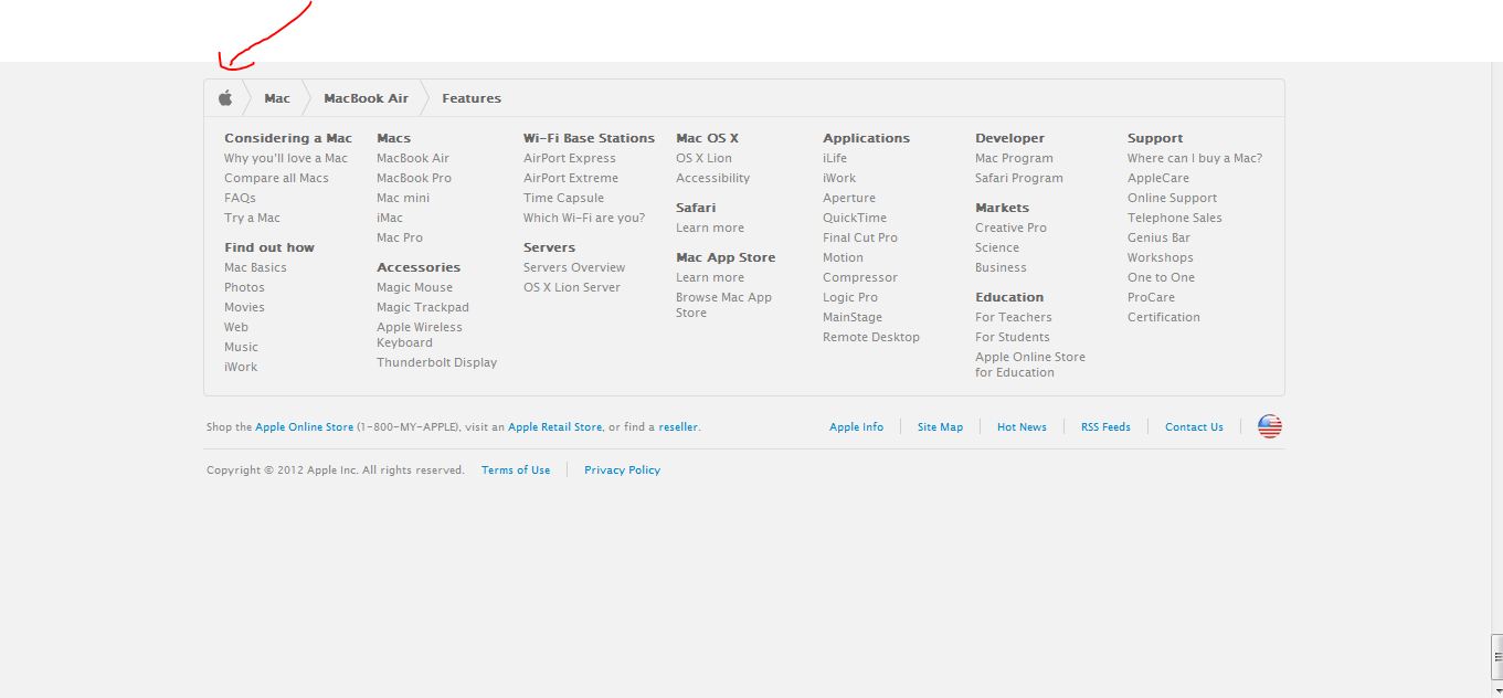
I'm a big fan of the Apple web site. However, I was wondering why they have put their breadcrumb menu in the footer. I thought the idea of the breadcrumb menu was to let the visitors to get a quick glimpse of where they are in the site hierarchy? Scrolling all the way to the bottom doesn't feel like the natural way to do it.

What is the reason for placing the breadcrumb menu in the footer?

1
  • 1
    Huh, I had no idea Apple.com even had that menu
    – Zelda
    Commented Mar 30, 2012 at 13:15

5 Answers 5

4

Looking at the site, I suspect the breadcrumbs are not to aid the navigation at the top but to give the user an idea of where he is in the site when he scrolls all the way down to the footer which is pretty large and does take up quite a bit of space below it thus taking up the whole screen space and might confuse the user about where he is in the site.

enter image description here

The top navigation of the site does have several visual aids which do tell the user where he is at any instant and hence keeping a breadcrumb there would be redundant.

enter image description here

But the breadcrumb just above the footer (as shown in the first image) would be the ideal way to quickly tell the user where he is in the site and it also blends in well with the site design.

1
  • I noticed on the example you gave that depending upon whether you are in the "Store" or "Mac" section, the breadcrumb moves. From it's traditional position of the top in the store, to above the footer in the Mac section.
    – Sheff
    Commented Mar 30, 2012 at 13:51
2

It does seem a little redundant having the breadcrumb so far down the page. Maybe it is just a question of priority? Apple decided there were already plenty of clues for the user to understand where they were, that the breadcrumb could be relegated down the page. This pushes the content further up the page and "closer" to the user.

Potentially there could be an argument that these larger footers (which become a list of links within the site, almost like a mini site map) become a secondary form of navigation and that the breadcrumb then is of more relevance next to this? As once the user gets to the footer there would generally be no indication of where they are in the site. With this combination the user can both see where they are (breadcrumb) and all the places they can go (large footer) in a single area of the page.

1

The footer doesn't have a breadcrumb so much as a mini site map.

This is usually done for SEO purposes, and since their menu uses JS-driven drop downs, may not be as easily spidered (like the constantly persistent text links in the footer are)

1
0

Apple in general seems to put more emphasis on its main navigation. This question also talks about how they have de-emphasised the search field on the main menu.

0

I recall that the breadcrumb was invented as an aid for lost users to find their way into the site. After a while it become a generally accepted recipe, something customary and not questioned, that sited should display a breadcrumb. I think that instead of having breadcrumbs, pages should not have lost users. So if the navigation is clear then the site does not need a breadcrumb but a round of Information Architecture.

IMO there are cases where the breadcrumb is valuable, like for example when navigating deep Dewey decimal categories.

That said, the screenshot looks more like a site map that like a breadcrumb. Site maps in some cases was also a solution for confusing navigation. It seems that I'm against anything ...

Your Answer

By clicking “Post Your Answer”, you agree to our terms of service and acknowledge you have read our privacy policy.

Not the answer you're looking for? Browse other questions tagged or ask your own question.