added 3 characters in body
Source Link
dnbrv
  • 13.3k
  • 5
  • 44
  • 75

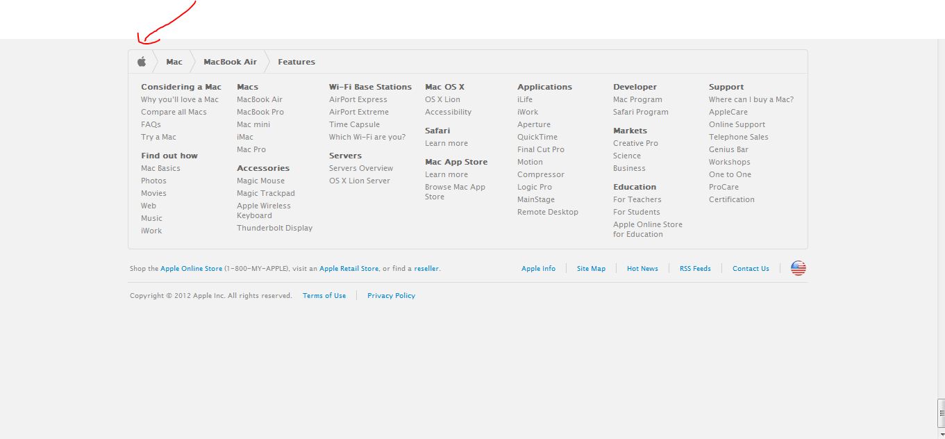
Looking at the site,I I suspect the breadcrumbs are not to aid the navigation at the top but to give the user an idea of where he is in the site when he scrolls all the way down to the footer which is pretty large and does take up quite a bit of space below it thus taking up the whole screen space and might confuse the user about where he is in the site.
enter image description here

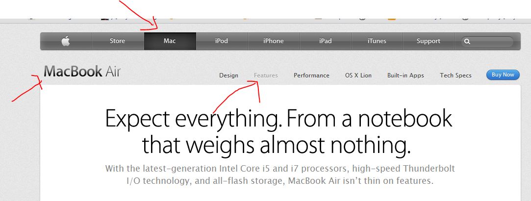
The top navigation of the site does have several visual aids which do tell the user where he is at any instant and hence keeping a breadcrumb there would be redundant.
enter image description here

But the breadcrumb just above the footer (as shown in the first image) would be the ideal way to quickly informtell the user about where he is in the site and it also blends in well with the site design.

Looking at the site,I suspect the breadcrumbs are not to aid the navigation at the top but to give the user an idea of where he is in the site when he scrolls all the way down to the footer which is pretty large and does quite a bit of space below it thus taking up the whole screen space and might confuse the user about where he is in the site.

enter image description here

The top navigation of the site does have several visual aids which do tell the user where he is at any instant and hence keeping a breadcrumb there would be redundant

enter image description here

But the breadcrumb just above the footer (as shown in the first image) would be the ideal way to quickly inform the user about where he is in the site and it also blends in well with the site design

Looking at the site, I suspect the breadcrumbs are not to aid the navigation at the top but to give the user an idea of where he is in the site when he scrolls all the way down to the footer which is pretty large and does take up quite a bit of space below it thus taking up the whole screen space and might confuse the user about where he is in the site.

enter image description here

The top navigation of the site does have several visual aids which do tell the user where he is at any instant and hence keeping a breadcrumb there would be redundant.

enter image description here

But the breadcrumb just above the footer (as shown in the first image) would be the ideal way to quickly tell the user where he is in the site and it also blends in well with the site design.

added 3 characters in body
Source Link
Mervin
  • 44.1k
  • 8
  • 107
  • 191

Looking at the site,I suspect the breadcrumbs are not to aid the navigation at the top but to give the user an idea of where he is in the site when he scrolls all the way down to the footer which is pretty large and does quite a bit of space below it thus taking up the whole screen space and might confuse the user about where he is in the site.

enter image description here

The top navigation of the site does have several visual aids which do tell the user where he is at any instant and hence keeping a breadcrumb there would be redundant

enter image description here

But the breadcrumb just above the footer (as shown in the first image) would be the ideal way to quickly inform the user about where he is in the site and it also blends in well with the site design

Looking at the site,I suspect the breadcrumbs are not aid the navigation at the top but to give the user an idea of where he is in the site when he scrolls all the way down to the footer which is pretty large and does quite a bit of space below it thus taking up the whole screen space and might confuse the user about where he is in the site.

enter image description here

The top navigation of the site does have several visual aids which do tell the user where he is at any instant and hence keeping a breadcrumb there would be redundant

enter image description here

But the breadcrumb just above the footer (as shown in the first image) would be the ideal way to quickly inform the user about where he is in the site and it also blends in well with the site design

Looking at the site,I suspect the breadcrumbs are not to aid the navigation at the top but to give the user an idea of where he is in the site when he scrolls all the way down to the footer which is pretty large and does quite a bit of space below it thus taking up the whole screen space and might confuse the user about where he is in the site.

enter image description here

The top navigation of the site does have several visual aids which do tell the user where he is at any instant and hence keeping a breadcrumb there would be redundant

enter image description here

But the breadcrumb just above the footer (as shown in the first image) would be the ideal way to quickly inform the user about where he is in the site and it also blends in well with the site design

added 57 characters in body
Source Link
Mervin
  • 44.1k
  • 8
  • 107
  • 191

Looking at the site,I suspect the breadcrumbs are not aid the navigation at the top but to give the user an idea of where he is in the site when he scrolls all the way down to the footer which is pretty large and does quite a bit of space below it thus taking up the whole screen space and might confuse the user about where he is in the site.

enter image description here

The top navigation of the site does have several visual aids which do tell the user where he is at any instant and hence keeping a breadcrumb there would be redundant

enter image description here

But the breadcrumb just above the footer (as shown in the first image) would be the ideal way to quickly inform the user about where he is in the site and it also blends in well with the site design

Looking at the site,I suspect the breadcrumbs are not aid the navigation at the top but to give the user an idea of where he is in the site when he scrolls all the way down to the footer which is pretty large and does quite a bit of space below it thus taking up the whole screen space.

enter image description here

The top navigation of the site does have several visual aids which do tell the user where he is at any instant and hence keeping a breadcrumb there would be redundant

enter image description here

But the breadcrumb just above the footer (as shown in the first image) would be the ideal way to quickly inform the user about where he is in the site and it also blends in well with the site design

Looking at the site,I suspect the breadcrumbs are not aid the navigation at the top but to give the user an idea of where he is in the site when he scrolls all the way down to the footer which is pretty large and does quite a bit of space below it thus taking up the whole screen space and might confuse the user about where he is in the site.

enter image description here

The top navigation of the site does have several visual aids which do tell the user where he is at any instant and hence keeping a breadcrumb there would be redundant

enter image description here

But the breadcrumb just above the footer (as shown in the first image) would be the ideal way to quickly inform the user about where he is in the site and it also blends in well with the site design

Source Link
Mervin
  • 44.1k
  • 8
  • 107
  • 191
Loading