1

I'm working on redesigning a large corporate website with thousands of pages covering various products and services, similar to an e-commerce platform. Each product or service connects to others, much like the steps in constructing a house—from laying the foundation to building the frame.

I'm searching for a unique navigation pattern that could be layered on top of our existing navigation system. The goal is to help users visualize the relationships between different products and services and to guide them through the various paths they can take to reach an end goal (like completing a house).

I'm imagining a navigation style reminiscent of an old-school interactive CD-ROM encyclopedia, where users can explore and understand how different categories and items relate to one another, almost like a "choose-your-own-adventure" experience. Alternatively, it's similar to selecting courses in academia to build toward a degree.

Does anyone know of any modern examples of this type of navigation or have any suggestions? Thanks!

1
  • "Does anyone know of any modern examples of this type of navigation or have any suggestions?" Some product oriented sites use a list of products and then add "related items" at the bottom. This avoid too much jumping back and forth. And my experience is that navigation in more than 2 levels should be avoided if possible. 3 levels and more can create user experience like "where am I?"
    – sibert
    Commented Aug 27 at 5:54

1 Answer 1

0

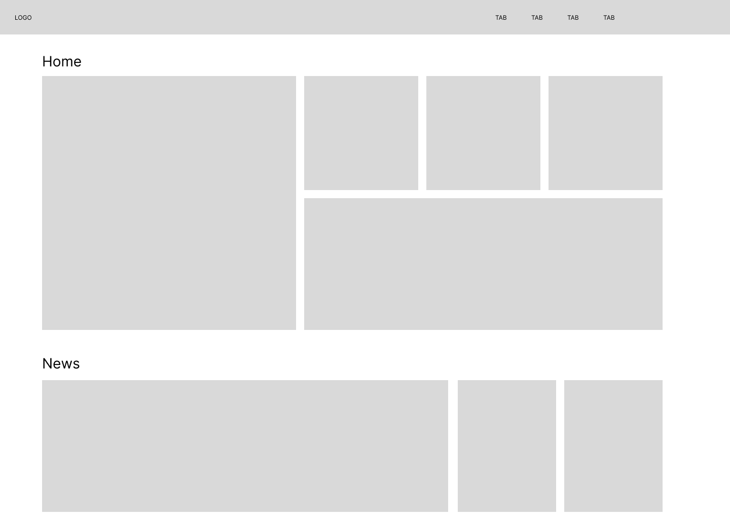
One layout that was really helpful for me as an employee was from an IT company that was updated regularly. This company had the approach as it is shown in the image below. The cards were the most common searches from the employee, in my home view I always saw on top training, vacations, hr resources, dev communities and so on. On sections below was the most common searches from all the employees, and the thing here that was really awesome was how every page was interconnected with all the company and other employees by using colors.

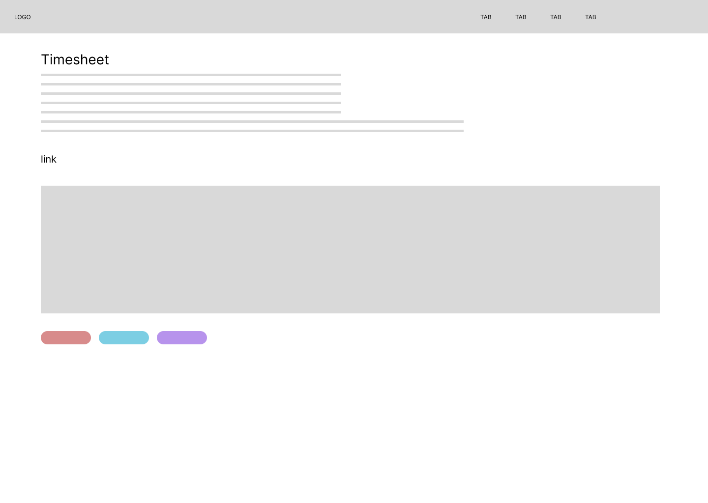
For example if I was on my timesheet page to submit my hours, the current page was just a link for the tool but I had recommendations and images on how to submit my hours, and with the use of tags I could see related search like vacations or trainings.

Intranet Home page ---------------------------------------------------------------- [2 Timesheets page

It was really great.

Your Answer

By clicking “Post Your Answer”, you agree to our terms of service and acknowledge you have read our privacy policy.

Not the answer you're looking for? Browse other questions tagged or ask your own question.