1

I'm working on a B2B product that has a large user base who have been using it daily for the past 3-4 years. We're planning to modify the functionality of a button that most users interact with at least 100 times per day. From user interviews and session studies, I've observed that users are extremely familiar with this button, using it almost automatically.

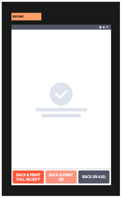
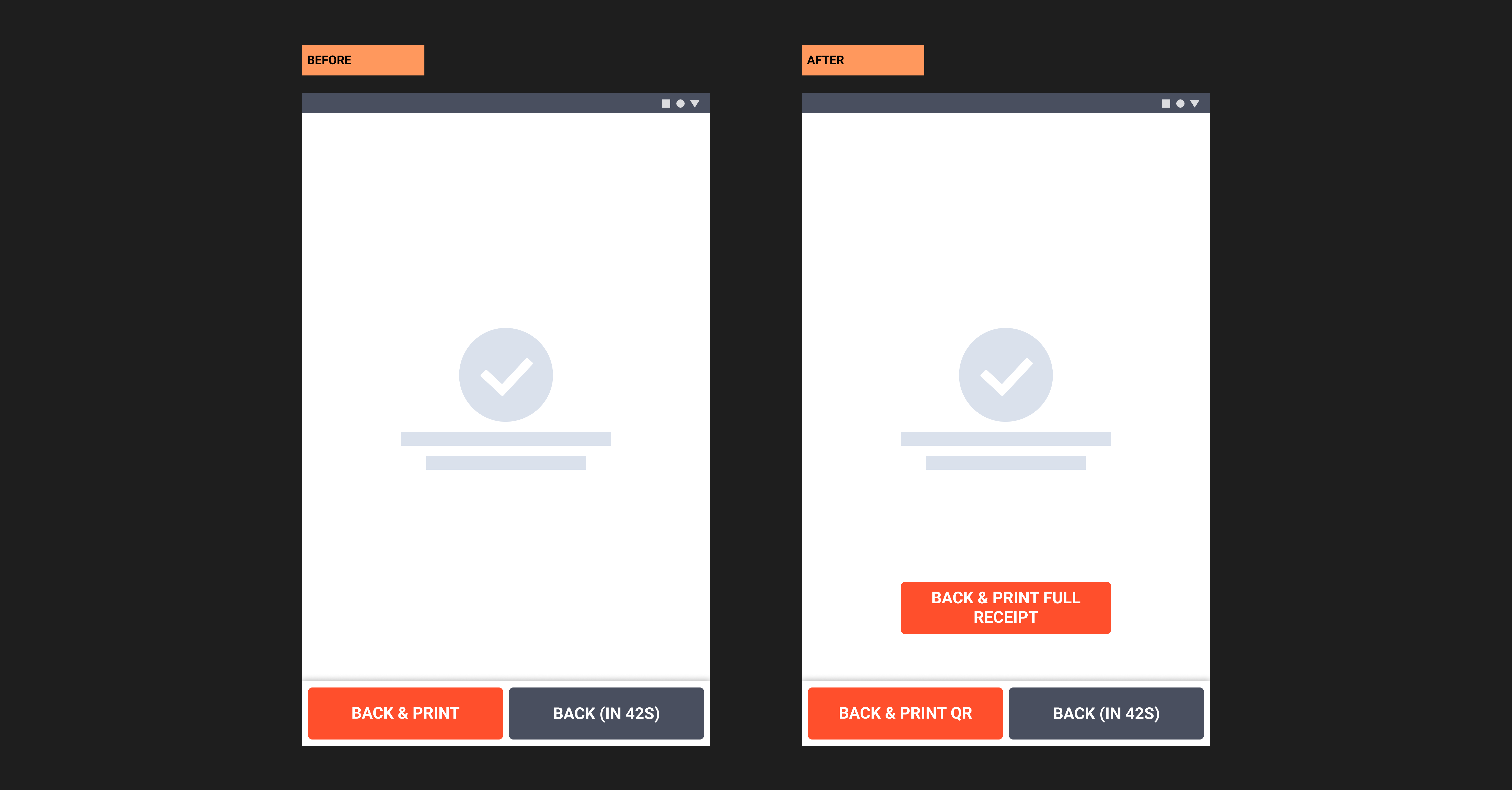
The specific change involves splitting a single "Back & Print" button into two separate buttons: one for printing a QR code only, and another for printing the full receipt. The goals of this change are:

  1. To reduce paper wastage by offering a QR-only option.
  2. To increase the usage of QR codes.
  3. Don't increase the time taken for user to go back (eg: my introducing a modal popup when user clicks on BACK asking if they want to print QR only or full receipt)

Here's a wireframe of the change: enter image description here
I'm looking for strategies to make this transition as smooth as possible for our long-term users. Some questions I'm considering:

  1. What are effective ways to introduce this change without disrupting users' workflow?
  2. Are there any design patterns or UI elements that could help users adapt more quickly?
  3. Anyone who have been in a similar situation - please ignite me with your learnings.

Any insights, best practices, or examples of similar situations would be greatly appreciated. Thank you!

1 Answer 1

2

It is obvious and unavoidable that there must be a change.

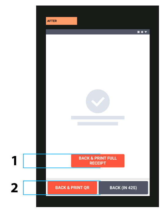
The biggest problem with the proposal is there are two changes, not only the addition of a new button 1 but also a new action area different from the already established 1 and 2

new action area

What are effective ways to introduce this change without disrupting users' workflow?

Do not add more changes than those that are strictly necessary.

Personally

  1. I would keep a single action area with the simple addition of the new function button
  2. Color code keeping the same scheme for better identification of the new component

three buttons

3
  • 1
    I think the order of the new buttons should be reversed: QR first, then full receipt. Because the new QR feature is intended to become the new default.
    – Morco
    Commented Aug 14 at 15:49
  • 1
    And also, the color for QR button should be more obvious than the one for full receipt, like a green or similar strong color.
    – Morco
    Commented Aug 14 at 15:52
  • At the consumer's discretion 😉
    – Danielillo
    Commented Aug 14 at 15:56

Your Answer

By clicking “Post Your Answer”, you agree to our terms of service and acknowledge you have read our privacy policy.

Not the answer you're looking for? Browse other questions tagged or ask your own question.