2

I would like to hear your opinion on the matter. We do have a set-up wizard like that.

Step1


Step 2


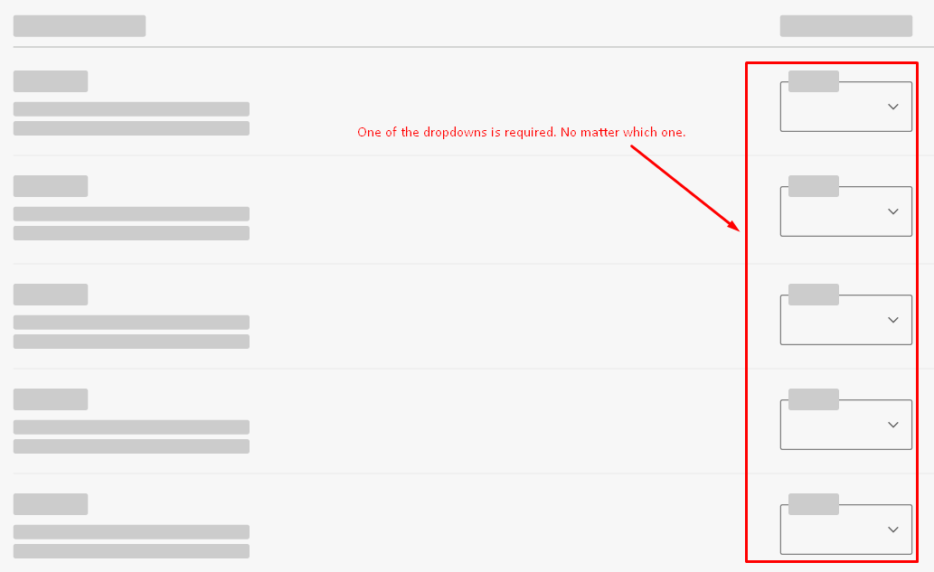
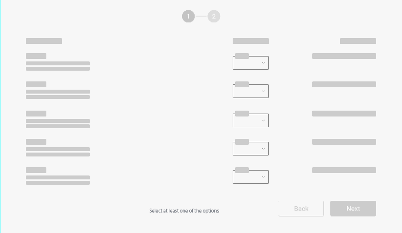
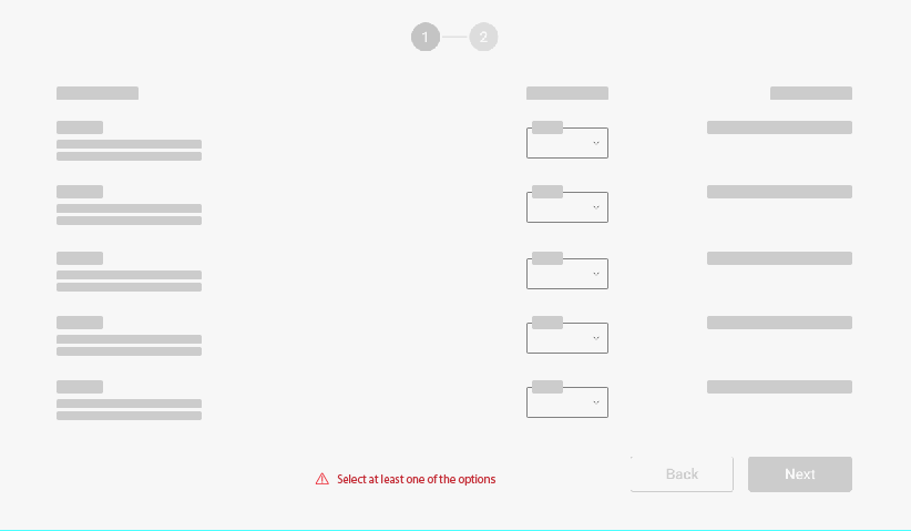
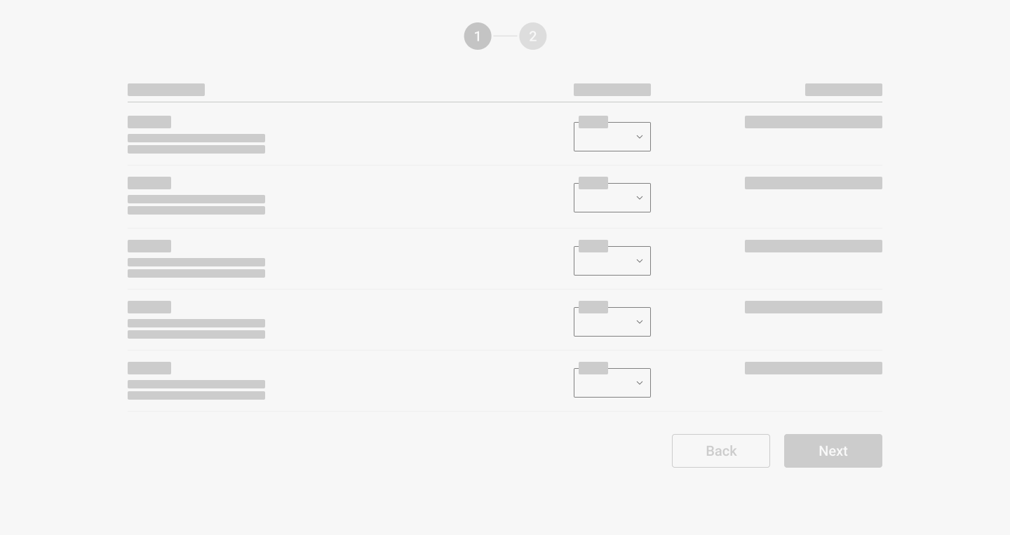
Let's say in step one we do have dropdowns with values from 0 to 10 and 0 being the default value. The user can only move forward if he chooses at least one of the dropdown values to be different than 0. He can choose all or only one (no matter which one).

enter image description here

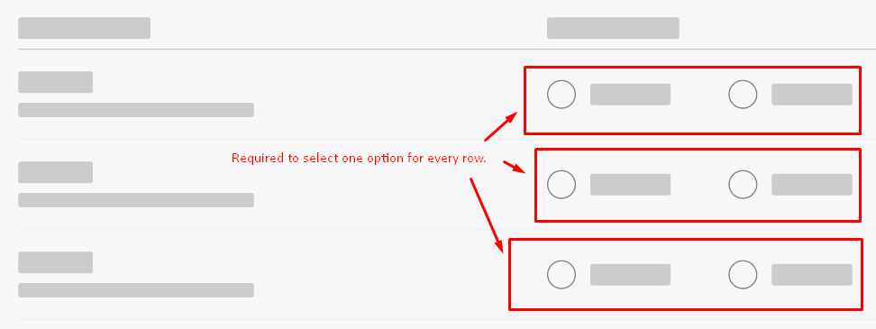
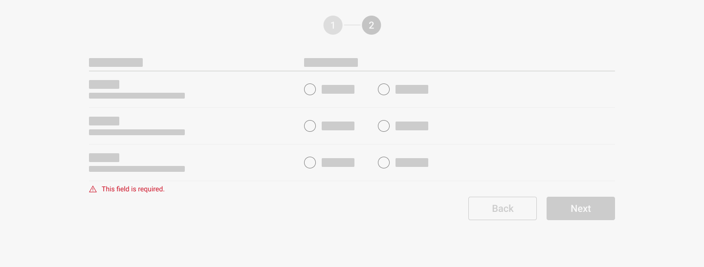
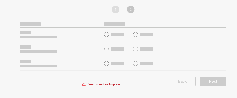
In step two we have groups of 2 radion buttons per row. The user is required to select an option from every row to be able to continue. No row can be left without a selected option.

enter image description here


How would you suggest showing what is required for the user to select? Considering the differences between these two cases.

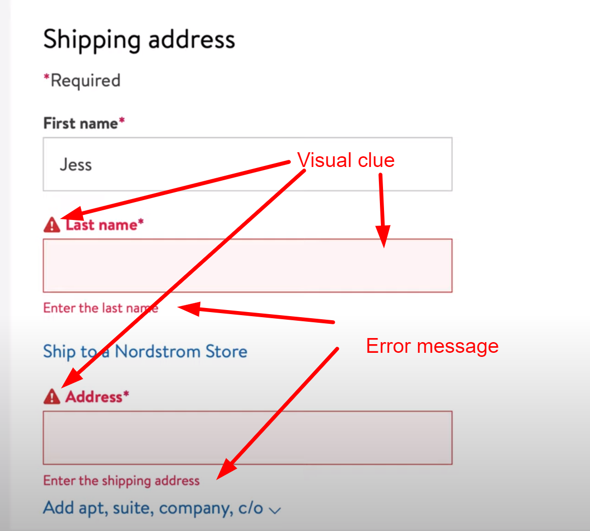
In my research what I found is the user should be able to see visual clues + error messages placed correctly. Is that the way to go? What do you think?

enter image description here


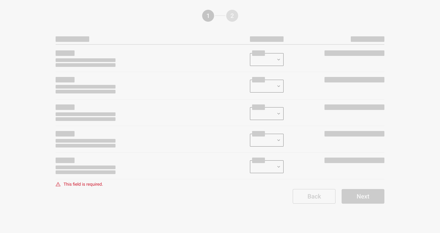
Currently what we do is indicate only with an error message placed the same way for both cases, but it is not clear what is actually required. Error messages are triggered after pressing the button (Next). That is a commonly used pattern in our product.

enter image description here


enter image description here

How would you solve this issue? I will be happy to read your opinions. Thanks in advance


EDIT: What you see presented in steps 1 and 2 is not the only thing that the user has to interact with to be able to proceed. I've only shown the sections from each step I have a problem with.

In the wizard there is a lot more going on than what I showed. There are between 5 and 7 steps and in each step, there are 3-4 sections all dependant on each other. What you see is only one section for a step.

2
  • 1
    Side note: Blank, or a dimmed "select a number 1 - 10", is a better default select option than "0" if a selection is required. Commented Nov 6, 2022 at 21:58
  • Step one: "Select at least one or more of the following. Step two: "Select one of each." Highlight the instructions upon error. Possibly pop up a message box, that either fades or is clicked away. Commented Nov 6, 2022 at 22:01

6 Answers 6

1

I understand the question is like about the difference between required step and required field inside a step and trying to find a single rendering mode.

Half the question is about how each step works and then the problem. I think both things can be simplified by unifying explanation and alert and switching from one to the other when needed.

The main window with an explanatory text:

enter image description here

The alert:

enter image description here

The main window with an explanatory text:

window II

The alert:

Alert II

As each step doesn't contain a large number of elements, this method helps to keep the interface clean of visual noise as seen in the example capture with the error messages and alerts in red in each item.

2
  • The suggestion is great. I personally would integrate the instructions into the flow of the form. So left aligned and positioned on top instead of below the form. Reading "Select one of each option" before you start processing the form might help prevent errors. The error message should be shown below as that happens at the end of the flow.
    – jazZRo
    Commented Jan 7, 2022 at 8:44
  • Something I forgot to mention is that in the wizard there is a lot more going on than what I showed. There are between 5 and 7 steps and in each step, there are 3-4 sections all dependant on each other. What you see is only one section for a step. Commented Jan 7, 2022 at 9:03
1

Add instructions for each section within a Step with a "progress" message:

Step one:
____________________________________________

Select one or more of the following options.
Currently 0 out of at least 1 required selection made.

Select #1: [select from 1 - 10]
Select #2: [select from 1 - 10]
Select #3: [select from 1 - 10]
Select #4: [select from 1 - 10]
Select #5: [select from 1 - 10]

[Next] (disabled)

Once a selection is made, change the "progress" message to:

Currently 1 out of at least 1 required selection made.

Possibly color the "progress" message green. Once all step requirements for each section are completed, enable the "Next" button.


Step two:
____________________________________________

Select one from each.
Currently 0 out of 3 required selections made.

Radio #1: () A  () B
Radio #2: () A  () B
Radio #3: () A  () B

[Next] (disabled)

In this case when a radio selection is made and the 0 changes to 1, it may be bolded to bring attention to it.

In the case some are required and others are not the instructions can read:

Complete the fields marked "required".
Currently 0 out of 4 required fields completed.

...and label the required selections.

An advantage of leaving the "Next" button enabled is if the user clicks it and the requirements are not met additional help can be provided. It is frustrating if the user thinks the requirements are met but the "Next" button is disabled. And the user must then hunt for a solution having already missed the meaning of the instructions and the "progress" message.

0

You are trying to use an inline validation (which is great, but may not necessarily apply for your specific case). What I recommend you to do is to separate your problem into parts:

1: Users are pressing the button "Next" without filling the required field

Possible solution:

Just disable the "Next" Button and add a message that says something like "Please, select at least one value from the list above to proceed". After the user has selected a value, you can enable the button for it to be clicked and voilá. Problem solved

2: User don't get to read the error message because is not well understood or is not in context.

Possible solution: This can also be solved using the solution #1. Pro tip: If you user attempts to click in the disabled "Next" button, you can also include a micro interaction that highlights the columns that you need your user to focus on to fill.

Additionally, I recommend you to check this article for error messages: https://uxwritinghub.com/error-message-examples/

Hope it helps!

1
  • There are aspects I like about disabling the "Next" button until required selections are made, however, if I already missed the instructions it will be frustrating that the "Next" button remains disabled after I think I'm ready to move forward. By allowing me to click the "Next" button without having made the required selections makes it clear I need additional help, before I get frustrated and without me having to look for help. Commented Nov 6, 2022 at 22:11
0

Forms are always tricky! BUT I found this article https://www.nngroup.com/articles/required-fields/ and it says you should always mark (minimum) the required fields AND the optional fields before submitting a form. This means in my opinion that you should show in your first and second screen, what the user needs to do all the time. A hint like Danielillo suggested would be nice, but maybe think about an other position because the reader is used to read the form from top to bottom.

0

What I understand is that the dropdowns are like a group of checkbox without checkbox. You select the dropdown by changing the value instead of selecting a checkbox.

If before each dropdown you have a checkbox/toggle :

  • by default nothing selected : dropdowns value is 0 (or no value) and it's readonly
  • when selected : dropdown is active, the user selects a value
  • checkbox not selected : dropdown value is reset to 0 (or no value) and it's readonly

You have the error on the group level: at least one must be selected
You have error on the dropdown: if selected, the value must be different than 0.
If instead of 0, you can have no value, the dropdown becomes required when selected.

0

You can use visual clues + error messages. It is a classical solution in this case.

What you need to keep in mind are:

  • to show an error message near the problem. Don't place an error message at the center of the screen or near the beginning of the row. It confuses the user and follow in the wrong way.
  • keep a clear and simple message. Don't use long and stylistic advanced sentences. Your message should be short and clear for the user.
  • don't give the user to move on to the next step if the scenario is not finished. If the user doesn't finish your requirements or brake your rules don't give him the option to move on to the next step. Make "next" button disabled and add a message while hovering on it.
  • user testing. Try to make short user testing. You can evaluate how users understand your design and add rectify where it needs it.

Your Answer

By clicking “Post Your Answer”, you agree to our terms of service and acknowledge you have read our privacy policy.

Not the answer you're looking for? Browse other questions tagged or ask your own question.