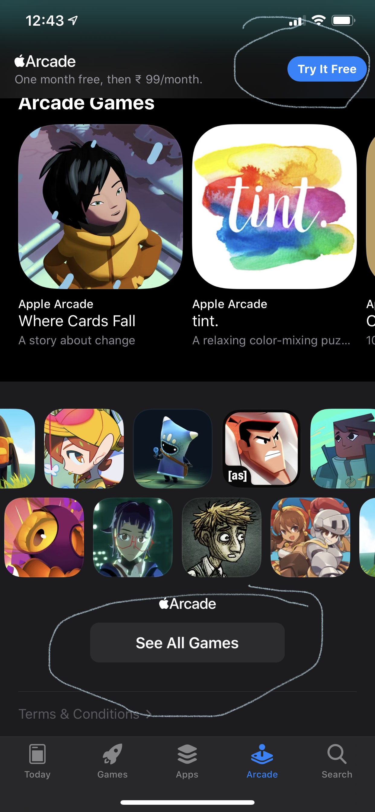
To be blunt, this is another example for Apple needlessly creating inconsistencies in their UIs. Consistency is good for our users, because it reduces cognitive overhead in interacting with our applications. In that sense, a button should look like a button should look like a button. Regardless of size, etc.
It does make sense to introduce slightly different appearances to indicate specific states, such as "enabled/available" vs. "disabled/unavailable", and to guide the user to the most likely action via a "primary" or "call-to-action" button that has more visual prominence than other buttons on a screen.
But if the user has to wonder what is a button, and what isn't, the design is flawed. And, IMHO, that's exactly the case in the above example. One could argue that the rounded shape indicates the call-to-action on this screen. Still, the much brighter color would have provided enough indication of that fact already.

