21

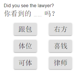
I developed an app for learning Chinese that requires the user to do fill-in-the-blank exercises. A word in the sentence will be blank, and the user has to select which options is correct. It looks like this:

enter image description here

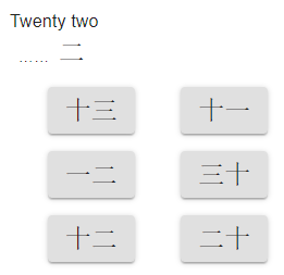
Users seem to be able to understand what they are supposed to do there. However, some users are confused by exercises like this one:

enter image description here

They don't notice that the character for "two" is already present and that the blank should be filled with "twenty". Instead, they look for a button that has "twenty two" and are confused when they can't find it.

Is there a better way to present the exercise to make it more clear that they need to fill in the blank, rather than find the translation of "twenty two"?

6
  • 13
    I question the premise: it seems to me that in both cases the users understood there was a blank that needed to be filled in. If the latter question had asked them to translate "twenty" there likely wouldn't have been any confusion. You may be dealing with the perception that 22 is single unit for translating; partly because it isn't part of a longer sentence, and partly because you wouldn't ask them to translate only the "law" part of "lawyer". Commented Sep 3, 2019 at 20:02
  • 6
    I would blame the number two, for being a couple of lines that are easy to miss.
    – Ángel
    Commented Sep 4, 2019 at 2:31
  • Step 1) Make sure the user knows they are performing a "fill in the blank exercise" by making the title "Fill in the blanks". Step 2) Fill in the _____ exercise questions are traditionally/usually made apparent with adequate underscores. See what I did there?
    – MonkeyZeus
    Commented Sep 4, 2019 at 16:18
  • I'd suggest that the ellipses are the main problem. A solid underscore or box could go a long way here.
    – usul
    Commented Sep 4, 2019 at 17:12
  • @Ángel And potentially for masquerading as an "equals" sign... Commented Sep 5, 2019 at 14:18

4 Answers 4

69

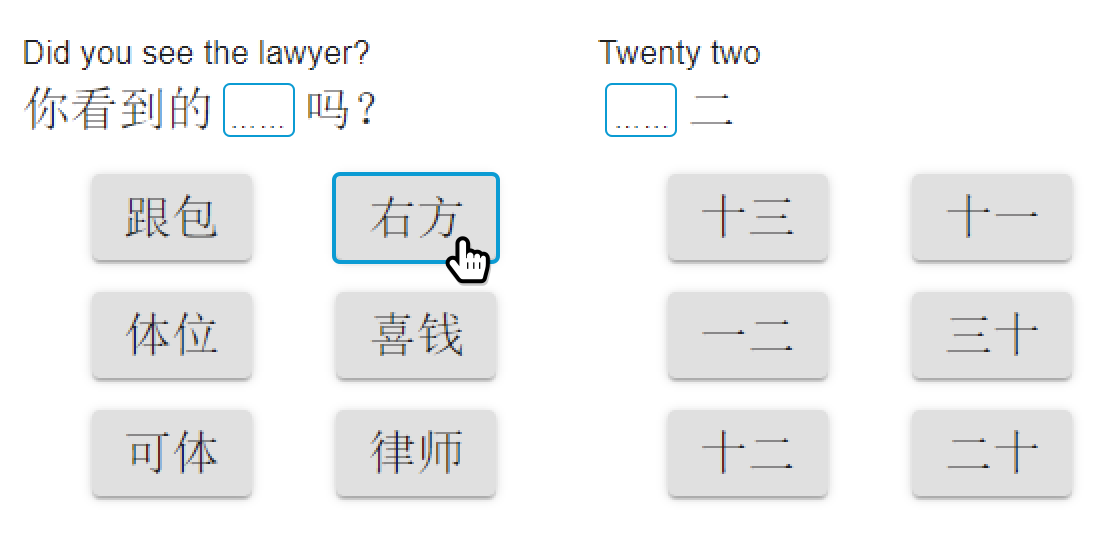
You could suggest a shape that matches the choices below, and use a color to suggest interactivity.

Then, to match that, make a hover state that matches the area above:

enter image description here

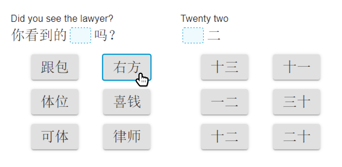
Another slight option is to treat it like a drop area, and just have the space, but no ellipses:

enter image description here

8
  • 21
    Maybe you could also replace the ellipses with the caption of the button when you hover it, like a preview? I don't know, but that could work well. Commented Sep 4, 2019 at 6:49
  • 8
    Assuming OP means "mobile app" when they write "app", hovering may not be applicable @AndreasRejbrand
    – DeepSpace
    Commented Sep 4, 2019 at 7:25
  • 2
    I'd also border the panel containing the six choices in the same blue as surrounds the gap to be filled.
    – nigel222
    Commented Sep 4, 2019 at 8:43
  • 1
    I would recommend replacing the ellipses with a question mark(s) Commented Sep 4, 2019 at 9:58
  • 1
    The shape within the sentence alone should be plenty since users will most likely be familiar with this from preschool (or equivalent) exercises from their early youth. (Extra UI help is definitely helpful though!)
    – Sayse
    Commented Sep 4, 2019 at 14:52
5

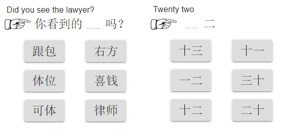
You may need to add any signal (icon or graphic) showing where the beginning of the area to be completed is, in this way you will avoid leaving orphan the incomplete areas at the beginning of the paragraph.

enter image description here

1
  • 6
    In your first image the icon is not at the beginning of the area to be completed, so it doesn't really help much.
    – Luciano
    Commented Sep 5, 2019 at 11:37
3

Instead of giving the character for ‘two’ as part of the question, could you include it next to (or as part of) each answer?

That would take a little more screen space, but seems far clearer than the other alternatives, with less opportunity for confusion or misinterpretation, even for people not giving it their full attention.

2

Perhaps by keeping the blank spaces the same size as the answer, including any kerning issues?

That way, were the answer moved into place everything would line up identically as when it's fully typed out.

With Chinese especially, there's a lot of learning how characters relate to each other, and, at least for me, much of that study has been spatial as much as memorization of individual characters. Because it is a pseudo-pictorial language, it is far more visual than many other written languages; I know, that sounds strange, but think of how some dyslexic children are taught to read. They take, say, the word cat, and make it into a cat by drawing it out... so they learn the full and empty space and shape/outline of the entire word rather than just the symbols. At least for me studying Chinese, that approach helped a lot more than whatever it was I used to learn phonetic English reading as a child. So for 22, if they have half the image, they may be more likely to fill it in properly if all of the parts line up more like a puzzle than a section of text.

Another option would be, upon mouseover, a preview of the selection showing in the empty space.

Your Answer

By clicking “Post Your Answer”, you agree to our terms of service and acknowledge you have read our privacy policy.

Not the answer you're looking for? Browse other questions tagged or ask your own question.