2

I'm building a UI Kit and I'm trying to define the best position for tooltips to be displayed.

Some thoughts: On charts, I believe the tooltip should be displayed on the top of the pointer; On touch devices, the tooltip should be displayed on top because if you are pointing up it's probable that your finger will hide what's on the bottom;

Do you have any recommendations about this?

3 Answers 3

3

This is likely a very opinion-oriented question, but I do have a personal rule: Tooltips should never get in the way of the experience.

  • They should not cover the object being controlled by the button the tooltip is attached to. For example, a checkbox next to descriptive text (the tooltip shouldn't obscure the text) or a slider controlling a displayed response (the response should not be covered by the tooltip).

  • And, in my opinion, tooltips should not be between the cursor (or finger for mobile apps) and the control. Regrettably, your available "white space" may not be large enough to always follow such recommendations (especially with mobile apps).

1

It is also about the recent position of the element (the tooltip is attached to) on the screen.

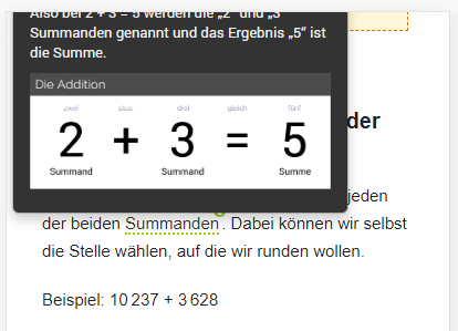
When it is on the top and the tooltip pops up on top, it could be outside the screen. Example:

Example 1

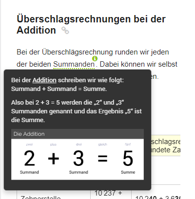
Better solution, when element is on top of the screen, then display the tooltip to the bottom:

Example 2 Solution


The same goes for elements on the bottom of the screen, then display the tooltips on top.

By the way, I am using the tooltip library: https://github.com/q2apro/webui-popover

1

While the top position is often the best default for tooltips, especially on touch devices, it’s important to consider the specific context and user interaction patterns. Implementing dynamic positioning based on the user's device and the location of the element on the screen will lead to a more intuitive and user-friendly experience.

  • Implement a slight delay before showing the tooltip to avoid overwhelming users with unnecessary information as they move their cursor or finger around the interface.
  • Ensure that tooltips disappear quickly after the pointer leaves the element, but also provide enough time for users to read the content.
  • The primary rule is to ensure that tooltips do not obscure the content the user is interacting with. This is particularly important on touch devices, where the user's finger can block the view of the tooltip if it's not positioned correctly.
  • Tooltips should appear close to the element they are describing but should not cover it. This ensures users can clearly see both the element and the tooltip content.
  • Consider implementing dynamic positioning for tooltips in charts, where the tooltip can adjust its position (e.g., left, right, top, bottom) based on the proximity of the pointer to the chart's edges. This ensures that the tooltip remains visible and doesn't get cut off by the chart's boundaries.

It's essential to consider the context in which the tooltip will be used, the type of device, and user behavior

Your Answer

By clicking “Post Your Answer”, you agree to our terms of service and acknowledge you have read our privacy policy.

Not the answer you're looking for? Browse other questions tagged or ask your own question.